The “Blue Marble”

Today marks the fortieth anniversary of the taking of a remarkable photograph on December 7, 1972.  The image is of the planet Earth and was taken by the astronauts of Apollo 17, then racing to the moon.  The image is often referred to as “The Blue Marble.”  It conjures up the same thoughts now as it did then.  We are all connected. The world is a beautiful place. We have tremendous power of technology, that we may chose to use for good or evil.   Why do we continue to kill each other, pollute, and destroy our beautiful planet?

Figure 1 – “The Blue Marble” taken by the astronauts of NASA flight Apollo 17, December 7, 1972

Joseph Petzval and the dawn of modern lens design

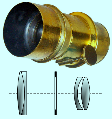
Figure 1 – An example of one of Joseph Petzval’s lenses.By Szőcs TamásTamasflex (Own work by uploader – Lens Photo by Андрей АМ) [CC-BY-SA-3.0 (http://creativecommons.org/licenses/by-sa/3.0) or GFDL (http://www.gnu.org/copyleft/fdl.html)], via Wikimedia Commons

In reading the January 2013 issue of Shutterbug (Is it really 2013 already?), I came upon an interesting excerpt from “Pring’s Photographer’s Miscellany” about Joseph Petzval (1807-1891) that was worth looking into further.  Petzval was a Slovakian physicist and eventually chair of Mathematics at the University of Vienna. He was the first person to design camera lenses mathematically; so in that respect was the father of geometric optics and modern lens design.  There is a wonderful Antique and Classic Cameras website that offers an excellent discussion of  early camera lenses.

The bottom line is that early Daguerreotypists were plagued by the very high f-numbers of their cameras and the long exposures that they consequently demanded.  The original lens that Daquerre used was a  cemented doublet achromatic Chevalier 15-inch telescope objective with an f-number of 15.

Petzval’s innovation was to design a  pair of doublets, where the second doublet compensated for the aberrations of the first.  This produced a sharp image at the center with a softer focus off center as well a vignetting at the edges.  Such a lens was ideal for portraiture, where the goal is to focus the eye on the subject not the background.  Indeed, Petzval lenses are still manufactured today so as to achieve just this effect.

At f/3.6 this lens was almost 25 times faster than the original Chevalier lens.  This made sitting times for portraits manageable, even for children. In this respect, Petzval may be credited with contributing significantly to the development of modern photography.

Petzval initially teamed with Voigtlander & Sons to produce his lens.  Utimately, Petzval fell out with Peter Wilhelm Friedrich von Voigtländer (1812–1878) .  Patent laws were problematic in the 19th century; so they continued to produce copies of his lens design and there was a dispute as to who held the legal right to manufacture these lens.   In 1859, Petzval’s home was burglarized and his manuscripts and notes were destroyed.  He never was able to reconstruct all of his previous work and he ultimately withdrew from society and died a destitute hermit in 1891.  This seems, sadly, to be a common epilogue for the photographic geniuses of the 19th century.

Random noise, counting noise

So let’s build on what we know about noise. The operative word for the day is random.  Suppose we have a camera sensor and we look at what is happening to a single pixel.  Let’s suppose that there are about 100,000 photons of light randomly hitting that pixel every second.  The pixel builds up charge in response to the light (which means it converts those photons to electrons and somehow counts them).  For now, we’ll assume one photon creates one electron.

OK, now assume that you read the amount of light every microsecond (one millionth of a second).  What this means is that most of your microsecond intervals are going to be empty.  In fact, only one in ten on average will have photon.  Or put another way, the probability that any given microsecond contains a photon is 1/10.  By-the-way, this means that the probability of catching two photons in an interval is (1/10)X(1/10) or 1/100 or 1%.

The point is that there is a lot of variability.  Because the photons are discrete and their delivery random, you cannot get 0.1 photons in an interval which happens to be the average.  Most (~90%) of the time you get 0.  Some (~10%) of the time you get 1.  And rarely you get 2, 3, 4, etc.

If you instead count for 2 micron intervals, ~80% of the time you get 0 and ~20 % of the time you get  1.  The odds of a 2 go up to 2.5%.  Basically, the longer the interval the less variability you get.  However unless you count for an infinite amount of time there’s always going to be variability.

Here’s the key.  Suppose your exposure (that’s your measurement interval) gives you 10,000, then there’s an uncertainty of the square root of 10,000 or 100 in the number of photons detected.  OK, I have to say it accurately at least once.  The laws of probability predict that if you made your measurement (exposure) a lot of times, 68% of the measurements would fall between 10,000-100 (that’s 9,900) and 10,000 +100 (that’s 10,100). This corresponds to a 1% uncertainty or variability.  I’m sorry I had to say it.
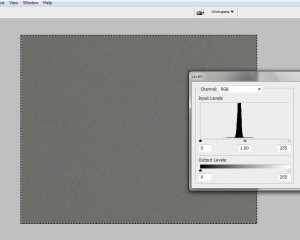
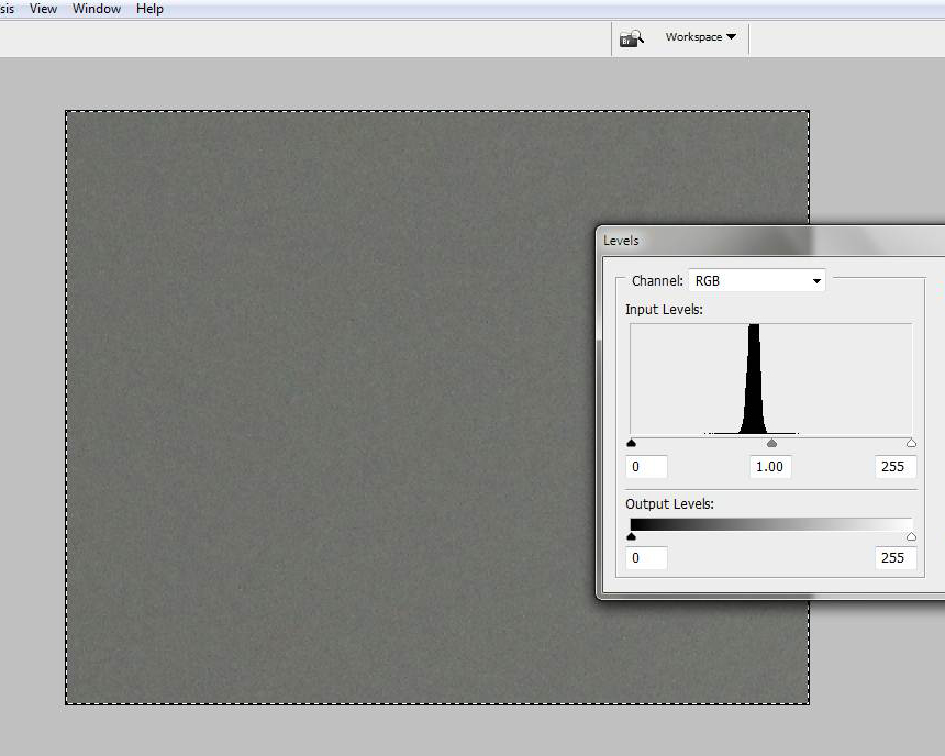
Figure 1 – Image of a grey wall and the corresponding histogram of measured intensities

The really important take home message here is that ultimately you’re counting photons (really electrons) and there’s always going to be variability, or noise, by virtue of the random way that light is delivered.

OK, so let’s prove it.  In Figure 1, I show a picture that I took of a homogeneous wall. Superimposed on this image is the histogram of the grey values.  While they’re tight they’re not all the same.  There is variability or noise even in this homogeneous image. Engineers refer to this as counting noise, and it’s inescapable.
Peter, the whipped slave

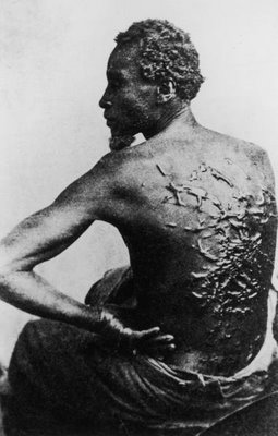
Figure 1 – Peter, 1863, an African American slave from Baton Rouge shows the scars inflicted by his overseer. Photographer unknown. Image is in the public domain because of its age.

Those of you who have seen Steven Spielberg’s new movie: “Lincoln.” may recall the scene where little Tad Lincoln is lying by the fire looking at lantern slides.  He ponders for a moment, fixated by the horrible image of a beaten slave. This is an actual and infamous abolitionist image of an ex slave from Baton Rouge, named Peter, who bears the scars, brutally inflicted by his overseer.

The photographer is unknown.  The image is brilliant.  Written on that poor man’s back is the history of his life, indeed the history of his people.  In one still image the photographer speaks to us of the immeasurable cruelty of slavery, and of unspeakable toll that it takes on its victims.

Slavery was abolished in the British Empire in 1833.  As a result photography could play no role as its chronicler.  Of course, as we have seen through the brave work of Lisa Kristine and others, it continues to this day.  In the United States, the abolitionist movement and the American Civil War were contemporary with the invention of slavery.  As a result, we can today still see the effects, the reality, and the after effects of slavery and subsequent Jim Crow documented in vivid images.

As for Peter, he was freed and went on to fight in the Union Army against slavery.  That unequal justice is also documented in Spielberg’s “Lincoln,” in Ken Burns’ “The Civil War” and in Edward Zwick’s 1989 film “Glory.”


Signal-to-Noise, an intuitive view

We all have an intuitive understanding of what noise is; so let’s start with that.  You’re sitting in a restaurant, and your boyfriend is about to propose to you.  The problem is that you’re having trouble hearing him, because of all the noise around you – the self-impressed boorish lout at the next table gfawing loudly at his own jokes, the children screaming on the other side of the room, and the large table full of intoxicated people all talking at once. Your boyfriend is nervous and speaking unusually softly.  So we have it – first background noise and second a low signal.

Engineers describe this as the signal-to-noise ratio.  When this ratio becomes less than about one, the signal becomes very hard to discern above the noise.  And recognize, that it’s not just that there is a background that’s the problem, the problem is that it varies and is random.  Your ears and your brain just don’t know how to process the sound to separate the signal from the noise.  Note, that I’m trying to distinguish between background, which if it is constant, can be easily dealt with, and noise which is random.

Let’s return to the restaurant, somebody steps up to the front of the room and starts talking into a microphone.  Suddenly, there’s a signal that is way above the noise, has a high signal-to-noise ratio, and is easily discerned.  Wait a minute you say, what about my proposal.  I’llk leave that for you to figure out.

Have you ever heard someone speak or sing into a microphone that has a loose connection that causes the amplification to vary randomly?  Sometimes the sound is high above the background and sometimes it’s low and near the background.  Well, that’s another type of noise, called signal noise.  The total noise in a system is the combination of the background noise and the signal noise.  In fact, every component of a system, say a camera system, can introduce noise.

Optical systems, like cameras, have the same issues.  For instance, fog introduces noise into your image, making it hard to see things.  It reduces the contrast.  Now in my blog of October 20, 2012, we discussed the relationship between image resolution and contrast.  Contrast is the difference between white and black.  The finer detail you want to see, the more contrast you need.  We have defined resolution in terms of the finest line separation you can still discern.  If you make it harder to discern the lines by adding noise, both to the white signal and to the black background, your resolution decreases.

By the way, I do hope that the proposal worked out!

Returning to the question of image sharpness

I’d like to pick up on the issue of image sharpness.  So maybe, we should begin by reviewing where we are, with references to earlier blogs.

  1. We discussed the pinhole camera and described how larger f-numbers (the ratio of focal length to aperture) improve depth of field and sharpness.
  2. We discussed the pixel limit of a given camera’s resolution.
  3. We considered the diffraction limit of resolution in the context of pixels.
  4. We described the concept of measuring resolution in terms of line pairs and line width.
  5. We explored the relation ship between image contrast and resolution.
  6. We developed a simple method for measuring image sharpness or resolution that can easily be implemented and we showed the results of some real-life lens.
  7. We found that with a “good lens” you can achieve resolutions close to the pixel limit.
  8. We found that for real lenses matched with a given image sensor there is an ideal diffraction limited f-number, where you will achieve your sharpest image, provided you don’t need to worry about depth of field.

All of this was meant to enable you to declare war on useless statements that you see all over the place like: “tack sharp,” “excellent resolution, and “very,very sharp.” Care to try to put these in quantitative order – as in is a “tack sharp” lens better than a “very, very sharp lens” or the other way around?  They are really meaningless descriptions.  Yet, you see them in lens reviews all of the time.

Oh yes, and we found that the IPhone camera is pretty amazing!

So in the next technical blog, I’d like to set the stage, for considering how image noise affects resolution.  And of course, noise is an important element to understanding the dynamic range of cameras and images as well.

The magic of daguerreotypes

All of this talk about daguerreotypes may leave you wondering about what the big deal is.  So I just thought that I should pause for a few moments and reflect on the sheer magic of these little silvered copper plates.  They are truly magical, or at least as magical as things get in this age of science and high technology.  And, of course, part of their mystery resides in the way that they, as the original photographic medium, blend science, art, and seeming sorcery.

If you haven’t already done so, you really should experience them first hand.  They are still “affordable” at antique stores.  A lot of what are labeled to be daguerreotypes are, in fact, tin types.  There’s a simple way to recognize them.  The image seems to hang in space.  You cannot quite place it as being on the surface.  If you move your head slowly over a daguerreotype, you will see that just when you view it head on, it disappears, replaced by a shiny silver mirror like reflection.  Indeed, in the day of daguerreotypes special boxes were constructed for viewing them.

Many of the people who made daguerreotypes were truly artists.  As a result many of these images are beautifully and delicately hand-colored.  The cases are special in and of themselves.  These, often referred to as being made of gutta percha, a natural latex product, are in fact mislabeled.  While manufactured in the nineteenth century they are created of the world’s first true thermoplastic.

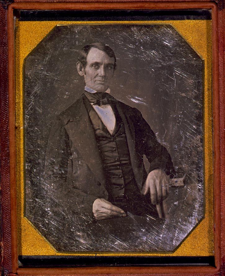
Figure 1 – Daguerreotype of Abraham Lincoln in 1846 attributed to Nicholas H. Shepherd.  In the LOC and in the  public domain.

As I have said before, part of the charm is that captured in that ethereal daguerreotype image is a person from the mid nineteenth century.  Often these are famous people, whom you never expected to see in a photograph.  But more often, they are just everyday people, now long gone.  There are even post mortem images, where the photographer was called upon to capture a last memory of a loved one.

I have categorized today’s blog both as “Reviews and Critiques”  and “Personal Photographic Wanderings.”  This is because viewing a daguerreotype is a highly intimate and personal experience.  You have to experience them for yourself.  They can affect you in so many different ways.

And finally, I know that many of you, including myself, have flocked or plan to flock to see Daniel Day-Lewis, as Lincoln, in Steven Spielberg’s new movie by that name.  So if you have wondered what Lincoln actually looked like, I offer you the image of Figure 1, a daguerreotype taken in 1846 by the great American daguerreotypist Nicholas H. Shepherd.

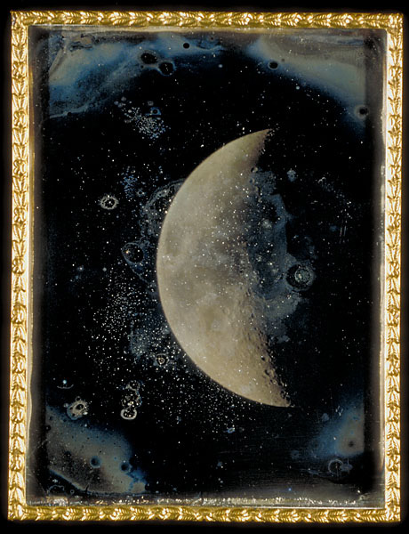
Photographic Firsts #3 – The first photograph of the moon

The question of the first photograph of the moon appears to be a bit of a fuddle.  Daguerre (1787 – 1851) himself is said to have photographed the moon.  Unfortunately, on March 8, 1839 Daguerre’s diorama, his laboratory, early experimental works, and his notes were all destroyed in a fire.  So his image of the moon was destroyed.  Indeed, there are currently less than twenty-five existent daguerreotypes that can be unambiguously attributed to Daguerre.

Next, the New York University Professor John Draper (1811 – 1882), who collaborated with Samuel F. B. Morse (1791-1872) actively produced daguerreotypes of the moon in March of 1839 at NYU’s observatory in Washington Square.  An image in the archives of NYU taken on March 26, 1839 appears to be the earliest moon photograph currently in existence.

Figure 1 – John Adams Whipple “View of the Moon, 1852” in the public domain.

A very interesting exposure sequence daguerreotype of the moon was taken by Samuel D. Humphrey, author of “Handbook of the Daguerreotype,” on September 1, 1849 in Canandaigua, NY.  As a side note, because the moon is lit by the sun, photographing the moon is like photographing an earthly scene on a sunny day.  As a result, the exposure typically falls within the old rule of thumb, shoot at f/11 at one over the ISO.  This rule served Ansel Adams (1902 – 1984) well in determining the correct exposure for “Moonrise Hernandez, NM, 1941.”

Finally, a magnificent set of daguerreotypes of the moon were taken by Harvard Professor John Adams Whipple (1822-1891), in collaboration with astronomer William Cranch Bond (1789-1859), between 1847 and 1852.  These images won the prize for technical excellence in photography at the 1851 Crystal Palace Exhibition in London.  On the night of July 16–17, 1850, Whipple and Bond also made the first daguerreotype of a star (Vega).

I’ll leave you with that image to ponder.  By 1852 astrophotography was certainly born as a tool for science.

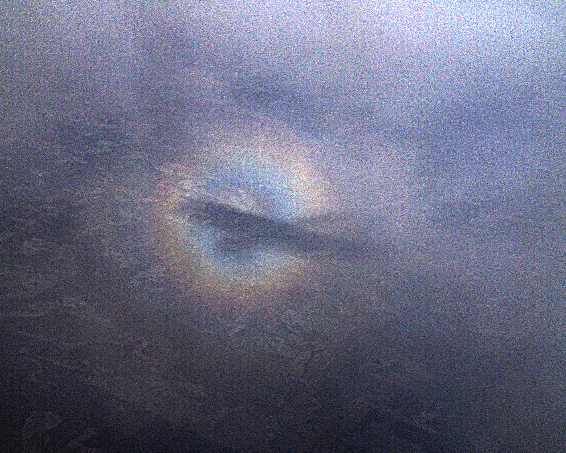
The Airy disk of an airplane

Figure 1 – Airy disk of an airplane projected on the distant clouds

In our discussion of camera resolution, we described how a point source appears, not as a point, but as an Airy disk in the camera.This phenomenon is, in fact, fairly ubiquitous.  An interesting variation is to see the Airy disk projected by the sun illuminating an airplane and projected onto the clouds below.  I am not sure that I fully understand the mechanism here.  But I thought

Figure 2 – Airy disk of an airplane with shadow of plane projected on closer clouds

that I would show some examples that we took while flying into Minneapolis/Saint Paul for a recent experimetal trip to the Mayo Clinic in Rochester, MN.  Figure 1 shows the disk itself, a bright central region and a ring progressively blue to red.  In some cases you can see a second ring.  Also note that the central peak is fairly weak, presumably because we are looking at a dark hole rather than a bright spot.  I have also noted that, when the clouds get close, you often see the shadow of the plane centered in the ring (see Figure 2).

So I put it out for readers’ comments on the exact physical mechanism at work here.  Judging by the angles involved and the order of the colors it is pretty clearly a diffraction phenomenon and not a water droplet or ice crystal phenomenon like rainbows and solar halos.

Whether or not you are interested in the physics, keep an eye out for this next time you fly.  The can be very dramatic and cool. In the meantime, I am going to do some furtehr research and see if I can come up with a more complete explanation.