First experiments with AI sharpening

Unless you’re very lucky or very good as a bird photographer you find yourself needing to do some image sharpening – no shame in that! Several years ago I tried Topaz Sharpen AI and decided that that I could really do as well with Adobe Photoshop Smart Sharpen. I have been following the development of the Topaz products for the last few years and recently decided that it was worth a revisit.

So I downloaded Topaz PhotoAI and began the adventure. This is a complex story, but I thought I would begin with seeing what the software would do for me straight out of the box. So I opened up the original version of the bald eagle image that I posted a few days ago and sharpened it on Topaz. This was a picture that I wasn’t quite happy with from my recent Florida trip. For reference the Adobe Photoshop process image is shown in Figure 1.

Figure 1 – American bald eagle, Sanibel Island, Fl, processed with Adobe Photoshop smart sharpen, (c) DE Wolf 2024

There are three issues with standard sharpening algorithms. First, if you’re not careful, you can get a kind of comic book effect; second you tend to sharpen the noise as well as the subject, the image becomes annoyingly grain; if the main subject of an image is a small part of the image, say a person’s face or a bird’s head, the resolution is poor and only becomes worse on sharpening.

Now imagine that the photograph was a painting, a talented painter could get rid of the noise and increase the resolution of the image. Increase the resolution? The intelligent painter is applying his/her knowledge of faces and bird heads.

The key word is, of course, intelligent. An AI program takes the part of the painter, recognizing noise features from true feature, adds pixels and intelligently fills them. That last process is referred to as upscaling. An upscaled image has many many more pixels than the original image.

So using Topaz PhotoAI and with very little knowledge of it, I created the improved image of Figure 2. Actually, I first sharpened with Topaz PhotoAI and then processed, but didn’t further sharpen it, with Adobe Photoshop. The noble eagle is now, well more noble. There is less noise and there are four times as many pixels. Although this is somewhat lost by image compression for loading on the website. To see the sharpening and noise reduction zoom in on the eagle’s head. I am a bit concerned about the eye possibly being over worked, but I need time to learn.

Figure 2 – Bald Eagle processed with Topaz PhotAI and Adobe Photoshop, (c) DDE Wolf 2024.

American Gothic

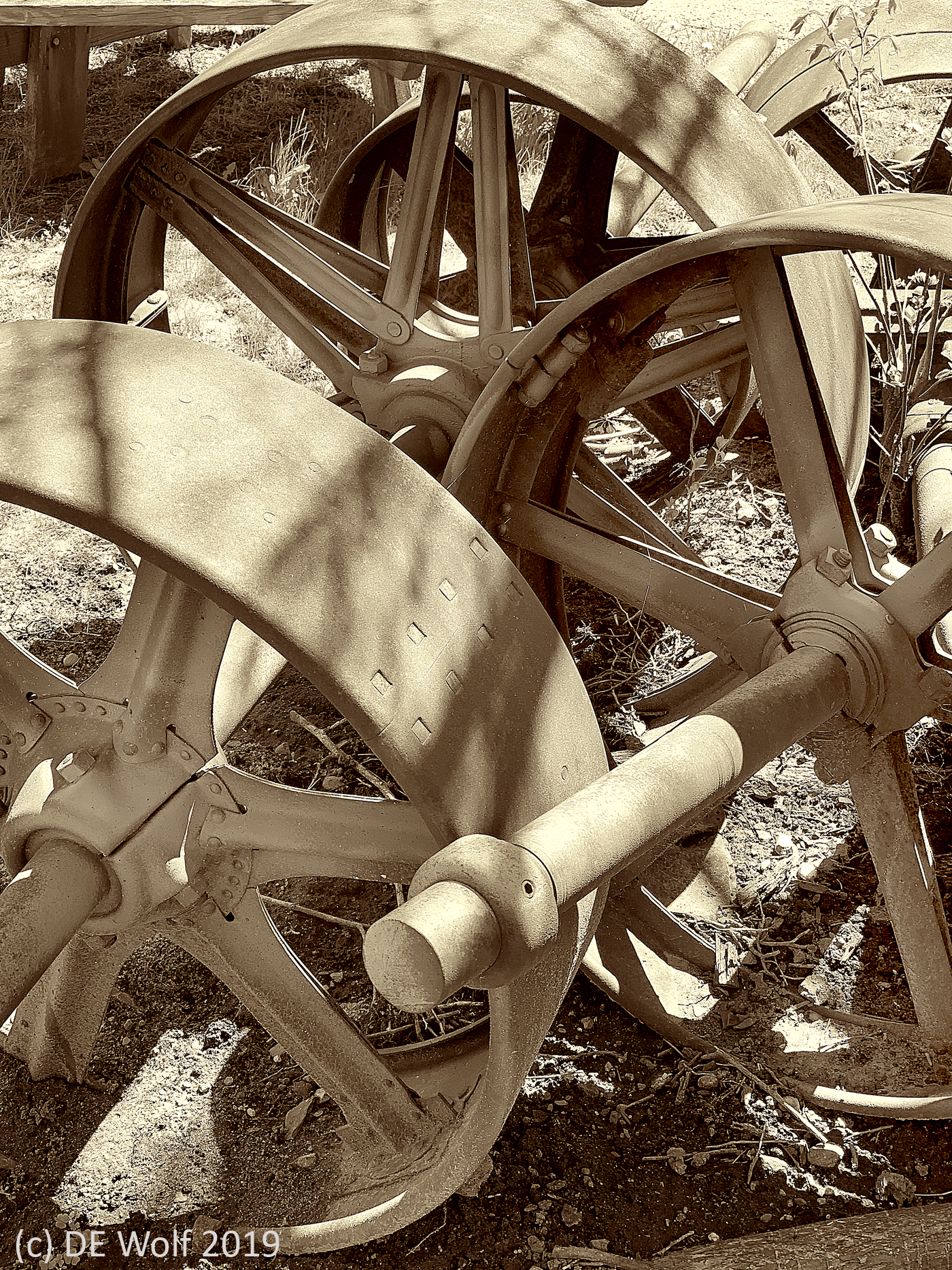
Figure 1 -Discarded antique belt wheels at the historic Damon Mill in Concord, MA. (c) DE Wolf 2019.

This past week, I made two photographic transitions.

First, I upgraded my failing IPhone 6 to an IPhone  XSMax. The 6 represented a major advance in cell phone camera technology, and the 7 even more so.  With the XSMax comes the best camera until, I suppose the XI. There are three cameras on the iPhone XS Max, two in the back and one in the front for selfies and facial recognition. Significantly for those of us who do a lot of post-processing, the dual rear cameras are at 12 megapixels, which some will recall was the transition point when digital started to be equivalent to film in resolution. The lenses are f/1.8 for the wide-angle camera and f/2.4 for the 2x “telephoto.” Let’s put the word telephoto in quotes, for photography buffs this is more of a “normal” lens. But I hasten to mention the fantastic capabilities of these cameras in terms of close-up and wide-angle ability. For me, there is no reason to carry any other cameras but my phone’s and my DSLR.

Of course, a lot of the value lies in the Artificial Intelligence. the AI, in the algorithms. Yes that again, friends!  This is not your father’s camera, or at least not my father’s. This is “computational photography” and has a new feature called ‘Smart HDR’ where the phone begins capturing images as soon as you open the app not just when you push the shutter. Each image is a stream of images, one being chosen as “best.” But, I hasten to add you can change that later as you use the camera’s post-processing algorithms. By combining images the camera optimizes lighting and in the process avoids overexposure and shutter lag. While the images produced are only 8 bit per color plane, in my experience so far, the histograms are spot on, filling the dynamic range perfectly. Well enough said for now, I am having fun, and getting fabulous shots.

And as an example of image quality, I am including as Figure 1 a sepia toned black and white image of discarded antique belt wheels at the historic Damon Mill in Concord, MA taken with my IPhone XSMax and very minimally modified in Adobe Photoshop. I think the subject matter fitting. In its day, in the mid to late nineteenth century, these waterworks that, electricity free, powered the clothing industry of the Industrial Revolution were the height of technology, just as these new cellphone cameras are today.They are now discarded ornaments, which truly makes one wonder what is next!

Second, at the urging of a wise friend, I have started playing with the app PRISMA. This stylizes your images in various painterly fashions. According to Venture Beat, “PRISMA’s filter algorithms use a combination of convolutional neural networks and artificial intelligence, and it doesn’t simply apply a filter but actually scans the data in order to apply a style to a photo in a way that both works and impresses.” If you’re like me this tells you NOTHING. But the point is that these are not simple filters but AI neural networks applied to image modification. They are a lot of fun to use, and when you have a photo, which lacks a certain umph, you can often “jazz” it up with the PRISMA app. It is important, I believe, that the goal here is to achieve a beautiful and artistically pleasing image. Artistic photography is intrinsically nonlinear. Strict intensity and even spatial relationships are fundamentally lost in the processing.So there is nothing wrong with using modern image processing techniques to enhance the effects.

More importantly both the iPhone camera transition and the PRISMAand related apps transition truly represent a new world for the photograph, one where, along with the photographers brain, the camera itself has a brain that works in tandem with you. Of course, the beginnings of all of this rest historically with the development of autofocus and autoexposure back in the seventies. But really, it is a new world energized by neural networks and artificial intelligence. You may have wondered how I can write a blog about photography and futurism in the smae breath. Now you know!

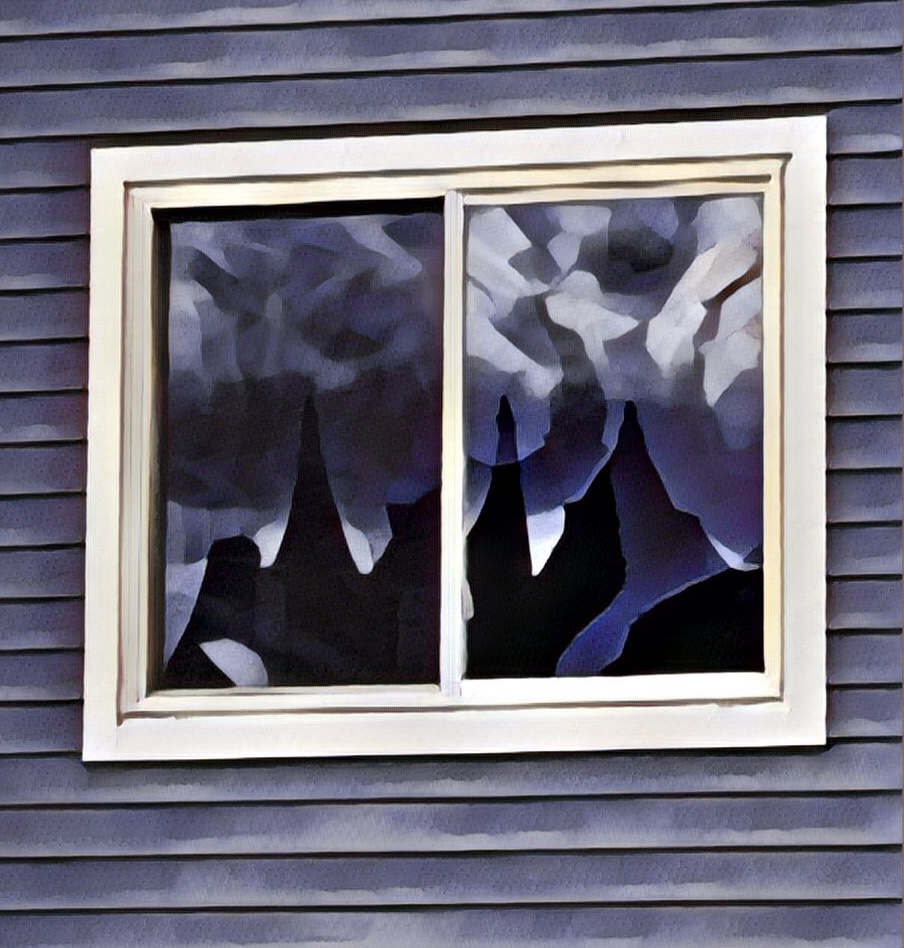
As an illustration of this, Figure 2 shows The Old Salem District Courthouse in the Federal Street District of Salem, Massachusetts reflected in the window of a condominium. The scene struck me as ever so Gothic. I wasn’t quite satisfied with the original image. However, I was able to accentuate this feeling of medieval  Gothis as well as to brighten up the tonality with the PRISMA Gothic filter.

Figure 2 – American Gothic, reflections of the Salem District Courthouse in a condominium window, modified using the PRISMA Gothic filter, Salem, Massachusetts. (c) DE Wolf 2019.

Robotic eyes are seeing more clearly

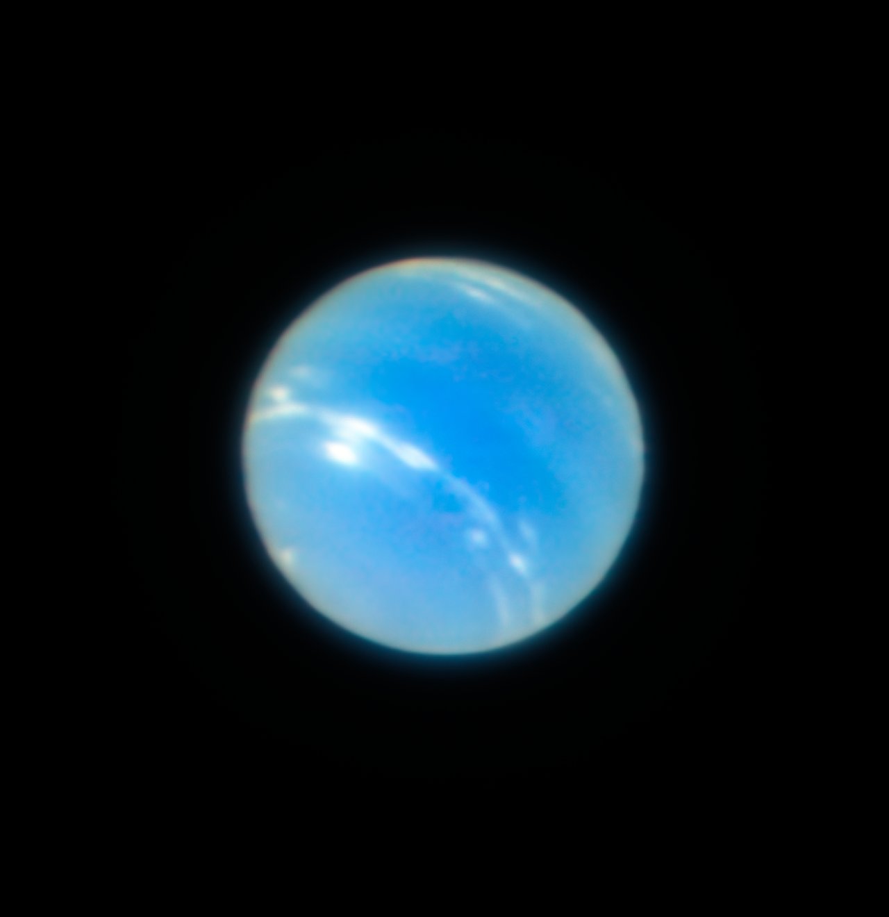
Figure 1 – This image of the planet Neptune was obtained during the testing of the Narrow-Field adaptive optics mode of the MUSE/GALACSI instrument on ESO’s Very Large Telescope. The corrected image is sharper than a comparable image from the NASA/ESA Hubble Space Telescope.Credit:ESO/P. Weilbacher (AIP)

Figure 1 is something new and astounding. It is a photograph taken with the European Southern Observatory’s Very Large Telescope (VLT) in Chile’s Atacama Desert using adaptive optics. Look closely and you will see clouds and a multitude of subtle shadings. Significantly the image rivals images such as that of Figure 2 taken with NASA’s Hubble Telescope in Earth orbit. What this mean is that it is possible to obtain images from a Earth-bound telescope that rival images taken from space. Said differently, what it means is that we now have a second pair of truly amazing eyes focused on the universe.

As anyone who has used a telephoto lens on a atmospheric day knows, water in the atmosphere between you and the subject scatters and fuzzes out the image. That’s one of the reasons that its so hard to get a good and sharp image with a long telephoto lens.  Worse still for a telescope, convection (heat flows) in the atmosphere causes minute localized changes in index of refraction which cause fluctuations in the focus and position of the object in the sky. Orbit-based telescopes solve this problem by going above the atmosphere. ESO’s VLT takes a different approach, it uses lasers to create guide stars and fluctuations in the focus and position of these guide stars is used to adjust the array of mirrors that make up the primary mirror of the telescope, The telescope’s thin, deformable mirror compensates for these fluctuations by shifting its shape 1,000 times a second to correct the distorted light. And the result are the super sharp images like that of Figure 1.

With this demonstration land-based astronomy has entered a new phase, one that will, like the Hubble, will take us to new worlds.

Figure 2 – Image of Neptune taken with NASA’s Hubble Space telescope. Credit: NASA.

Favorite Photographs 2016 #9, NASA, “John Glenn on Friendship Seven in Orbit, 1962”

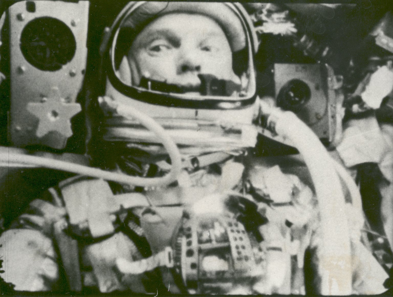
Figure 1 - John Glenn in orbit on the Friendship 7 Feb. 20, 1962. photographed automatic sequence motion picture camera. NASA Public domain. during

Figure 1 – John Glenn in orbit on the Friendship 7 Feb. 20, 1962. photographed automatic sequence motion picture camera. NASA Public domain.

I was searching through the NASA photograph archives looking for a picture that would commemorate John Glenn’s Friendship 7 flight on Feb. 20, 1962. What struck me the most was how many pictures there were of people. Yes there were planets and galaxies, but so many people. While NASA gives us some of the most stunningly profound images of space it all ultimately comes back to people. NASA and the exploration of space are human endeavors.

As a result it really all comes back to the image of Figure 1. I remember the thrill when these images were first released – fifty five years ago. Man in space. Man in orbit. Man on the moon. This is human destiny. Men and women shall move forward in this realm of exploration that ultimately dwarfs and, indeed, eclipses all other exploration in the history of the human race.

And it all evolved photographically. Black and white image and videos. Color images and videos. Building a compact lightweight video camera in those days wasn’t so easy. Certainly thye space race was a motivating factor in these innovations. But with the moon landing we were effectively there, as if the Goddess Selene had sent out her personal camerawoman to photograph the event.

We shall not cease from exploration, and the end of all our exploring will be to arrive where we started and know the place for the first time.
T.S. Eliot

The albumen technique

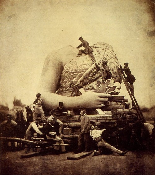
Figure 1 - Alois Locherer "Transporting the Statue of Bavaria to , 1850" in the public domain in the United States becuase of its age.

Figure 1 – Alois Locherer “Transporting the Statue of Bavaria to Theresienwiese , 1850” in the public domain in the United States because of its age.

The technical process of making an albumen print is relatively straight forward and it is still accessible to photographers today through alternative photography sites such as Bostik and Sulilivan (see also). Interestingly, in the nineteenth century the albumen process did not lend itself to mass production and was largely done by hand.  Also the vast majority of albumen print workers were women.

  1. A piece of paper is first coated with an emulsion of egg white (albumen) and salt (sodium chloride or ammonium chloride), then dried. The albumen acts as a sizer to seal the paper, creating a semi-gloss finish upon which the sensitizer can rest. In commercial manufacture this coating was typically done by floating the paper on a bath of albumen and salt.
  2. The paper is bathed in a solution of silver nitrate, the sensitizer,  making it sensitive to ultraviolet radiation.
  3. The paper is then dried in the absence of UV light. That is out of the sunlight.
  4. When ready to use the paper is placed in a frame in direct contact with the negative. Analogue photographers will remember the critical rule of emulsion side down.  Typically in the nineteenth century the negative was a glass plate. If glass is not used then a sheet of glass is used to maintain contact of paper and negative.  The frame typically opens in halves so that the exposure can be observed without moving the paper relative to the negative.
  5. The frame and therefore the paper is exposed to sunlight, or today UV lamps, until the image achieves the desired density.
  6. The paper is removed from the frame and fixed in  bath of sodium thiosulfate to remove unexposed silver.
  7. And then,  – The Beauty – the image is optionally toned by soaking in a toning solution of gold or selenium.

Today we are reminded of the nasty chemicals of analogue photography, although albumen printing uses the sun for developing.  We are much more eco-conscious than our predecessors. But compared, for instance, to making a daguerreotype this was nothing from a toxicity point of view.

Again, I think that all of this technical stuff earns us the right or privilege to marvel at another great nineteenth century albumen print. I discovered on the Plaidpetticoats blogspot  this wonderful photograph by nineteenth century German photographer Alois Locherer (1815-1862) entitled “Transporting the Bavaria Statue to Theresienwiese, 1850”.  The first thing that crossed my mind on looking at it was Gulliver in Lilliput.


The problem of the photographic emulsion

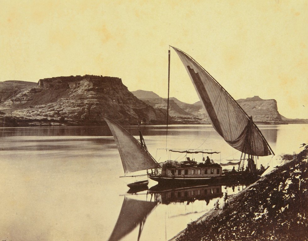
Figure 1 - Albumen print by Frances Frith, "Travelers boat at Ibrim (1856-1859) in the public domain in the United States because of its age.

Figure 1 – Albumen print by Frances Frith, “Travelers boat at Ibrim (1856-1859) in the public domain in the United States because of its age.

I wanted to talk about the albumen process from a technical point-of-view.  But first, we need to deal with a sticky issue: what is an emulsion? Back in the day when science was still taught in American schools most people would have answered: mayonnaise. Mayonnaise is an answer to the technical problem in cooking of how do I get two imiscible liquids, oil and water to mix, and the answer is that you add egg yolks. Egg yolk contains a compound called lecithin which acts like an “emulsifying agent.”

OK so far, what about photographic emulsions? Well photographic emulsions are not technically true emulsions, because what they are are silver halide crytals (so a solid) dispersed or suspended in a liquid (typically gelatin nowadays). Well, the distinction between emulsions and colloidal suspensions is really a big snore and quite besides the point.

The important point is that the photographic emulsion was invented to solve a very important problem in the development of photography. You will recall that the Daguerreotype was invented in 1838 and produced truly magnificent images. You could examine them with a magnifier or loupe and they would reveal exquisitely resolved detail. But its image was merely a silver-mercury amalgam film lying precariously atop a silver plate. It was fragile and delicate. And perhaps, more significantly it was a direct positive process that didn’t lend itself well to the creation of multiple copies, ideally on paper.  Public demand is the mother of invention.

Reproduction was, of course, the goal of William Henry Fox Talbot’s calotype process, where the vehicle for the negative was paper and the second image was produced from the negative onto a similarly light-sensitized sheet of paper. An artistic, luminous, softness image is the essence of the calotype process. But it could not equal the sharpness and realism of the daguerreotype. In the calotype the light-sensitive salts are suffused into the paper. What was needed was to produce a transparent sharp layer that could be placed on either glass to produce a negative or on shiny paper to produce a positive from the negative. The use of albumen from eggs as an emulsion for glass negatives was invented independently by two Frenchmen in 1848, Niepce de Saint Victor and Louis Desire Blanquart-Evrard. As it turned out the production of glass negatives with albumen “emulsions” proved technically difficult on a large scale. There was just two much variability. But its use as an emulsion on paper became the dominant process for the next half century, with negatives produced first by Frederick Scott Archer’s wet collodion process and subsequently by dry plates, which used gelatin as the emulsifying agent.  The dry plate was invented in 1871 by Dr. Richard L. Maddox. Maddox’s dry plates were extremely sensitive to touch. A method of hardening the gelatin emulsion was discovered by Charles Bennett in 1873. Significantly, Bennet also discovered that prolonged heating of the emulsion significantly increased its light sensitivity. The era of high ISO films was born. The rest as they say is history…

With all this technical talk I think that we deserved a lovely nineteenth century albumin photograph to look at. Figure 1 is by the great nineteenth century travel photographer Francis Frith (1822-1898 ), taken in Egypt (1856 – 1859) and entitled “Traveler’s Boat in Ibrim.”


Seeing double

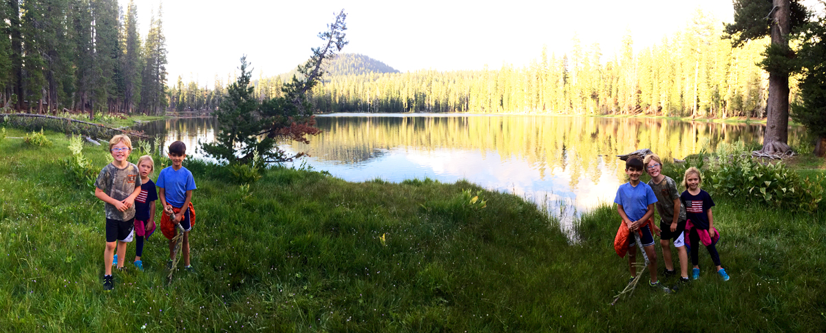
Figure 1 - Seeing double. (c) J. P. Romfh 2015 reproduced with permission.

Figure 1 – Seeing double. (c) J. P. Romfh 2015 reproduced with permission.

A colleague of mind came back from a vacation to the Lassen Volcano National Park and was showing me some very beautiful pictures. The one of Figure 1 really caught my eye.  I’ve never seen seen this particular trick before and I think it very cool and fun.  Basically, he took a panoramic image with his IPhone (what else?) starting with the kids in the left hand side. When they went out of view he told them to run quickly to the other side and as a result they appear twice in the image. It is very reminiscent of Joel Myerowitz’ classic “A Day on the Beach, 3″ image.   I may just have to try this myself.

Shopped or not shopped? That is the question!

The other day an old friend asked me how to tell a real photograph from a fraudulent one, or more specifically, “how I can tell a touched up, photo shopped, photograph from the real thing?” It is a subject that we have spoken about before, but one I think revisiting, especially since there are about to be midterm election campaigns in the United States.

Actually, the word “fraud“ is a telling one. We “Photoshop” (isn’t it great how that has become a verb) for one of three reasons: to entertain, to create art, and to deceive. The evil is obviously in the act of deception. There lies the lie! Fraud may be for monetary or political motives. It always bears that self-serving component.

People tend to be gulible and people want to believe.  But with very little effort you can usually find the fly in your ointment.

First of all to the age old point – if it’s too good to be true it probably isn’t. So much for the zebra standing next to the lion at the watering hole.

Second, look for incongruities. How come Theodore Roosevelt is riding on a moose across a lake and his pants legs aren’t wet? Why does the picture suddenly go out of focus where his hands hold onto the moose? Right, it’s because it’s otherwise hard to obscure the fact that in the original photograph he was on a horse and holding onto the reigns. Also he’s a bit large for the moose in question. Well, that’s just bully. And don’t forget to look at the shadows in the picture. Are they consistent?

Third, zoom in as close as you can and look at the edges.  Yep, all the way to the point that the pixelation of the image is obvious and apparent. A great example of this was the “Money”/”Romney” fake from the 2012 elections. When you cut and paste in Photoshop or other image processing software you form sharp edges, which are tell-tale. So to avoid these people use a process known as “feathering” which kind of scrambles the transition between regions and is itself tell-tale.

Fourth, if you know how to do it, increase the contrast. These edge effects tend to pop out at you when you do that.

Finally, recognize that revealing fraudulent photographs can make you unpopular. President Obama was not born in Kenya. But there are lots of people who want to believe that he was.


The dimensions of photography

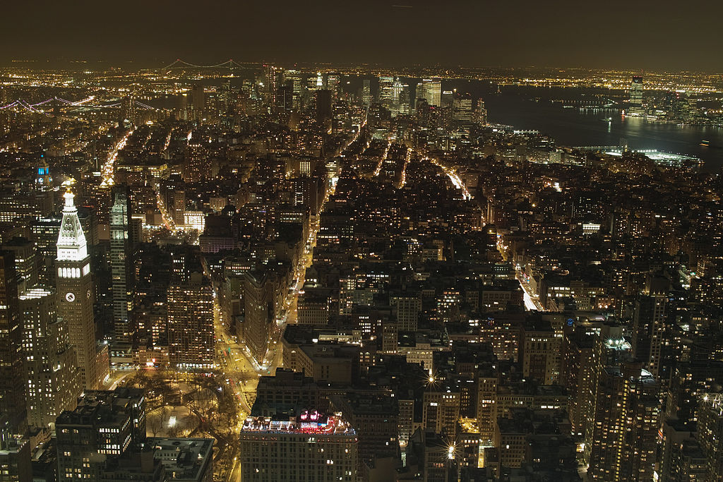
Night view from the deck of the Empire State Building, January 11, 2011, from the Wikimediavommons uploaded as original work by Yorumac under creative commons license.

Night view from the deck of the Empire State Building, January 11, 2011, from the Wikimediavommons uploaded as original work by Yorumac under creative commons license.

The word dimension, in a physical sense, really strikes at the heart of what a digital photograph is.  You might start off by saying that a photograph is a two-dimensional representation of the three-dimensional world.  That’s OK as far as it goes.  However, believe it or not, the subject deserves further examination not only to help us understand what a digital photograph really is, but also to understand what it is becoming. And “becoming” is ultimately where our interest lies!

So first of all some physics “mumbo jumbo.” Actually, it’s mathematical “mumbo jumbo,” but if I said that, it would cause many of you to shut down perception – always a bad thing.  Don’t want to lose you; so please bear with me.

The Empire State Building is located in New York City at the intersection of E33rd Street and 5th Avenue.  New York is laid out in some kind of a grid, well kinda, just like a sheet of graph paper, and we can abbreviate the coordinates of the Empire State Building as (+33, 5). Note that I’ve replaced the E with a plus.  Imagine that you were standing at the intersection of Houston and Fifth Avenue in lower Manhattan.  I know for New Yorkers this takes a lot of imagination, because Fifth Avenue doesn’t go down that far and sorta becomes LaGuardia Place – but not really.  The grid system was added later and really only applies to Midtown Manhattan.  But I’m assuming a perfect city, and New Yorkers never claim the Big Apple to be perfect.  So anyway, Houston and Fifth would be the origin of your graph – the magical point with coordinates (0,0). But if you were standing at that intersection and looked toward the Empire State Building (It’s big and tall, which is why I chose it) you could imagine an arrow running from your feet to the Empire State.  Physicist call this kind of arrow, as opposed to the ones used in archery, as a vector.  And for that reason the point (+33,5) is referred to as a vector.

Of course, there are other ways to describe the address of the Empire State Building.  One way is to give its latitude and longitude; so (-73.9857, +40.7484).  This too is a vector; only its origin is at the intersection of the prime meridian and the equator.  It is in the Gulf of Guinea in the Atlantic Ocean, about 380 miles (611 kilometers) south of Ghana and 670 miles (1078 km) west of Gabon.  Hmm, hard to stand there for sure.  This address is, of course, the one that your phone’s GPS system uses.

You will, needless-to-say, realize that these coordinates do not fully describe the situation.  Standing on the top floor (373.2 m above the ground) of the Empire State Building is quite a different story from standing at street level. So we tend to add a third dimension and give the coordinates as (+33,5,373.2).

All well and good.  We seem to be saying that the world, our world, is described as a three dimensional space, that one of those fancy-pants physicists would call a 3D vector space.  Well, not so fast!

But before we move on I want to point out that there are other ways to represent the location of the Empire State Building.  The United States Postal Service is happy with 350 5th Avenue.  But that is really a different way of saying the same thing.  We’ve still got a 2D vector with coordinates (350, 5) instead of (+33, 5).  But more importantly, all the address that you really need for a letter to the Empire State Building is the zip code 10118.  Most zip codes to really define a location are 8 digits long, but the Empire State Building only needs five because it is cool and special. There are also IP internet addresses that specifically designate the Empire State Building’s location as a single number.  Zip codes and IP addresses are examples of compressive addresses.  We don’t need two numbers only one.

Wait compression.  You mean like TIF to JPG.  Yes, Virginia, that is what I mean.  I’m not just dragging you along here for no reason.

OK, well probably I have exhausted everyone’s patience by now.  So I thought that I would stop for today. But I do owe you some historic and/or beautiful photographs.  Hence, Figure 1 which is a view from the observation deck at night looking downtown and portraying New York as the beautiful constellation that it is.  More on this dimensionality story to come.