Transforming reality with the camera

Engineers would describe the camera as a “black box.”  You put a signal, in this case the object you are photographing, into the black box.  The black box transforms the input signal into an output signal, in this case the image.   The black box is a combination of the lens, the sensor, the electronics, as well as any intentional image processing that the camera does.  In general, we refer to this as “the system,” a fancy word for “the camera.”  There are many ways that the camera transforms the object.  Let’s consider some of them.”  The camera:

  • takes a three dimensional object and flattens it to form the image
  • typically makes the object smaller in the image
  • pixelates the object
  • distorts the object via its point spread function
  • distorts the object due to various lens aberrations, such as fish-eye distortion
  • if set to do so, may
    • sharpen the image
    • set the brightness and contrast
    • set the white balance
    • set the color or convert to monochrome

There is a lot going on, and we’ve already discussed some of it.  This engineer’s description can be a very useful one, as it enables the basis for a systematic language to describe what the camera does.

We have, in fact, without knowing it been using the engineer’ signal-processing by a black box” perspective in our discussion of image sharpness.  In creating this uniform language, engineers typically look at how a “black box” modifies one of three types of signal; each of which totally describes how the system transforms an object and forms an image.

  • The first is to input an impulse.  This is our point of light
  • The second is to input a so-called square wave.  This is our set of black and white lines
  • The third is to input sine waves.   These are the spatial frequencies shown in Figure 2 of the last blog.

Each of these definitions are essentially equivalent.  Each will be useful as we further consider resolution and other camera properties.

Camera resolution and image contrast

In our exploration of digital camera resolution, we started off with the pixel view and recognized that in order to distinguish two white points or lines there had to be a black point or line in between.  This leads to the concept of dots per inch or line pairs per inch.  Then we discussed the lens’ point spread function and described Rayleigh’s criterion that two points of light become distinguishable when there is an approximately 20 % dip in between them.  This 20 % value was based on the properties of the human eye, and we can argue, in a digital age where the eye is not the primary detector, whether this should still be 20 % or whether a smaller percentage could be detected by our cameras, or more accurately since we know the camera can do better, should the definition of resolution be changed.

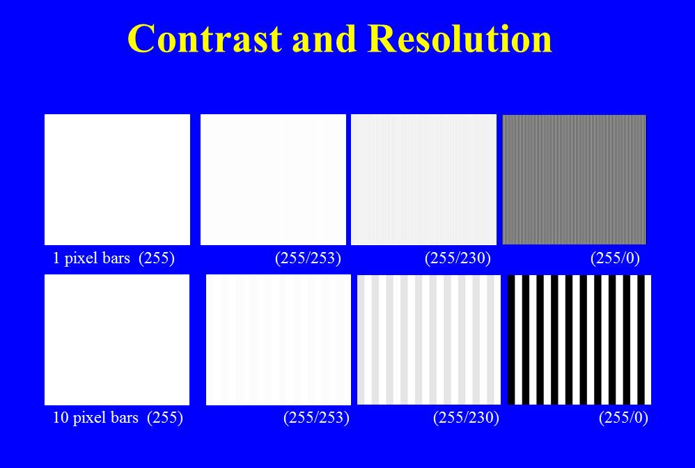
Figure – The relationship between contrast, or modulation, and resolution

Rather than worry about these semantic issues, let’s accept the view that the dip needs to have some value and see where this concept leads us.  In Figure 1, I have computer-generated some images.  In the top row of images, I have created a set of alternating one pixel wide vertical lines.  In the upper left hand image all of the lines have the same intensity of 255, and, big surprise, they’re not distinguishable, because they’re not different.  Moving to the right, in the next image the alternating lines have intensities of 255 and 253.  This is only about a 2 % difference.  This difference is referred to as: the contrast or the modulation.  I’m pretty sure that you won’t be able to see the individual lines.  In the next set the lines have a greater contrast or modulation, about 10 %.   The values are 255 and 230.  Maybe you can just make out the lines or maybe you see this as a uniform grey of average intensity about 242.  We’re pushing the resolution limit here!  Finally, look what happens if we go to 100% modulation, that is set the alternating intensity values to 255 and 0.  The individual lines should be pretty clear now.

Now here’s where things get interesting.  In the bottom set I’ve done the same thing, only the vertical lines  are ten pixels wide.  I think that you will see that even at the 2 % contrast or modulation the individual lines are visible.  In general, we see that the larger the separation the less contrast is needed to see the object.

There are two practical aspects of this.  First, if you take an image on a cloudy day, objects will be softer.  There will be less contrast and sharpness.  If you take the same image on a sunny day, objects will be harder or harsher.  There will be more contrast and sharpness.  Second, if you increase contrast in an image, it appears sharper, often to the point of exaggeration.

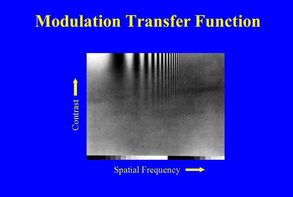
Figure 2 – the modulation transfer function 1

The number of lines per inch or mm is referred to as the spatial frequency.  There are other definitions , or more accurately other units, of spatial frequency, such as mm-1 or cycles/mm.  But, we don’t need to worry about that now.  Spatial frequency enables us to define the fundamental resolution properties of a lens or camera system.  This is very vividly shown in Figure 2.  Here we have done a similar thing to what we did in Figure 1, with the exception that instead of using lines we use a sine wave that oscillates from some minimum to some maximum, still called the modulation.  Spatial frequency increases to the right and contrast increases vertically.  Very clearly, we see that to resolve higher and higher spatial frequencies, we need more and more contrast.

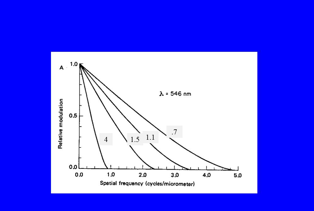
Figure 3 – The modulation transfer function 2

In Figure 3, we see how this data is most usually shown for a lens.  This is the so-called modulation transfer function, which defines a lens’ resolution.  We suppose perfect modulation a modulation of 100 % or as a fraction 1.0 and consider what modulation the lens or camera delivers.  The numbers in the grey boxes are the lens’ f-number.  For a given lens, we see how the modulation is reduced more and more, by the lens, as the spatial frequency increases.  We also see how the smaller the f-number the better the modulation you get at a given higher spatial frequency.  In conclusion, the more modulation, or contrast, you have, the better your resolution.

Photographing in low light

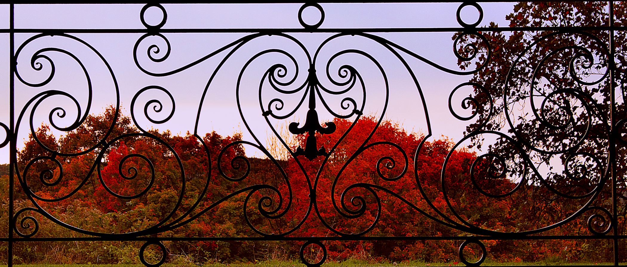
Figure 1 – Gate framing the fall colors at the Vanderbilt Mansion at Hyde Park, NY

There is no better time to vacation in New England than October as the fall colors peak. This was my plan, and successfully executed. It has been a pretty good fall, except that because of the lack of summer rain the maples have failed to exhibit stunning reds. This past Thursday, camera in hand, we visited Chesterwood, the summer home and studio of sculptor Daniel Chester French, most famous for his Minuteman Memorial on the Concord Bridge, in Concord, MA, and his colossal Lincoln Memorial in Washington, DC. On Friday, we visited architect Phillip Johnson’s Glass House in New Canaan, CT, and then on Saturday the Roosevelt and Vanderbilt historic sites in Hyde Park, NY.

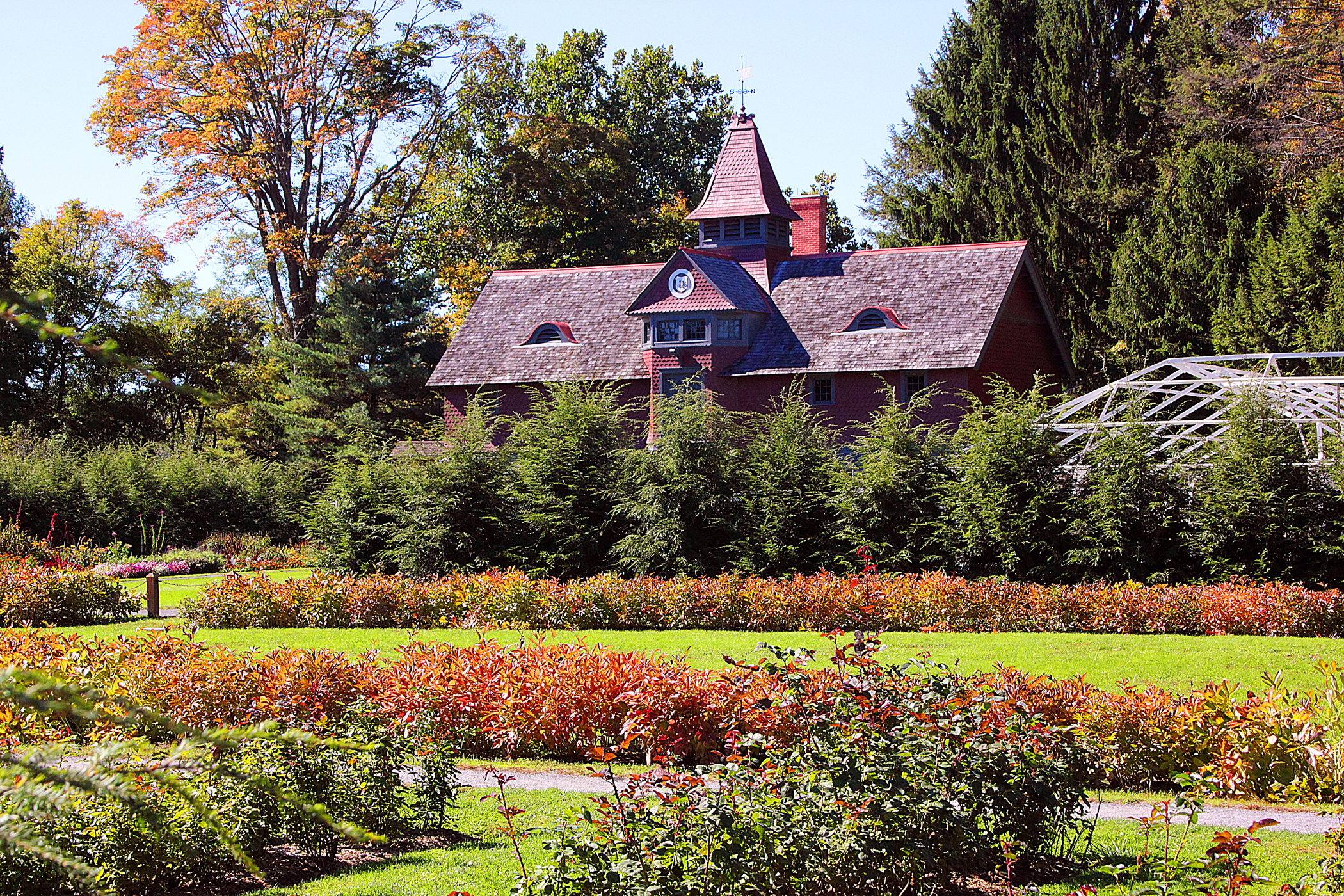
Figure 2 – Stables and rose garden at the Franklin Roosevelt National Histor site at Hyde Park, NY

I took some images that I am really happy with at the Glass House. Unfortunately, I cannot show these here. This is because the site’s photography policy allows photographing for personal use and not for publication (like putting it here) or sale.

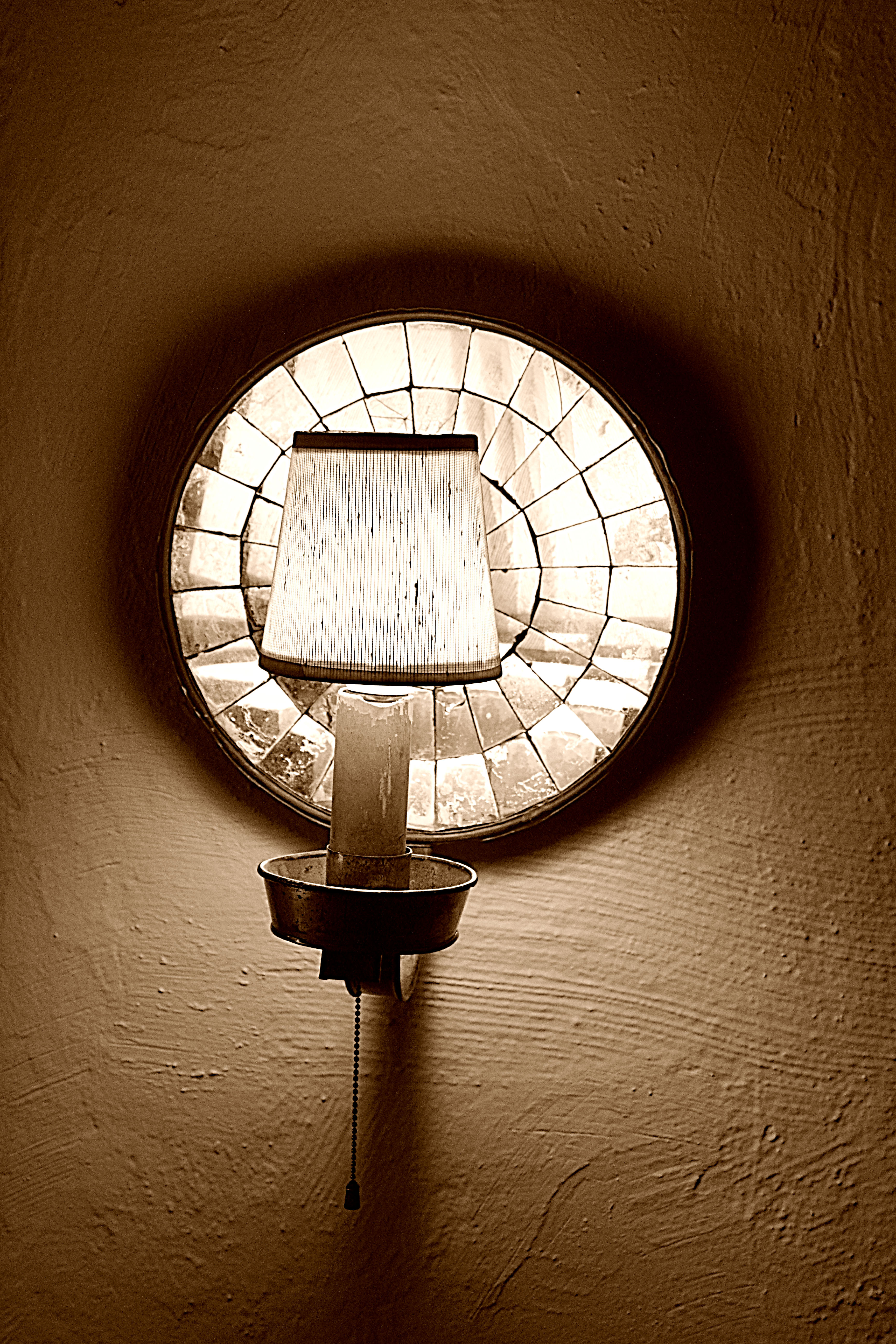
Figure 3 – Wall lamp Vallkill National Historic site.

The good news is that the National Historic sites, run by the United States Parks Service, now allow photography, as long as you don’t use flash, and they don’t specify private use only. I don’t know whether this is an admission that everyone now carries a cell phone, making it impossible to prevent pictures being taken or whether it is a tilt to a more democratic egalitarian sense of these objects belonging to the people; so let the people photograph them. In any event, the effect is that photographic life is good!

The bad news is that they’ve turned off the lights to protect artifacts from the damaging effects of light. So the whole affair becomes an exercise in how to take photographs in the dark. Oh yes, did I mention no tripods allowed? And if you lean against the wrong wall or door to steady your camera you might set off an alarm.

Figure 4 – Red vases on bureau at the Vanderbilt Mansion National Historic site at Hyde Park, NY

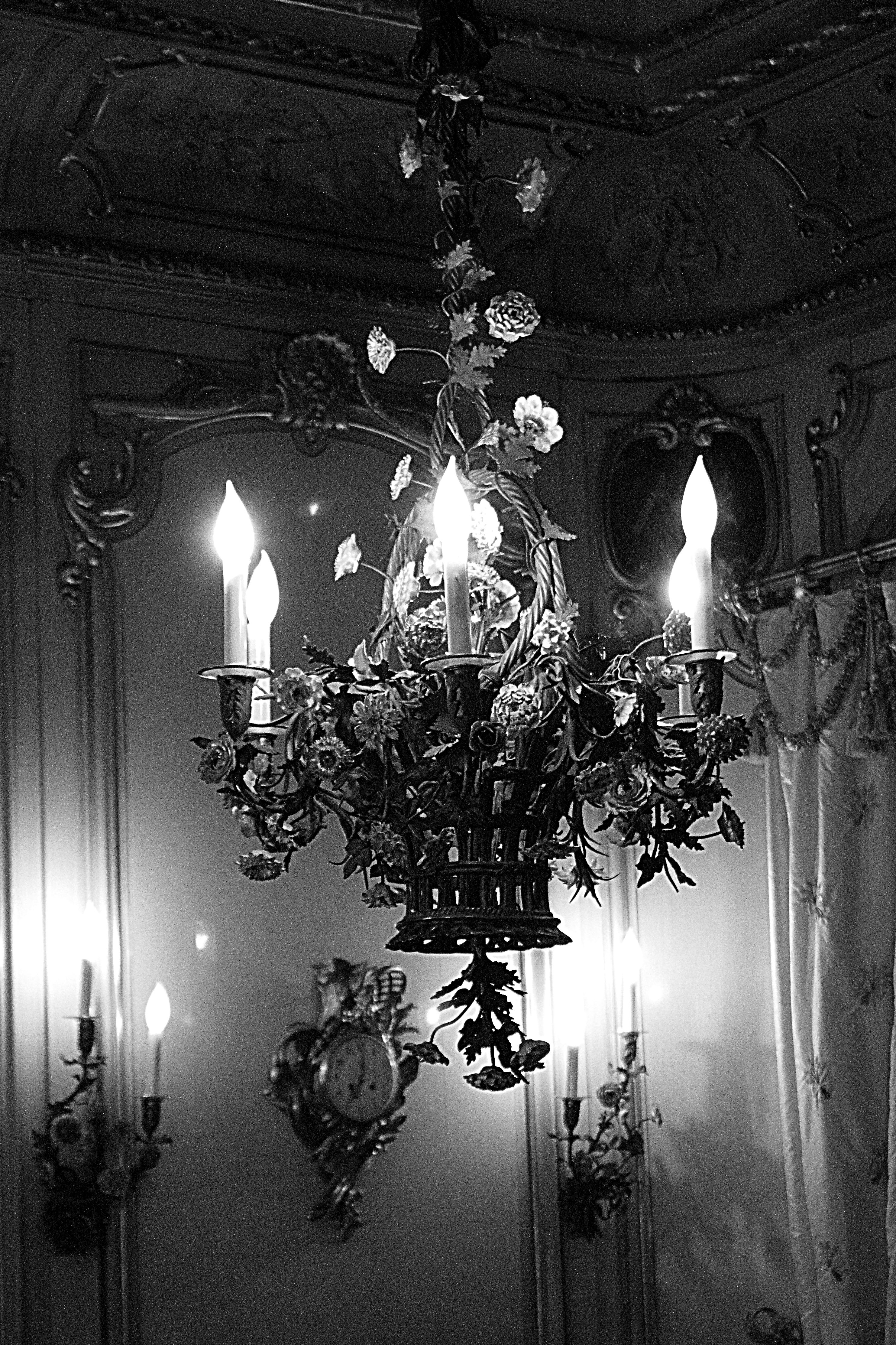
I suddenly found myself obsessed with photographing chandeliers and candelabras. This is all fine until you realize that you are photographing, well, light fixtures! Still, you can get some very pleasing range of light images, and it is challenging to strike the dynamic range just right so that you get both shades of shadow at the low end and shades of white at the high end. There is nothing more annoying, like fingernails on a blackboard, than a screaming white, seeming to burn a hole in your picture.

Figure 5 – Chandelier Vanderbilt National Historic site at Hyde Park, NY

Another point that I have learned is that these modern digital SLRs really do enable shooting at ISOs as high as 6400 without introducing too much graininess (sometimes). This really helps you to overcome defocusing caused by hand shake.  However, you can pretty clearly see this graininess when you blow up these pictures (here) to full size.

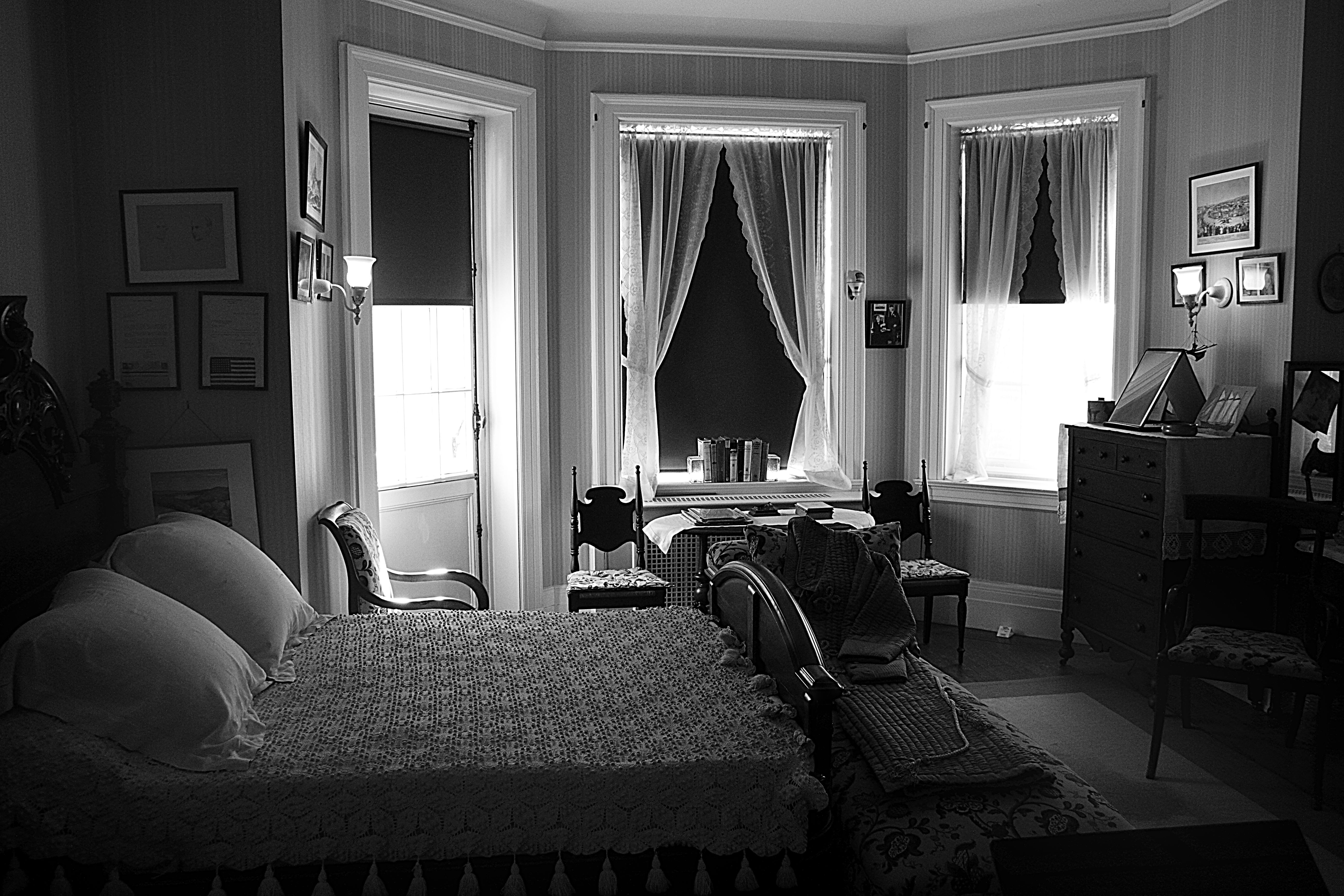
Figure 6 – FDR’s bedroom Hyde Park, NY

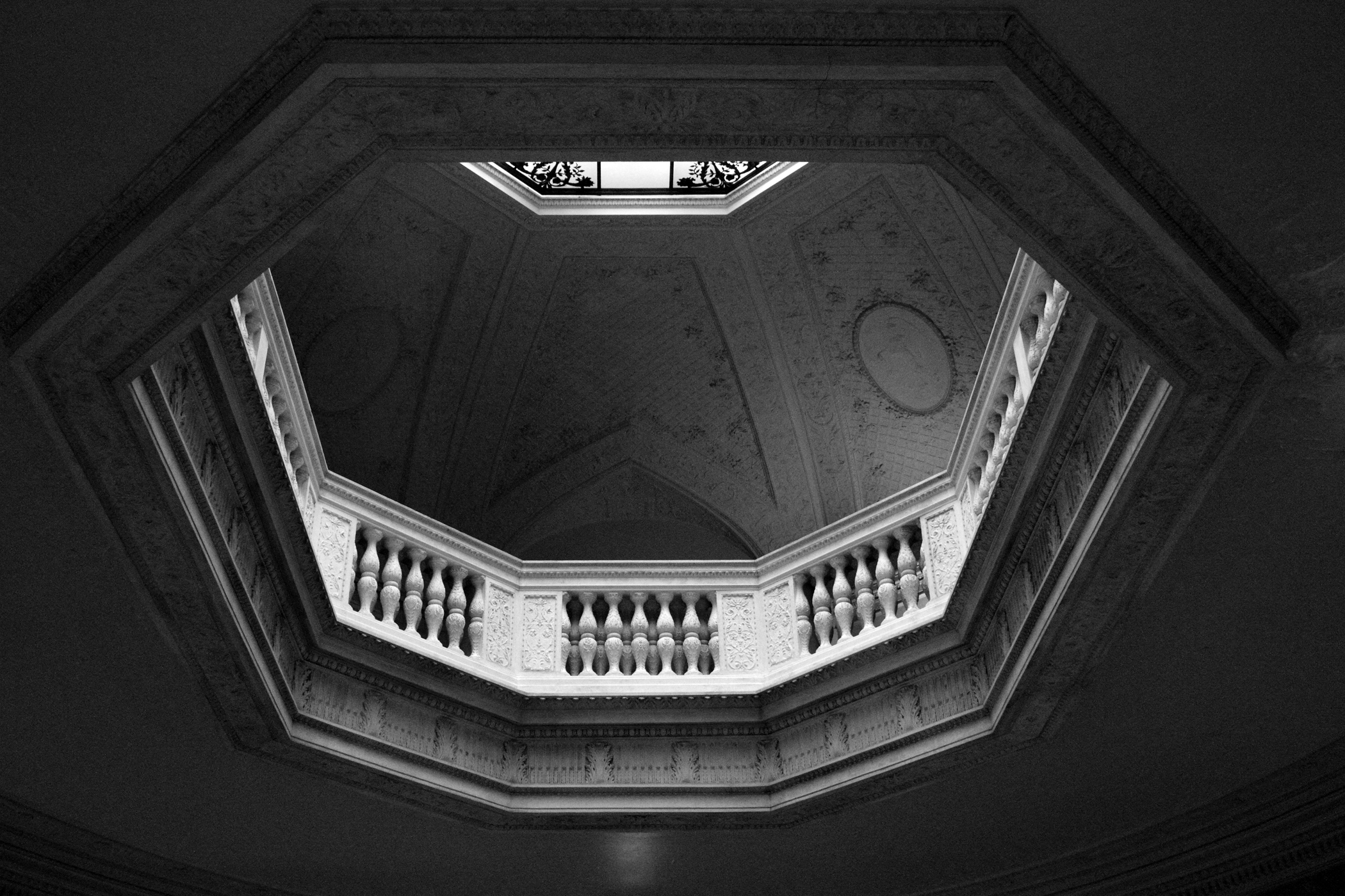
A type of scene that I really like to photograph is illustrated in Figure 6. This is Franklin Roosevelt’s bedroom at Hyde Park. Note the small bed where his valet slept.. The room was flooding by a delicate diffuse sunlight and again the challenge was pulling subtlety out of both the blacks and the whites. The danger of burning a hole is again present. A similar image and challenge is posed by Figure 7, which shows the skylight and balcony at the Vanderbilt’s Hyde Park mansion. All of these images are really helped by having 14-bits of dynamic range. This is how you go from black to white and get everything in between.

Figure 7 – Skylight at the Vanderbilt Mansion National Historic site, Hyde Park, NY

So in the end it was an education, if not terrific, picture taking day. It is always good to have the practice of anticipating the light and overcoming the challenges that the light offers. Like Pooh-Bear you’ve got to have a good think about the problems lighting presents and think about how to overcome them. That way when you’ve really got an opportunity to grab an image under adverse conditions you’re ready.

Figure 8 – The last leaves of summer

The Vogels and “America in View” at the Rhode Island School of Design Museum of Art

We went on Saturday to visit the Museum of Art at the Rhode Island School of Design. Our principal purpose was to see the Vogel Collection; so first a note on that. Dorothy and Herbert Vogel were art collectors who on a shoe-string budget collected more than 4000 works of art. Much of this body of work can be classified as Minimalist or Conceptual art. The Vogels stuffed their collection into their tiny Manhattan apartment. The Vogels donated their work to the National Gallery in Washington, DC, and it was decided that some of the work would be donated to each of the states, Fifty Works for Fifty States. All of this is delightfully documented in the film “Herb and Dorothy.” I highly recommend this film. It is fun and shows what can be accomplished, as a collector, with taste, understanding, and very little money.

Next we have a truly monumental and marvelous exhibit, “America in View Landscape Photography 1865 – now.” There is a lot to say about this wonderful exhibit, and I hope to explore some of the individual photographers in upcoming blogs. But simply and succinctly, if you can go see it, you must see it. The exhibit runs through January 13.
For many of us, American landscape photography begins with Ansel Adams’ images of a pristine wilderness. But this is only one vision, and it doesn’t even begin there.

A miraculous point is that most of this work is in the permanent collection of RISD, much of it collected by the late photographer and RISD Provost, Joe Deal, and his wife Betsy Ruppa or donated by others to the museum. I have been to few exhibits with so much photography, so well displayed. I think that I could have spent hours there and certainly plan on a return visit.

So let me just mention a few personal favorite highlights:

  1. Laura Gilpin, Footprints in the sand 1931;
  2. Arthur Rothstein, Father and son walking in the face of a dust storm, Cimarron County, Oklahoma, 1936;
  3. Documentary works of the American West in the 1870’s by Timothy O’Sullivan and William H. Bell;
  4. Beautifully contrasted images of women at the turn of the nineteenth and twentieth centuries: Anne Brigman, Soul of the blasted pine, 1909; Clarence White, Morning, 1905.

The point is dramatically made that landscape has many meanings. It does not just connote a pristine wilderness void of people. People share, enhance, or mar the environment. It can be mythical or it can be raw. It can be artistic or utilitarian. The American landscape is both in the National Parks and in your neighborhood. It is a lonely dark house with a brightly lit front entryway seen on a night walk. It is a decaying urban environment, or a sewage treatment plant.

I will now have a new sense of meaning the next time I fly into San Francisco Airport and marvel at the salt extraction ponds vividly colored by the halobacter (salt thriving bacteria).  It’s all landscape.

Camera Resolution and the Airy Disk

Suppose that you look at a point of light with your camera, what do you see?  This is a trick question; so the answer isn’t a point of light.  If you expand the image enough the point of light appears fuzzy.  This is a property of all lenses.  No lens can focus a point to a point.  Instead the point gets fuzzed out.  In fact it gets fuzzed out in all three dimensions.  The shape of the fuzzy light is called the “point spread function” or PSF.
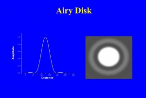
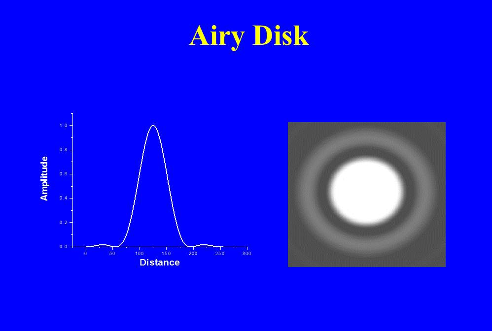
Figure 1 – How a point of light appears in a camera – The Airy Disk

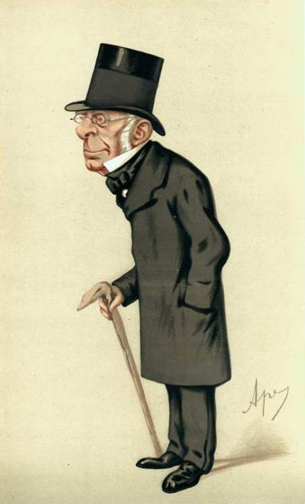
In Figure 1, I show what this point should look like on the right and an intensity scan through it on the left.  You will, of course, see that it isn’t quite just a fuzzy point.  Rather, there is a ring (of about 2% peak intensity) around the fuzzy center.  In fact if we had enough dynamic range to display it, we would see that there are an infinite number of concentric rings, each progressively fainter than the last.  This pattern is referred to as the Airy disk after the nineteenth century physicist-astronomer, Sir George Biddell Airy (see Figure 2).  Those of you familiar with optics will immediate recognize that the Airy disk, because of the concentric rings, must be some kind of interference phenomenon.  For now, let’s just accept it as an experimental fact.  This is what we see in an optical imaging system from a point of light.  For those of you interested in a complete explanation, I refer you to Arnold Sommerfeld’s excellent work on Optics and my own, more modest, paper in Digital Microscopy.
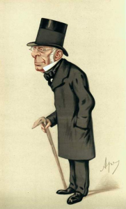
Figure 2 – Sir George Biddell Airy (1801-1892)

Now, you might ask, why blow things up so much?  Why not confine the Airy disk to a single pixel.  Then it would appear effectively as a point in the image.  If you do this you allow the image to be pixel limited in its resolution and you do not get as much resolution as you possible can out of your optics.

Another important question, why do we care how a point behaves in an image.  The answer to that takes us back to the question of a pixelated world.  Every scene or image consists of a set or array of points.  Therefore, if we know how the camera alters a point we will then know how it alters every scene that we can look at.  I like to say that the image is the transform, by the camera, via its point spread function, of reality or the scene.  This is not just a philosophical point.  If we know the point spread function there are mathematical methods of reversing the fuzzing, of making the image more accurately descriptive of the true scene.  This is what the various image sharpening methods used in your camera or image processing software attempt to do.
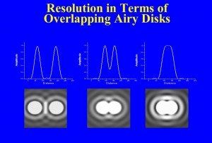
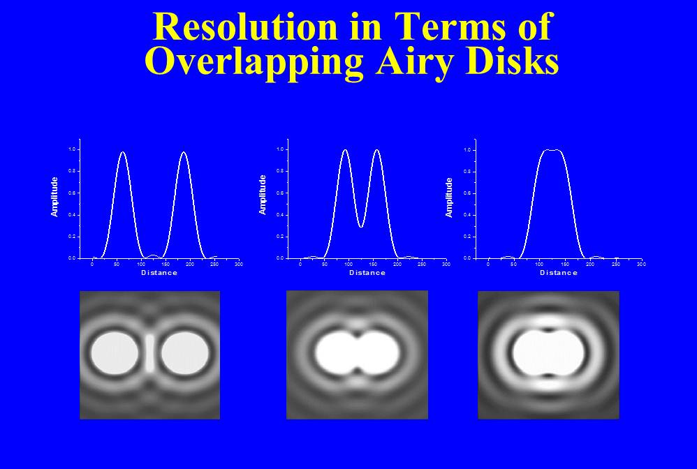
Figure 3 – Resolution in terms of overlapping Airy disks

You will remember that we described how in order to see a bright spot located at a pixel and distinguish it from a second bright spot at another pixel, there had to be a darker pixel in between.  The question of resolution can be described in very similar terms.  If we have two points, each converted by the camera to an Airy disk, how close can they get before we cannot figure out if we are looking at one or two spots?  Take a look at Figure 3.  You can see that the closer the points get to one another the smaller the dip in intensity in between them.  Any detector, your eye or the camera’s sensor, has some limit in its ability to see that dip.  This is what defines resolution.  In the nineteenth century, Lord Rayleigh defined resolution, somewhat arbitrarily, as being when the center of the second Airy disk falls on the first ring of the first Airy disk.  This corresponds to approximately a 20% dip in between, and this was found to be just about what the eye could do in a telescope.

For a camera, Rayleigh’s criterion can be written as:

(separation on the image sensor)=1.22 X (wavelength of light)X(f-number).

So let’s see , if we have light of 0.5 microns (green) light and are using a f-number of 8, the resolution will be about 4 microns.  We have already seen in our discussion about lenses and magnification, how to translate this to resolution size for an object at some distance.

(separation at the object) =(separation on the image sensor) / Magnification,

where,

Magnification = (focal length)/(distance to the object).

I’m trying very hard to limit the number of equations in this blog.  However, the equation adds one very important point, namely that resolution is inversely related to f-number.  The higher the f-number, the larger the separation distance, which means that we have less resolution. How’s that for counter-intuitive!  F-number improves your depth of focus at the price of weakening image sharpness.
Photographic image sharpness – where we are and where we need to go

Since we are working step by step through the question of camera image sharpness and resolution. I thought that it would be useful to review what we have already learned and where we have to go next.

  1.  We considered the pinhole camera and showed how  we can form an image by isolating single rays from each point of an object.  We also defined f-number and found that the bigger the aperture the worse the depth of field.
  2. The problem with the pinhole camera is that it collects very little light and therefore requires a very long exposure.  This limitation can be overcome by using a lens to collect many rays from the same point and bring them to a focus at a corresponding point of the image.
  3. We then considered what would happen if we had a “perfect lens.”  That is if the resolution was limited by the separation between and number of pixels, what would the resolution be?
  4. This enabled us to determine what the number of pixel requirement is for displaying images on a computer monitor.
  5. Similarly we determined the number of pixels requirement for high resolution printing.

So now we have to consider the other factors which govern image sharpness the quality and properties of the lens and stability of lens positioning.  This will lead us into some very fundamental concepts including:

  1. The point spread function.
  2. The Rayleigh criterion for image resolution.
  3. The relationship between contrast and resolution – the so called modulation transfer function.

Ultimately our goal needs to be a very practical one, how do you cut beyond the qualitative hype of manufacturer’s ads and really assess a lens?  How do you find and understand real quantitative lens specifications?  And beyond that is there a way to critically assess and compare your own lenses?

Pixels per inch vs. dots per inch

The next question in our quest to understand image resolution is the difference between pixels per inch (PPI) and dots per inch (DPI).  PPI is generally used to describe camera sensors, while DPI is generally used to describe digital printers.  We discussed in the previous blog how a pixel that is 1/200th of an inch on a side is just about the smallest object that your eye can resolve.  So if you fill that little pixel with even smaller dots of color your eye will blend them together.  Early printers used only three colors, however modern printers can use as many as seven colors.  .  This is what enables them to achieve a more subtle range of color.  So if you are looking at 200 PPI you are going to need 7 X 200 = 1400 DPI out of your printer.  For my 200 PPI that would be 7 X 300 =2100 DPI. So basically, the number of DPI required is the number of colors) X (the number of pixels per inch).

Megapixels and print size

Let’s continue on our discussion of image sharpness and resolution.  So far we’ve limited our discussion to sharpness as limited by the number of pixels and seen how that determines required pixels per inch when you are displaying your wonderful image on a computer screen.  Today let’s consider the issue of displaying your images on paper – that is printing them.

The situation here is very similar to that of displaying on a computer screen.  The limitation here is how fine can the human eye resolve?  This number is something like 200 pixels per inch.  For good measure I like to crank that up  to 300 pixels per inch.  Ok then, this means that if you’re going to print an 8” X 12” print  you need 2400 pixel by 3600 pixels; so 8.64 M pixels.  Boy, that was easy!

Let’s consider the maximum number of pixels required for different size prints.  The first column gives you the number of megapixels,  MPz, requirement assuming 200 pixels per inch while the second column gives you the required MPz assuming 300 pixels per inch.

6” X 4”

.96 MPz

2.2 MPz

8” X 10”

3.2 MPz

7.2 MPz

8” X 12”

3.8 MPz

8.6 MPz

11”X14”

6.2 Mpz

13.9MPz

12”X18”

8.6 MPz

19.4MPz


The other way to look at this is that for a Canon T2i with its 5186 pixel by 3457 pixel (or 18 MPz) sensor array, if we assume 200 pixels per inch as a requirement, then the biggest picture you should print is 5186/200 x 3457/200 , then the biggest picture you should print is 5186/200 x 3457/200 or 26” x17”.  For a 300 pixel per inch requirement this becomes 17” X 12”.  So now you can understand while I won’t print from my Canon T2i any bigger than 18” X 12”.

Nick Veasey’s X-ray vision

As a scientist, specializing in optical imaging,  I am always interesed in new ways of seeing the world.  So I was quite curious when my friend Rebekah introduced me to Nick Veasey’s website of X-ray images.

Veasey uses x-rays to create artistic images of everyday objects, thus rendering them not so everyday in the end.  The result is a unique view of the world: a flower recast, a womans foot inside a shoe, or a man’s hat.  All of us, in my generation, have wondered what it would be like to have Superman’s x-ray vision.  Ever wonder what you car keys look like in your pocket or what the TSA scanners are seeing as you make your way through airport security?  Here is the wonder of Veasey’s images.

Nick’s process involves some fairly involved and nasty (safety wise) x-ray sources.  So thankfully, I do not have to remind you that you should “not do this at home.”  He has a special building set up for exposing his subjects.  His process involves exposure onto x-ray film followed by digital scanning of the x-ray image and some creative image processing.

I mention this because x-rays can also now be taken directly into a digital format and the big issue is just the one that we have been discussing for the case of digital vs. film-based photography.  That is whether the pixel size and number is equal to the resolution of film.

Of course, the end point should be the creative and beautiful, not just gee wiz.  And it is in this respect that Veasey’s images do not disappoint.  I recommend a visit to this website.