Yellow Journalism – image use and abuse*

We have talked a lot about the power of images and how, in the wrong hands, they can be abused.  And isn’t everybody just about sick of the current election cycle and all of the misinformation and out of context imagery?  The latest is the Romney ad purporting to show President Obama “bowing” to Chairman Hu of China (I’m not going to perpetrate that here, but do check out the video clips by the Fact Checker at the Washington Post).

The point is that this kind of manipulation, beside, as it is meant to, diverting us from the real issues, is pandemic in our sound-bite, screen-flash world.  Which is not to say that it hasn’t been around for a long time or that it wasn’t just as insidious in quieter and “more reflective?” times.
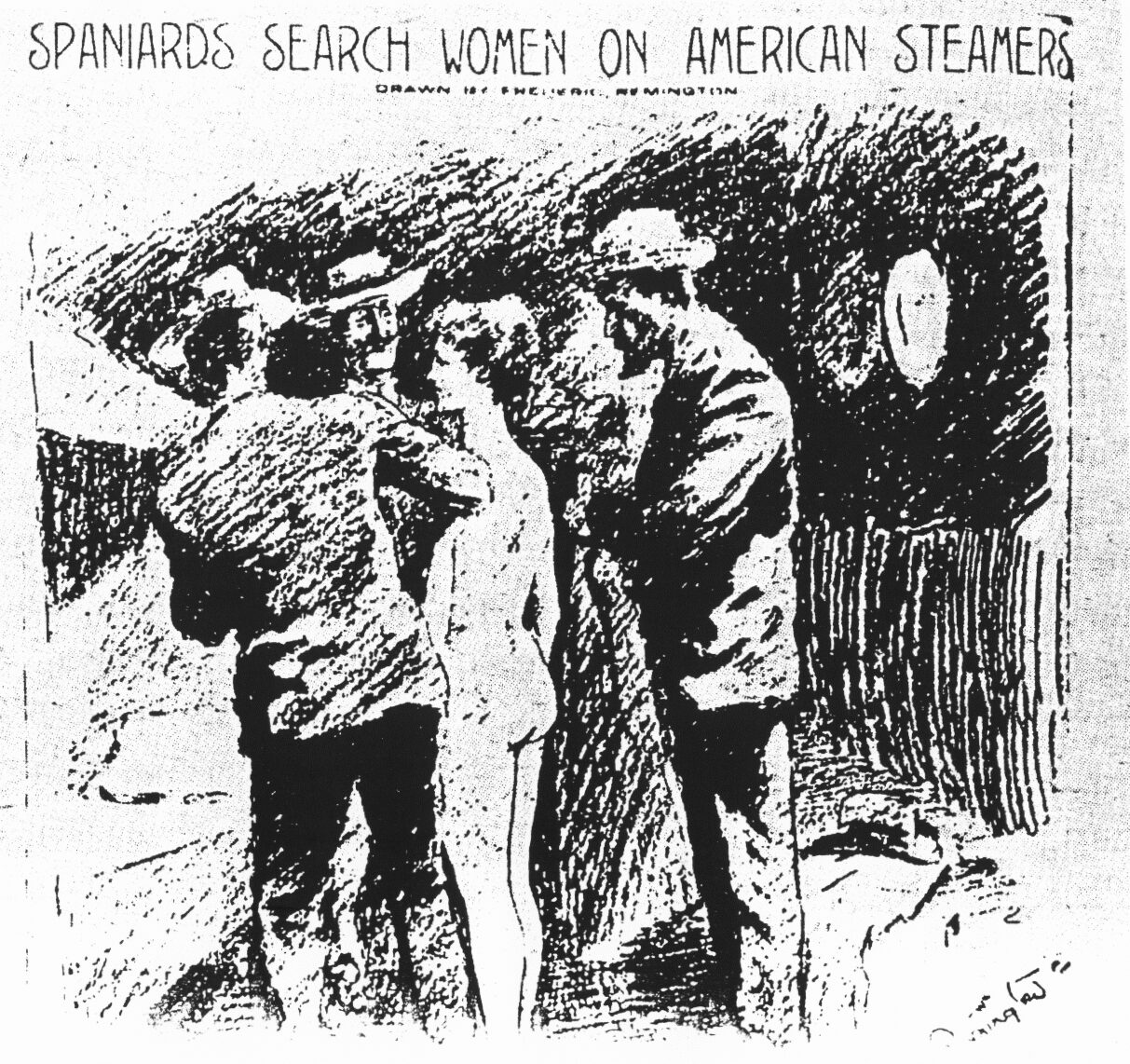
Figure 1 – Frederick Remington’s famous illustration in the New York Journal

So I was musing the other day about the great iconic image of yellow journalism (see Figure 1) of a woman being strip searched by leering Spanish officials on the American ship Olivette in Havana harbor in 1897.  There is some controversy now about the role played by yellow journalism in the instigation of the Spanish American War.  That aside, this picture by Frederick Reemington was published as an illustration to an article by journalist Richard Harding Davis Does our Flag Shield Women?,” in William Randolph Hearst’s  New York Journal on  Feb. 12, 1897. Reemington had left Cuba  weeks before the incident occured.

Not surprisingly the circulation of the New York Journal soared, and,  as a result of the article, public furor frothed to hydrophobic proportions.  The United States Congress demanded an explanation from the Spanish.  The truth, needless-to-say, was left
behind.  The truth was that three Cuban women had been searched, but that these searches were carried out by matrons. 

An enraged Davis exposed this truth in a letter to Joseph Pulitzer’s New York World saying:

“For the benefit of people with unruly imaginations, of whom there seem to be a larger proportion in this country than I had supposed, I will state again that the search of these women was conducted by women and not by men, as I was reported to have said, and as I did not say in my original report of the incident.”

In the end, the New York Journal and Hearst were forced to publish a retraction.  But lesson learned?  Of course not!

*For background see “War and Response, a Spanish American War Centennial,” and Evan Thomas’ “The War Lovers, Roosevelt, Lodge, Hearst, and the Rush to Empire, 1898,” Little Brown, New Yor, 2010.
Picturing hurricane Sandy

It feels impossible to blog on without acknowledging the terrible effects of hurricane Sandy.  It would be like Nero fiddling while Rome burned.  There are people living in the cold and dark without food, or water, or means of getting to work.

At first, it all seems impersonal and abstract.   And then the images start to come in.  Today these are as often little video clips as they are still pictures.  At first they seem unreal and impossible to process.  Then, as reality sets in, they evoke empathy.  Finally our minds sort through the barrage of images and our collective consciousness coalesces around as set of iconic images.  This is where we are now. The iconic is emerging.

If you think about it, all of the major historical events of our lives are crystalized in our minds around iconic images.  Consider Alfred Eisenstaedt’s VJ Day photograph of a sailor kissing a nurse (see also Chris Wilkins’ blog) or John John Kennedy’s famous salute at his father’s funeral or all the nightmare images from 9/11.

Today, of course, the immediacy of images and the speed with which they barrage us is intense.  What remains most important is that we do not allow them to be abstracting.  They involve real people, often suffering people, that could be us.  The positive role of photography is its ability to rally collective conscience and empathy.  The fact that we can still look at WPA pictures from the depression, or even pictures from the American Civil War and still feel the pain of those people is a testimony to the power of the image.

The magical realism of Beth Moon

There are many wonderful places for photography on the web, but one of my all-time favorite places to visit are the magical realism worlds of California photographer Beth Moon.  There is a long tradition of the mystical and magical in photography, arguably beginning with the little cherubs of photographic pioneer Julia Margaret Cameron and encompassing the nymphs and nyads of Annie Brigman.  But I truly believe that Ms. Moon takes this to a new level.  Magical realism is the insertion of the mystic into reality in such a way that it becomes redefining, and reality becomes much more than it once was.  We ascend into a mythic or spiritual plane much as we ascend into a great cathedral and we return to the mundane world a degree enlightened.

My introduction to Beth Moon’s work was a portfolio of her tree pictures, “Portraits of Time,” in Lens Work a couple of years back.  Many of the trees that she photographs are over a thousand years old, some as much as four thousand.  They are trees, but much more, they are silent witnesses to time and history.  And, of course, there are two additional associations.  First there is Frasier’s “Golden Bough,” the axis of the world, the Bodhi tree, the tree upon which Odin was crucified so that he could gain knowledge of the world, the tree of life, and the tree from which the cross was made.  Second, there is Tolkein’s tale of the Ents, the tree people that have become sedentary witnesses.

In her photographs Ms. Moon takes us to other worlds as well.  There is the world of many journeys in her series “Thy Kingdom Come.” There is a world of “Augurs and Soothsayers,” populated by magnificent all-knowing chickens.  That particular world is double edged in that it seems to take us in two directions at once: first along a magic path and second a scientific one as these pictures are reminiscent of illustrations for Charles Darwin’s “Origin of Species.”  And most recently, Beth takes us to “Odin’s Cove,” the intimate world of the ravens of the California.  What is more mythical in the new world than the old trickster raven, here masterful drawn with great empathy and love?  The point is not only that all of these pictures make us think, but that they first make us feel, and then they enlighten us.

Beth’s work has taught me a lot about the lack of limits that photography holds in the hands of a master practitioner.    But I also learned one more thing from her.  About three years ago I went to see her work in person at Gallery 291.  For the first time I understood the subtlety of art that is the Platinum Palladium print.  Now whenever I see one, my first reaction is “ahh, platinum palladium.”

Beth Moon’s work is not just worth seeing, it is worth seeing again and again.


ImageJ, a gift from gov

As we have developed topics in this blog, we are slowly moving into a very quantitative realm.  So for all of the serious techno-geeks reading this I’d like to give you a gift, or rather pass on a gift.  The National Institutes of Health has developed a very quantitative, very complete, and very open programing platgform called ImageJ that is available for download.  Did I mention that it is free?

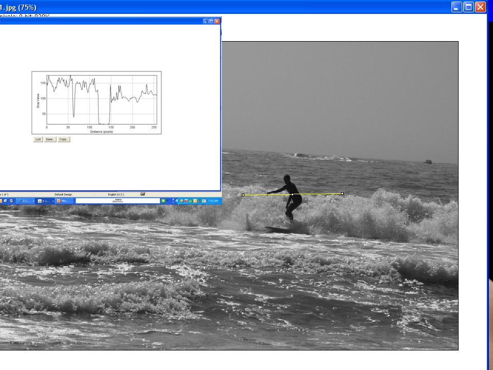
ImageJ is not going to substitute for you artistic image processing software.  It isn’t meant to so .  But it does enable you to do some pretty sophisticated, quantitative image processing tasks.  Just as a simple example.  Consider the image of our Maine Surfer again (see Figure 1).  Using ImageJ, we draw a yellow line through the surface and that ask it to display the intensity values along this line.  This kind of thing will become very handy as we examine issues like image resolution further.

Figure 1 – Some simple image analysis performed woth freeware ImageJ

“I am my Family” by Rafael Goldchain

About fifteen years ago, I started researching my family’s genealogy.  After a while I had amassed a reasonably large number of images of people from the “old country,” in my family’s case Russia, Poland, and Lithuania.  This collection is haunting.  There are all these people, now gone, who once had dreams and many of whom were murdered during the Second World War.  Finally you realize two things: first that as Edward R. Murrow said: “We are not descended from fearful men;” and second that we are their dreams.  These are significant lessons, because they teach us how we ourselves must live if we are to be true to them.

Often over the years I have found myself studying these images and looking for the resemblance.  As I have gotten older, I certainly see my father’s face in the mirror.  But what about the face of his Uncle Jack or that of my great grandfather?

Photographer Rafael Goldchain has taken the quest for family resemblance a step further.  He has duplicated family photographs, real or imagined, all with himself as ancestor.  The result is a remarkable set of self-portraits, portraits not quite right as they dwell somewhere in the middle, somewhere between the past and the present.  This creates a haunting effect and tension, which define these images.  And despite your knowledge of the creative reality, epitaphs like: “b. Warsaw, Poland 1890’s, d. Poland, early 1940’s” still cut deep as.  The realization of murder and snuffed out dreams haunts us.

Right now these wonderful pictures can be found in three places: Lenswork Extended #101, if you subscribe to that, at the ZoneZero.com website; and in Mr. Goldchain’s book, “I am My Family.” Check them out!

Making a solarization image

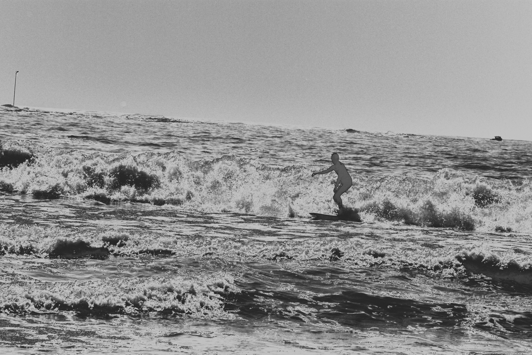
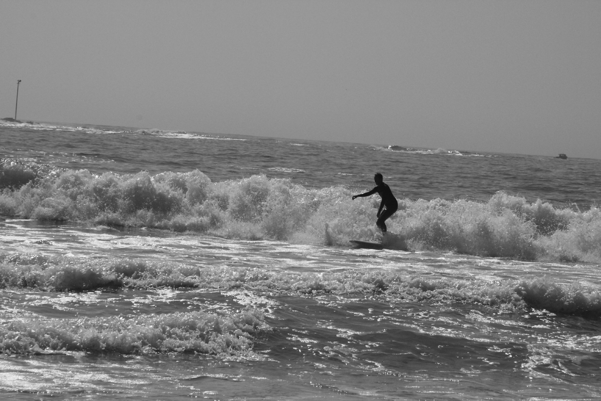
Figure 1 – Black and white image of a surfer in Maine

Figure 2 – Solarizing response curve or LUT for Figure 1

Recognize, that if we are prepared to play loosie goosie with the definition, the last image of yesterday’s post is indeed a solarization by virtue of the reversal in the tones at higher intensity.  The effect, is subtle, however.

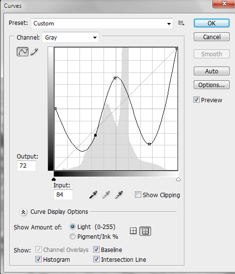
Today I’d like to have a little fun and make a more dramatic solarization.  The steps are identical to what we did yesterday.  Let’s start with another high contrast image.  This is a silhouette that I took of a surfer last month in Kennebunport, ME.  Figure 1 shows this as a black and white image.  We again go to curves, see Figure 2 and apply a very non-linear, non-monotonic response curve or LUT.  The effect is a very surreal and solarized image.  It looks almost like a negative!

Figure 3 – Solarized variant of Figure 1 obtained by applying response curve or LUT of Figure 2

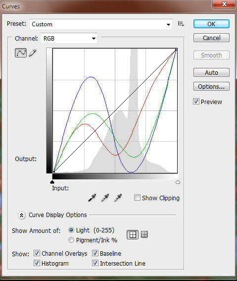
Figure 4 – Solarizing RGB response curves or LUTs

Now we can have some real fun by doing this in color.  We return to the colored version of Figure 1.  Then we apply a non-linear, non-monotonic response curve to each of the three color planes, Red, Green, and Blue.  This is shown in Figure 3.

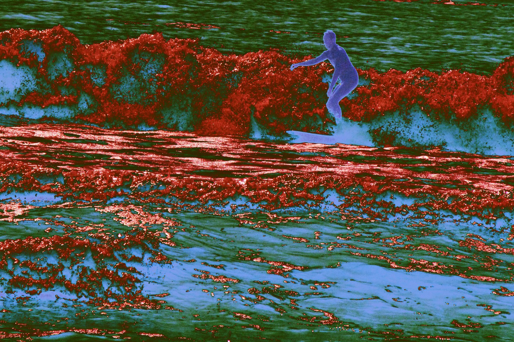
I then cropped a bit and adjusted the brightness and contrast to make the image more pleasing and voila, we have a solarized color image.  Finally, note the way that the surfer is outlined brightly.  This effect is classic solarization.

Figure 5 – Final version – solarized color image of Maine surfer

Curves and the Look Up Table

Let’s continue our discussion of the Look Up Table or LUT. As the pixels of your digital camera’s sensor are hit by light, they emit and store electric charge – the more light, the more charge.  After the exposure, this charge is sequentially read out.  The charge is read as a voltage and the camera’s circuitry applies this voltage to what is referred to as an “analog to digital converter” or A/D.  The important point is that if you have an 8-bit camera, it converts the voltage to 2^8 or 256 grey levels for each color and for a 14-bit camera to 2^14 or 16384 grey levels for each color.  That’s your basic image.

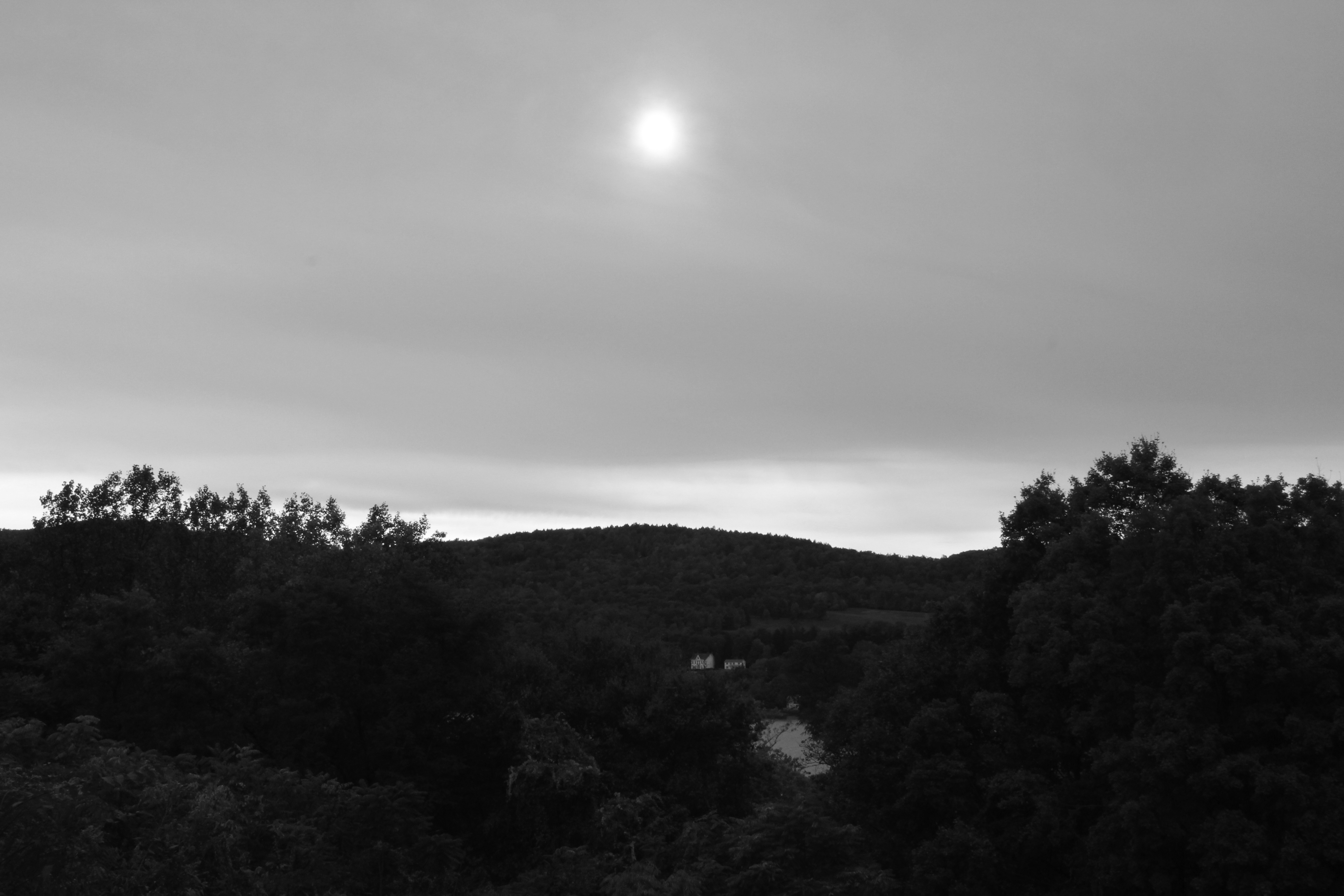
Figure 1 – Valley with Sun, B&W image

Your image processor, e.g. Photoshop, can alter this fundamental image by applying a Look Up Table to it.  To see what this means, let’s consider the image in Figure 1.  You can guess what I was trying to accomplish with this image.  There was the valley of trees, a very overcast sky, and the sun burning through.  The problem is that there was too much dynamic range in the scene for the camera’s sensor to handle.  Probably the picture should have been shot with a graded neutral density filter or taken at a set of bracketed exposures and then reassembled as a high dynamic range image. But nevertheless, errors can be educational.

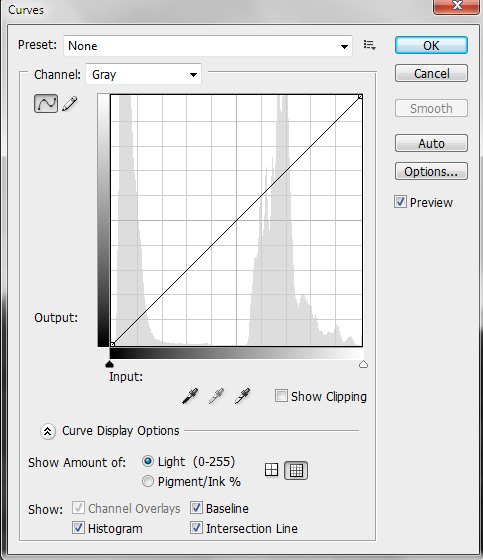
Figure 2 – Initial Photoshop CS3 histogram and response curve for Figure 1

In Figure 2, I display the Photoshop Curves screen.  Look first at the histogram.  A histogram is a display of the frequency or number of times a particular grey level appears in the image.  You can see that there are really two distinct regions: the dark tones of the valley and the high tones of the sky.

Next look at the curve, which is here a straight line.  The curve is a display of the LUT.  For a perfectly one-to-one linear LUT, like this, it says: a grey level of 0 should be displayed as 0, a grey level of 1 as 1, of 2 as 2, etc. So you can think of a two column table.  The first column is input value.  The second column is output value.  That’s your LUT.

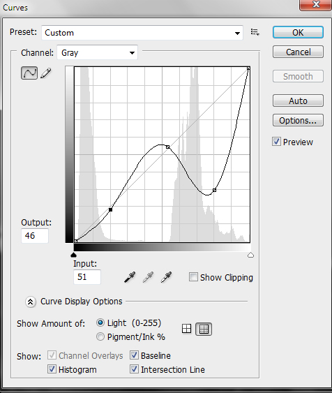
Figure 3 – Modified response curve for Figure 1

Now this picture calls for a different curve or LUT.  I set an anchor point at the end of the first subregion of the histogram and at the beginning of the second.  The lower values I don’t change by very much – just a bit of a concavity to the curve.  But the high values I seriously distort.  In fact, as seen in Figure 3, I drive the grey levels of clouds from very bright to very dark.  This is a very nonlinear and nonmonotonic (output grey level does not always increase with increasing input grey level) curve or LUT.

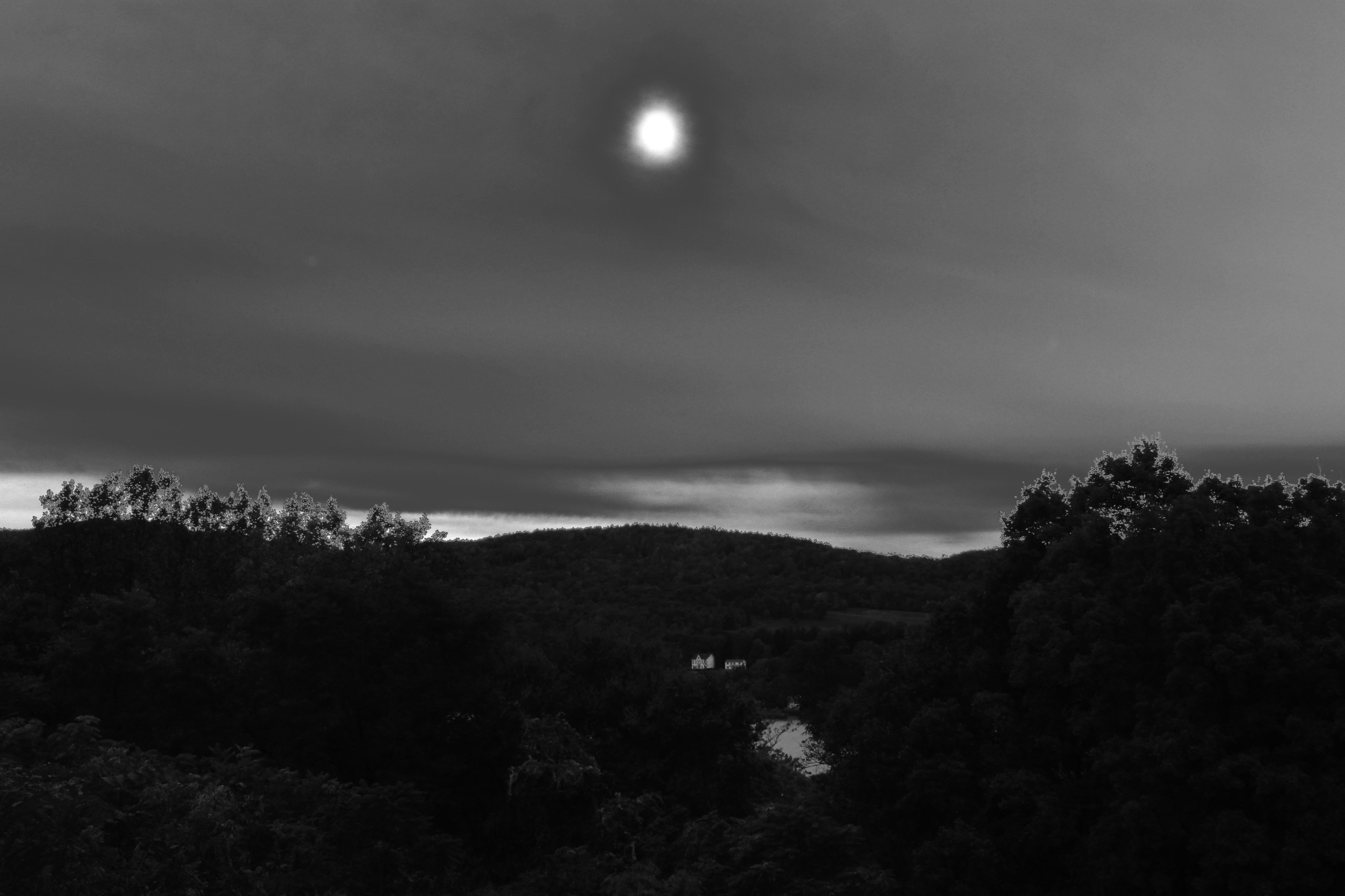
The final effect is illustrated in Figure 4.  It is certainly improved in comparison to the original, but there is still a lot of work remaining to achieve my concept of the image, when I first took it.  Indeed, it may not be salvageable.  However, it does serve to illustrate the concept of the LUT and response curve.

Figure 4 – The final result of applying the response curve of Figure 3 to the image of Figure 1

Solarization, Minor White, and the Look Up Table

I am not personally a great fan of extreme “Photoshopping.”  For my generation the rock star we emulated was Ansel Adams.  So the goal has been to achieve the ideal of his “range of light.”  This translates to a few basic techniques:

  1. Spread the dynamic range from black to white – a process referred to as, in image processing parlance, as histogram equalization,
  2. Adjust the gamma to get the tonal range you want,
  3. Dodge and burn judiciously to accentuate the wanted and suppress the unwanted,
  4. And in some cases to tone subtlety.

Radiant Tiddles, copyright 2005

But all this talk about “faking it” brought to mind a photograph that I took and played with in October of 2005.  I called this, in honor, sorry honour, of an English friend “Radiant Tiddles.”  This image is an example of a phenomenon known as “solarization.”  The first thought that you often have about solarization is that it is a form of photographic magic.  You will recall how the magic of photography is a theme of this blog.  And let me tell you that in the “good old days,” when creating a solarization involved flashing a print with light half way through development, it certainly felt like witchcraft.

Arguably, the most famous solarization is Minor White‘s “The Black Sun, 1955.”  This is a wonderful example, because you realize immediately what is going on.  Somehow the extreme white of the sun stopped being white and turned black – somehow the tone reversed. You’ll hear this referred to as “reciprocity failure.” If we look up solarization in Wikipedia, we learn that it “is due to halogen ions released within the halide grain by exposure diffusing to the grain surface in amounts sufficient to destroy the latent image.”  Let me say two things about that.  First, the latent image was the ultimate magic inherent in film photography, the fact that light created a memory in the film that could wait for years* to be brought out by chemistry.  Second, it’s a lot easier to understand as a digital phenomenon.

This understanding requires first an understanding of the concept of a “Look Up Table,” or “LUT.”  The LUT is very central and key to understanding much of what we do to create an image in digital media; so well worth the effort of understanding.

*And I do mean years later.  Film recovered in the Arctic in 1930 from an ill-fated balloon expedition in 1897 was successfully developed.


Faking it Manipulated Photography before Photoshop

A reader has brought to my attention an important new exhibit at the Metropolitan Museum of Art in New York City: “Faking it Manipulated Photography before Photoshop,” which runs from October 11, 2012 to January 27, 2013.  It looks well worth the trip or, absent that, well worth a careful study of the website.

I am happy to see Annie Brigman featured on the homepage.  She was famous for heavily reworking her negatives to remove unwanted features and add others, not to mention liberating the view of women while staying within the context of very classical imagery.

It is, of course, the case that much of what Photoshop and other artistic software does, is an evolution of techniques that were previously achievable only with intense effort.  These efforts typically included proper choice of both negative and print development and various methods of retoughing, such as dodging and burning.  And, of course, there were even more laborious techniques, such as effective multiexposure techniques and photomontage.  In a real sense modern artistic image processing methods have freed the photographer by making these techniques simpler and therefore much more accessible.  Also you are freed of that little cash register in your head that was always calculating how much a picture was costing you in paper, chemicals, not to mention time.

The exhibit also approaches the important subject of motivation.  Why is the image being manipulated?  Is the motivation artistic?  Is it for advertising purpose, to grab and evoke emotion? Or is it political, like the RMONEY subject of a previous post?

So I think that well worth seeing.  Now I just need to figure out how and when to get down to NYC.