Favorite Photographs for 2012 – and the winner is…

Before we get further into the New Year I thought that I should mention that, based on all of the feedback that I have received from readers, the clear favorite of everyone is not Ansel Adams “Moonrise,” but Edward Steichen’s “Flatiron Building, 1904.”  When choosing this image I very carefully sought out one of the colored ones as a opposed to the straight black and whites or the sepia toned ones. Take a look at each of these variations by clicking on the hyperlinks.  I suspect that you will agree with my selection.

When I first saw these bichromate gum colored versions, I thought that they were true color photographs.  But the fact is that 1904 predates the first true color photographs by three years.  Rather they are part of a long tradition of hand-colored photographs.  As early as daguerreotypes you can find examples of beautiful hand coloration.

While experimentation with color photography dates back into the nineteenth century.  The first practical and commercial color process was Autochrome. This is an amazingly clever process, which really deserves a blog of its own. There was a recent exhibit of autochromes at the Metropolitan Museum of Art in New York City..

From an aesthetic perspective, I think that colorization adds to the mood of Steichen’s image of the Flatiron building.  It creates a dramatic sense of mystery.  There is a light level or moment at night when your photopic (color sensitive) vision starts to fail you  and your scotopic (black and white) vision takes over.  At that point you are not quite clear whether you are seeing color or not.  I think that the hand coloring achieves the sense of that moment.

Also, I think it profound that just as we demand and devour the latest technical advances, people of Steichen’s time felt that the spectral dimension of the image was missing.  And they needed it.  They developed hand coloration to an art form, in and of itself, and they pushed their technical innovators towards the solving of a very hard nut crack, how to go beyond the limitations of the silver halide monochrome process to create true and pleasing polychrome.
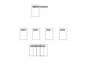
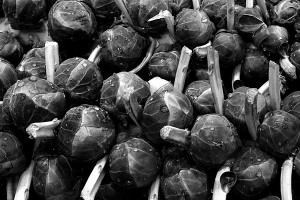
Image Stitching

A reader(ABW) has asked me to comment on a recent posting on the PetaPixel website concerning the creation by photographer “Michael “Nick” Nichols”, under the auspices of the National Geographic Society, of a giant image of the second largest Sequoia in the Sequoia National Forest, “The President.”.  I was all set to do so, when another reader (CJHinsch) responded so elegantly to my New Year’s Resolution post, expressing my desire to learn to photograph trees, and further pointed me to the work of James  Balog.  Mr. Hinsch really hits the nail on the head.  The real issue is not the marvel of how this is done technically, but the marvel of the tree itself, and that’s a very personal thing.  So more discussion on all of this needs to happen.

As far as the tree mosaics are concerned, the technical need for this type of image is the recognition of two points:  First, if you try to photograph a tree from its base, or suspended in another tree, or even from the air you are going to wind up with a pretty distorted image or a very tiny one from far away.  Second, that’s not how the eye works.  We see the tree in its entirety, then focus in on a few leaves, see them in fine detail, perhaps even notice a caterpillar.  Finally, we focus back and in our minds eye imagine that we have seen the whole tree at the caterpillar level of detail.  So if your desire is to reproduce the human experience “tree” in it’s full scale entirety, this is what you need to do.

Recognize that trees are not the only subjects that call out for this type of treatment. This happens whenever we are confronted by a subject that is physically larger than our lens can handle, unless, of course, we step way way back and lose all detail.  It should also be said removal of distortion is not always the artistic intent.  In the case of the tree images the goal is presenting a sharp and highly resolved undistorted image.  But there are other cases, making a 360 degree image of a landscape, where the distortion is intentional as a means of adding drama.  Moving frame by frame perpendicular to an image removes distortion.  Rotating around the axis of your tripod actually introduces a so called “spherical distortion.”

StitchingDoing a mosaic is conceptually pretty straight forward and is illustrated in Figure 1.  Imagine that I want to photograph something that is way too large to fit in my field of view, here the letters ABCDEFGHIJKLM.  In fact, my camera can only photograph five letters at a time.  What I do is take four overlapping images.  Then I reconstruct them by overlapping the images.

Now in the age of digital photography, this is an automated process.  Your Iphone or IPad will do it for you (have apps.) as will Photoshop.  When photography was a purely analog, this was a laborious and painstaking process.  But could be very effectively done, as witnessed by Ansel Adams’ giant landscapes for the Wells Fargo Bank.  It still is pretty laborious as the Sequoia project illustrates.  The desire is to keep things perfectly flat so as to minimize distortion and the need for corrected algorithms. In the case of the tree image the camera is moved up down and sidewards snapping multiple images on a hoist and framework.  The advantages of creating an image this way is that it is flat and undistorted and it has a much higher level of detail than could be accomplished with a single image.  In fact the major limitation in practice tends to be how big and at what resolution can you print.

That’s it technically, but like I said there’s a whole lot more to consider from a aesthetic and emotional viewpoint.

Boguslaw Strempel – forests and morning mists bathed in sunlight

One of the nice things about doing this blog is that I am constantly researching, which brings me chance encounters with wonderful images.  Today while working on a technical topic, I came across the work of Polish photographer Boguslaw Strempel whose images  of the forests and hills of Poland and Czechoslovakia are simply wonderful.  In particular, photographs of a nearly horizontal light flooding and streaming through forests and casting amazing shadows are quite breath taking.

A lot of bloggers don’t appear to give a whit about copyrights.  But please let me stick to my guns on this and point (hyperlink) you towards some of Strempel’s more spectacular landscapes.

This time of year, I’m usually driving to work at dawn.  And a lot of times the fog and the light make me wish that I had my camera with me.  So my advice to both you and myself is to keep these images in mind, remember to pack your camera, accept the delay of pulling over to the side of the road, and above all blast yourself out of bed and catch the light.!

Winter break 2012

BrusselsSprouts

Brussels Sprouts, (c) DEWolf 2013

I took a pretty extended winter break last month and I did manage a few photographs that were successful at some level.  So I thought that I would share them with you.

StreamSM

Winter Stream (c) DEWolf 2013

The first were of some Brussels Sprouts that were still fresh on the stalk.  I got a reasonable  tonality, and also got a nice effect by spraying them with water before photographing them.  I was impressed with the spiral form of the stalks and I tried to capture this.  Unfortunately, I wasn’t too successful,  and unlike Edward Weston, who just took his time and photographed until the vegetables were on the verge of spoiling, here the cooks were demanding and I had to take what I got.  They did taste good, however.

snowandice2

Snow and ice (c)DEWolf 2013

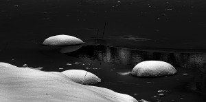
We had a snow storm the Saturday night before New Years, and Sunday morning dawned beautiful though overcast.  It seemed a perfect time to try out my new Canon 70 – 200 mm f/4.0 USM zoom lens.  Snow is always a tough task master, as it tends to bleach out and drive everything else into darkness.  Still I got a reasonably satisfying image of a brook near my house that I’ve been targeting for photographing for some time.  For some reason the image seemed to beg for sepia toning.  Since I’ve shifted to the Canon T2i, I’ve found that I generally like my black and whites straight-up and sans toning.

I also took an acceptable image of a frozen pond with snow.  It was a real lesson in dealing with snow.  It took a lot of processing including a very nonlinear LUT on the grey scale.  This can be tricky and turn the image into a solarization, if your not careful.  But the important point here is that I learned a lot.  Handling your equipment can be a bit of a pain, when you are wading in snow, carrying a monopod, and trying to keep your fingers warm.

The golden proportion – perfection in art and nature

SimilarGoldenRectangles.svg

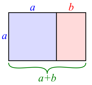
Figure 1 – the “Golden Rectangle,” from the Wikicommons and in the public domain

As I indicated the “golden rule of thirds” is an approximation of the “golden proportion” aka the “golden ratio.”  The “golden proportion” comes from the ancient Greeks, so it must be cool and mystical.  But what exactly is it?

It is a special rectangle as shown in Figure 1.  The rectangle has a height, which we will call a and a width, which we will call a+b.  Now honestly that is true of all rectangles.  Since as long as the rectangle isn’t a square, the width is always a bit larger than the height.  So we might as well call that amount b.  But the “golden rectangle” has the special property that

(a+b)/a = a/b =ϕ

I know that a lot of you don’t like equations, but forget the equation.  All that I am saying is that for this particular rectangle, when I divide it as shown, I create a second rectangle only on its side, and that the width divided by the height is the same for both rectangles.  This ratio is so important that we’ve given it a name, really a symbol, the Greek letter ϕ, which happens to equal 1.6180339887, approximately.  “Approximately?”  Mr. Spock.”  “I try to be precise, Captain.”

Parthenon

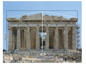
Figure 2 – The ratio of the width to the height of the Parthenon is the golden ratio phi. Original image from the Wikicommons and is by Eusebius (Guillaume Piolle)(own work).

Now before we go off on any tangents, take a look at Figure 1 again.  You see that the line b is almost a third of a+b.  Remember the “golden rule of thirds.”  If you do a little calculation you realize that instead of being 1/3 which is approximately 0.33, the fraction is actually approximately 0.38.  And it is this division of the image that we are really supposed according to the Greeks, or the imagined Greeks, to be striving for n order to attain both geometric and aesthetic perfection.

So now take a look a Figure 2, which shows the Parthenon in Athens, what did the architects Temple of the Goddess Athena choose the ratio of the width to the height to be.  Yes, you guessed it ϕ!  Perfection in the Goddess is here symbolized by perfection in the geometry of the building.

Fibonacci_spiral_34

Figure 3 – The Fibonnaci spiral from the Wikicommons by Dicklyon and in the public domain.

Finally, recognize that one of the key points of the construction in Figure 1, is that the placement of a line a distance a from the start of the width create a second and rotated “golden rectangle.  This construction can be done on paper with a simple drawing compass.  This process can be repeated over and over an infinite number of times each step creating a smaller and smaller “golden rectangle.”  If you look at Figure 3, you can see how this process defines a spiral, called the Fibonnaci spiral (for the mathematicians I apologize for not going into the subtle differences between the Fibonnacci spiral and the Golden spiral.”).  This is very cool!  And cooler still is the fact that this spiral is the basis for a large numbers of forms in the animal world including the ram’s horn and the spiral of ancient ammonites as well as the modern chambered Nautilus.  We find all of these to be objects of great beauty.  So therein lies the basis of the concept that this ratio is fundamental to the concept of beauty and to be emulated in the division of an image.

Lesley and Louise Brown – Madonna and child for the ages

Ever since seeing the Kennedy to Kent State Exhibit at the Worcester Art Museum, I have been haunted by images from the sixties and seventies: war, prejudice, assassination …  This past weekend I came across another image from that era, a Madonna and child and one that I have not, in fact, seen before.  It is a picture taken on Oct. 9,  1978 by Brian Bould of the London Daily Mail, of Lesley and Louise Brown, documenting the first successful in vitro fertilization by English scientists Patrick Steptoe and Robert Edwards.

The picture is simple and shows simple joy.  It could be of any mother and any infant child.  It is all of us, and therein lies its power.  Lesley Brown died this past June at age 65.  Let us celebrate her courage and take her life and that of her daughter as symbols that we can, in fact, “dream better dreams.”


The golden rule of thirds

So let’s talk about one of these important “mind tricks,” “the golden rule of thirds.”  As we shall see in a subsequent blog the “the golden rule of thirds.” is actually an approximation of the “golden proportion,” which is where our true aesthetic hard-wiring (whatever that means) lies.  But the “the golden rule of thirds.” is a very useful and practical compositional tool to use when taking and creating photographs.

The basic concept is that a photograph will be aesthetically pleasing if its elements are laid out on a basic grid that equally divides the image in thirds.  According to Wikipedia, “the golden rule of thirds” was first articulated and by John Thomas Smith in his book Remarks on Rural Scenery (1797).

Presentation1

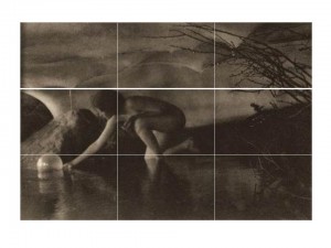
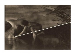
Figure 1 – Ann Brigman’s “The Bubble, 1909,” overlaid with a three by three grid to demonstrate the “Golden Rule of Thirds.” Original photograph from Wikicommons and in the public domain.

Let’s consider an image,  that we’ve seen before, Anne Brigman’s “The Bubble, 1909” to see how it’s done.  I’ve divided the horizontal and vertical axes in thirds and overlaid the grid on the image.  Vertically, you can see that the image is divided into: the ceiling, the middle ground where the figure is, and the pool.  Horizontally, the division is: the lit area to the left, the middle ground, and the dark background area to the right.  Indeed, the body of the figure is

Presentation2

Figure 2 – Ann Brigman’s “The Bubble, 1909,” overlaid with the arrow of directionality.  Original photograph from Wikicommons and in the public domain.almost completely confined to the middle zone.

As an aside there are some additional “mind tricks” or suppositions going on in “The Bubble, 1909” as shown in Figure 2.  An additional, and very well defined, diagonal line divides the subject again into roughly 1/3 and a 2/3 portions.  I’ve drawn it as an arrow to indicate the direction of the motion.  Why do I assume that the woman is launching rather than retrieving the bubble?  Why does my mind tell me that?  Well first of all the arrow goes from darkness to light.  Second, the woman expresses an outward gesture with palm up as if she were releasing the orb, not palm down as if she were stretching her fingertips out to retrieve it.  The final cue is most interesting of all.  In countries where one reads left to right, the eye/mind interprets the left-right motion as inwards.  If, in so moving our eye, we encounter an animate object, here the woman, we interpret that she is passing us in the opposite direction, that is moving outward.*

Returning to the issue of the “golden rule of thirds, let’s consider another old friend, Edward Weston’s, ” Nude in the Dunes, 1930.”  The picture is vertically divided into thirds and the nude is in the lower third.  As I’ve said, this placement and the sand dune above it gives the image a dynamic sense of motion.  You feel that the nude is slowly slipping out of the picture.  A very different and much more stable effect would be accomplished if the nude were at the center of the image. In fact the effect can be seen in Weston’s, “Nude in the Sand, 1936

Finally, let’s consider again Ansel Adams, “Moonrise, Hernandez, NM, 1941”  Adams made a very conscious decision here to emphasize sky over Earth.  The pictures is very neatly divided vertically in thirds (top to bottom): darkness, bright sky, and Earth.  The moon in the center region and very near the dead center of the image is clearly a very important focal point, and we need to move our eye outward from there to encounter the town going down or the dark sky going up..

It has to be said, that “rules are made to be broken,” and violating the “golden rule of thirds” can have dramatic effect.  It remains, however, a very easy compositional tool that can be readily implemented on the fly while taking pictures and then fine tuned in the light room.

*For a further discussion of this directionality issue see Lootens on Photographic Enlarging and Print Quality, The Camera, Baltimore, MD 1945.


Physiological vs. physical optics

In my last blog I talked about the resolution of the human eye.  That is all fine and dandy, but it is very important to remember that the eye does not function like a CCD or CMOS-based digital camera.  It does not snap pictures that it then stores intact in the brain.  The eye is part, an important extension, of the brain, and the brain is an image processing device that stores images in its own peculiar way, connects and combines them with other images, and connects them all with emotions.  When looking at a scene or photograph the eye doesn’t even stand still.  Rather it scans the scene picking out important recognition points.

Now I’m not an expert on this topic.  So I’m not going to dig myself in more deeply for risk of being inaccurate.  I just want to emphasize a few significant points.

  • First, when talking about the eye and brain, it’s important to recognize that you’re dealing with physiological and ultimately psychological optics, not just plain vanilla physical optics.  There’s even different set of units to describe physical and physiological optics.
  • Second, the brain connects an images and ultimately evokes emotion.  In a very real sense we feel an image.
  • Third, all of the aesthetic tricks of photography, the golden rule of thirds, the dynamicsm within an image, foreground/background flip, etc. are the result of what’s going on in the brain during image perception.

Of course, the eye, the brain, and all of the rules of physiological and psychological optics are ultimately determined by the physics and chemistry of the eye and brain.  But, and perhaps most importantly, without the brain and the way it processes there could be no photography, since it is the brain that accepts a flat image of a three dimensional world, even  images devoid of color, and enables it to evoke the same emotions as the original scene.*  It is the eye/brain that enables us to look at a photograph and say: “How beautiful!” – not just to say but to feel it.

*At the recommendation of a reader, I have been reading Timothy Egan’s biography of Edward Curtis, “Short Nights of the Shadow Catcher.  Egan records that in “December of 1904 Curtis rented out a large hall in Seattle and mesmerized the audience with hand-colored lantern slides and moving pictures of Indians of the Southwest.  The film prompted members of the audience to jump from their seats in fear.”


The resolution of the human eye

In our discussion of camera resolution we never asked what the resolution of the human eye is?  This is an important question, since ultimately, when we look at a photograph, regardless of how it is presented to us, we are looking at it with the human eye.

Doing the same kind of analysis that we have done to determine the diffraction limit of a camera lens, it can be shown. The human eye has an angular resolution for green visible light of about 1.2 arc minutes.  An arc minute is 1/60th of a degree.  Those pesky Babylonians, with their base 60. are at it again! Physicists prefer a different unit of measure, called the radian.  There are 2 π radians in 360 degrees; so 1.2 arc minutes is about 2.1 milliradians.  The value of using radians is that the spatial resolution is just the distance away from what you are looking at times the angular resolution in radians.

So say you are reading a book or looking at a photograph 12 inches in front of your face, then you resolution is going to be 12 inches X 2.1/1000 = 0.0252 inches.  Remember that this is in line pairs.  There are about 40 line pairs per inch – or 80 lines (or dots) per inch.  This is kissing close to the 72 dots per inch standard that Adobe Photoshop and historically topography use.

Similarly, as I write this, I’m looking from about 18 inches at a 15 inch laptop screen.  So in that case my eye’s resolution is going to be 18 inches X 2.1/1000 = 0.0378 inches or 26.5 line pairs per inch which is 53 dots per inch.  Across my 15 inch screen that’s 794 dots.  If I decide that I’m going to peer in, putting my nose to the screen at about nine inches, I’m going to need twice as many dots per inch or 1,588.  That’s pretty close to the 1366 that my screen is set at.

We’ve seen these numbers before.  But now we realize that the requirements in dots per inch for computer displays and digital prints of various sizes ultimately are defined by the resolution of the human eye.  And hidden in all of this is another important point that the print or display resolution required is defined by how far away you are viewing it.