Oscar Gustave Rejlander (1813-1875) – Darwin’s Photographer

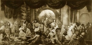
The Two Ways of Life

Figure 1 – Oscar Gustave Rejlander, “The Two Ways of Life, 1857” from the Royal Photographic Societ, Bath, UK, and in the public domain.

Oscar Gustave Rejlander (1813-1875) was born in Sweden and first made his name as a painter, lithographer, and copiest (of classical paintings).  Therein lie his roots in classical pictoralism.  There are conflicting accounts of what caused him to turn towards photography.  One story has it that it resulted from a visit to the great Crystal Exhibition of 1851 in London, another that he was converted when he saw how well a photograph captured the fold of a sleeve, and a final account has him inspired by one of Fox Talbot‘s assistants.
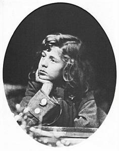
YoungHallamTennyson

Figure 2 – Oscar Gustave Rejlander, “Portrait of Hallam Tennyson, the son of Alfred Lord Tennyson,1863,” in the public domain.

Around 1846 he set himself up as a portraitist in the industrial Midlands town of Wolverhampton, and in 1850 he learned the wet-collodion and waxed-paper processes from Nicholas Henneman in London.  He set up a photostudio and supported himself with genre work and commissioned portraiture (see Figure 2).
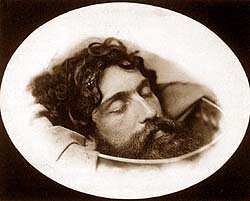
JohntheBaptistsHead

Figure 3 – Oscar Rejlander, “The head of Saint John the Baptist, 1850.” in the public domain.

It was while experimenting with the issue of depth of field in portraiture that Rjlander developed combination printing – the use of multiple negatives to create a photomontage.  Today in Adobe Photoshop this is straight forward. A hundred and fifty years ago in the days of analogue photography, this was difficult and pioneering.  An example of this work is shown in Figure 1 above from his allegorical study “The Two Ways of Life.”  The same figures are shown on the two sides of the image, depicting right the way of virtue and left the way of sin.  The work was view as scandalous by many of his contemporaries.  But the perceived ‘indecency’ faded when Queen Victoria bought a copy for 10-guineas as a gift for Prince Albert.

To our century the portraits, particularly those of children still bring a smile and retain a special loveliness.  The religious allegories are no longer in vogue.  However, we can still very much appreciate the creativity in producing something as convincing as his work, “The Head of Saint John the Baptist, 1850.”  This image is so reminiscent of classic works by Titian and Caravaggio.

The was a controversial and darker side to Rejlander.   He also created erotic work using circus girls, street children and child prostitutes.  He created images referred to as “The Charlotte Baker series.”  The most notable of these is “Mother’s Clothes,” which depicts a nude teenage girl trying on her mothers clothing.  It tests even our modern sensibilities and reminds us of sinister images of children taken by Charles Dodgson (aka Lewis Carroll), a colleague and friend of Rejlander’s.

As previously discussed, near the end of Rejlander’s life he was approached by Charles Darwin to do the photographs for “The Expression of Emotions in Man and Animals, 1872.”  He added a special humor and artistic quality to this early example of photographic illustration of scientific books.

* In addition to the sites hyperlinked, background for this blog was obtained from the ever useful and magnificently produced “The Golden Age of British Photography, 1839-1900.”
 

The Expression of Emotions in Man and Animals – a photographic and scientific milestone

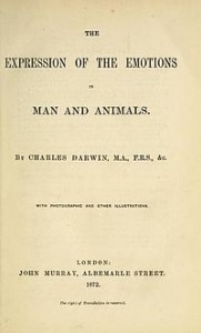
Title-Page

Figure 1 – The title page of Charles Darwin’s “The Expression of Emotions in Man and Animals.” From the Open Library and in the public domain.

Today I’d like to talk about a book – Charles Darwin’s “The Expression of Emotions in Man and Animals.”  Paul Johnson has suggested, and I believe rightly so, that Darwin’s magnum opus on the Theory of Evolution really consists of three major works: “The Origin of Species (1859),” “The Descent of Man (1871),” and “The Expression… (1872).”  In “The Expression…,” Darwin seeks to trace the animal origins of human facial expressions such as: the pursing of the lips in concentration and the tightening of the muscles around the eyes in anger and efforts of memory.

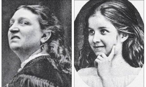
In composing the book, Darwin circulated a questionnaire to scientist around the world so as to gather data to test the universality of emotional expression in different ethnic groups.  Other sources (see Figure 2) were photographs of babies, children, and actors, and also descriptions of the behaviour of  psychiatric patients at the West Riding Lunatic Asylum at Wakefield in West Yorkshire. This kind of thorough attention to detail was characteristic of Charles Darwin, characteristic in fact, of much of Victorian Science, and is one of the reasons that, even today, he is so compelling in his arguments. Darwin also performed experiments involving electrical stimulation of the facial muscles to induce expression and elicit emotions (other than fear of electrocution) from his subjects (see Figure 3).

Hatred-and-love

Figure 2 – Images of hatred and love from Charles Darwin’s “The Expression of Emotions in Man and Animals,” in the public domain.

This book was published in 1872   and represents a cornerstone in the history of science (most particularly the then fledgling science of psychology) and photographic book illustration.  It was one of the first scientific books to use photographic illustrations.  Darwin saw this as imperative saying: “Several of the figures in these seven Heliotype Plates have been reproduced from photographs, instead of from the original negatives ; and they are in consequence somewhat indistinct. Nevertheless they are faithful copies, and are much superior for my purpose to any drawing, however carefully executed.

Facial-expressions

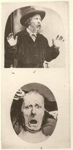
Figure 3 – Plate 2 from Charles Darwin’s “The Expression of Emotions in Man and Animals.” In the top image the photogrpher, Oscar Rejlander, using himself as subject. The bottom image shows and example of Darwin’s experiments on electrical stimulation of expression and emotion. In the public domain.

What exactly is a heliotype and why was Darwin concerned about its loss of sharpness?  A heliotype was a photomechanically produced plate for pictures in a book that was  made by exposing a gelatin film under a negative.  The film was then hardened with chrome alum, and the pages of the book printed directly from it.  What Darwin was interested in was a faithful and scientific rendering of the faces in the pictures and he was willing to suffer a little loss of sharpness to get the realism.

Darwin saw photography as a means to convey scientific observation, both accurately  and in detail.  Indeed, in a sense, the reader gets to observe for his/herself.  He set a new course and was followed by other luminaries, such as Eadweard James Muybridge (1830-1904) and his work on animal and human locomotion.

But beyond science, there is something wonderful and often humorous about the photographic illustrations of “The Expression…”  This immediately raises an important question.  Who was Darwin’s photographer.  The answer is Oscar Gustave Rejlander (1813-1875).  He is the man with the muttonchops in Figure 3.  Rejlander used himself as subject for many of the heliotypes in Darwin’s book.

Although a somewhat controversial figure in his day, he was one of the great British photographers and a master experimentalist with the new medium.  As in science, the Victorian era was a golden and innovative time in English photography.  Who was Oscar Gustave Rejlander?  That is the story I will tell in tomorrow’s blog.

André Kertész – La Fourchette, 1928

I was looking at a website today that was doing a series similar to my “Ten Favorite Photographs for 2012,” and I came across André Kertész , “La Fourchette, 1928” or in English, “The Fork.”  Please click on the hyperlink and have a look.  It was interesting to me because I had actually considered this for my 2012 list.  It is certainly, one of Kertész’s most famous works and as an abstraction pretty perfect and wonderful.  It defines all the right elements of a well composed and well executed black and white image.  There’s black and there’s white and there’s beautifully everything in between.  Then we see a well and interesting use of the “Golden Rule of Thirds.”  The objects are contrasted with their shadows, which in the case of the bowl forms a concentric circle.  The fork creates a marvelously strong diagonal line and presents a fantastically well done metallic sparkle.  The image is well designed and cries out “simplicity.”  And in a high resolution copy you can read the letter on the back of the fork.  The sharpness is intriguing.

I have read a bit of a “tongue and cheek” discussion of what it all means.  And I respect the expression, indeed I practice, the exploration of why the piece personally moves one.  But here ultimately it is like the old adage about over Freudian interpretation.  Sometimes a pencil is just a pencil, or in the present case a fork is a fork.

But something does bother me.  Something is incongruous.  And the problem is that the viewer, or a least this viewer, feels a bit like the chess master, who sees a board set up as a display and realizes viscerally and immediately that the position of the pieces could never have evolved.  What exactly is going on here?  Why is the fork teetering on the edge of the bowl?  Generally forks are associated with plates and spoons with bowls.  My mother would have insisted that the fork be placed tines up on the left hand side in anticipation of dinner.  And if dinner has already taken place then it would be rude to tangle one’s fork at the edge of the bowl, or so my mother taught me.  And finally, if dinner has already taken place, then why are both the fork and the bowl pristine and shining?  Puzzle me all of this!
So we are left, I believe, with two options either reject these incongruities and reject the picture, or accept them and conclude that they give the picture a sense of the dynamic a sense of motion.


Short Nights of Shadow Catcher – a review

Edward_Curtis_Self_Portrait

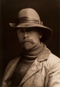
Edward S. Curtis Self Portrait
Edward -S. Curtis [Public domain], via Wikimedia Commons

In my November 17 blog, I mentioned a new biography by Tim Egan entitled “Short Nights of the Shadow Catcher”  This is a new biography of photographer Edward S. Curtis, who over the course of thirty years in the early twentieth century, documented native American populations.  In that blog I discussed Curtis’ prodigious and magnificent work; so here I’d like to focus on the book. And I have to say that I found the book somewhat disappointing.

I should, perhaps, mention that I was simultaneously reading historian Paul Johnson‘s new biography “Darwin,Portrait of a Genius.”  Johnson is one of the greatest living historians and a master at biography.  His biographies emphasize what should be an obvious point.  This is that understanding the life of a man like Darwin, a scientist,or Curtis, an artist, is to understand their work not a series of events in their lives.

Hopi_Mother

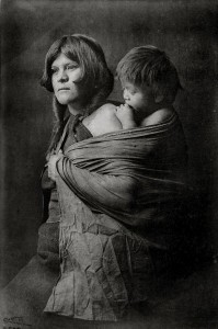
Figure 2 – Edward S. Curtis, “Hopi Mother”
Edward S. Curtis [Public domain], via Wikimedia Commons

From Egan’s book I did learn a lot about Curtis that  I did not previously know as well as about the difficulties that he faced, and also about the ferocious and evil prejudices that the native populations of North America faced in the late nineteen and early twentieth centuries.  It is just that I would have liked to better understand the evolution of Curtis’ view of the American Indians and I would have liked Egan to take on the enormous complexity of the issue of native peoples in America.  It is too easy to dismiss the terrible chain of events to self righteous prejudice, without a deeper exploration of the economics, religious, and even inevitable causes of cultural conflict.

From a photographic perspective, this book is really disappointing.  We are used by now to glorious reproductions of Curtis’ orotones.  Houghton, Mifflin, Harcourt’s choice of paper  doomed the images from the start and online reviews indicate that ebook readers found them even more pathetic.  I should personally have like to learn more about the technical processes that Curtis used, particularly his gold toning.

I hate biographies that inevitably march with time and lead us down the path of the subject’s death.  Whenever, I read such a tale, the words of Longfellow’s “Victor and the Vanquished” ring through my head:

Wounded and weak, sword broken at the hilt,
  With armor shattered, and without a shield,
  I stand unmoved; do with me what thou wilt;
I can resist no more, but will not yield.
  This is no tournament where cowards tilt;
  The vanquished here is victor of the field.

Egan, happily does not fall into this trap.  His concluding chapter describes the ultimate triumph of Curtis’ opus and the resurrection of the noble races of North America.


The Lumière brothers – a bit more

Fratelli_Lumiere

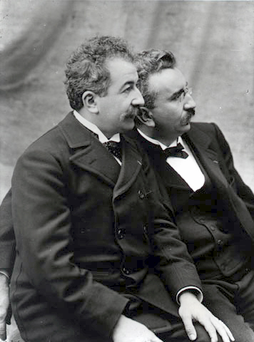
Figure 1 – the Lumiere brothers image form the Wikicommons and in the public domain

In my blog of January 10, I discussed the invention, in 1903, by Auguste Marie Louis Nicholas and Louis Jean Lumière  of the Autochrome process.  There is a bit more of significance to say about the Lumière brothers.  They were, in fact, the earliest film makers.  

Their father, Claude Antoine Lumière (1840-1911) ran a photography firm, producing principally the then dominant dry plates.  The two brothers entered the firm, Louis as a physicist, Auguste as a manager.  To give you an idea of the scale, the Lumière Factory was producing 15 million dry plates by 1894.

Antoine was invited to a demonstration of Edison’s Peephole Kinetoscope in Paris. He returned excited and presented Louis with  a piece of Kinetoscope film and the challenge to make it cheaper.

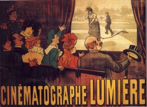
This led to several major patents including: the patent for the use of perforations in the film and the patent for the Cinématographe.  The Cinématographe was smaller than Edison’s Kinetoscope and was capable of recording, developing, and projecting the film – an all-in-one device.  Significantly, Louis’ device operated like a sewing machine on the principle of intermittent motion.

Cinématographe_Lumière

Figure 2 – advertisement for Cinematographie Lumiere by Marcellin Auzolle (1862-1942) Image from the Wikicommons and in the public domain in the United States


The first public screening of La Sortie de usines Lumière (Workers leaving the Lumière Factory) (click on link to see the movie and other of their short films for yourself) was presented on 22nd March 1895 at 44 Rue de Rennes in Paris.  This and their other short films were standardized to 17 m of film and was ~46 seconds long.

There are several individuals who have been credited with the invention of cinema.  Without a doubt however, the Lumière brothers played a very significant role both in the invention and popularization of both color photography and the movies.

* Two principal sources were consulted in writing this and I recommend them for further reading: the Early Cinema Website and Wikipedia.

Image stitching on the IPhone

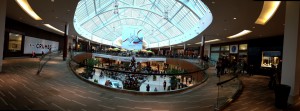
Figure 1 - Panoramic Image of the Natick Mall taken with my IPhone 4s

Figure 1 – Panoramic Image of the Natick Mall taken with my IPhone 4s

I talked about image stitching in my blog of January 11 and there mentioned that it is possible, indeed pretty easy to do this with an IPhone or Adobe Photoshop.   A friend of mine’s eight year old daughter discovered it on his wife’s IPad and showed them how to do it.  Above is an example, a panoramic image of taken with my IPhone 4S.  I was going to give you instructions on how to do this, but discovered a little instruction video on the web.  Grid stitching is also available.  And you can also get $0.99 apps to make your life even easier.

Doing this in Adobe Photoshop is a bit counter intuitive.  Go to the “File” tab, chose “Automate” and finally “Photomerge.”  Again it makes a previously hard job really easy.  So then you get into the age old question.  Does making it easy lead to thousands of mediocre images?  Who cares.  Have a fun time being creative?

Maryam Freyda Figa (Wolf) 1886-1972

Maryam

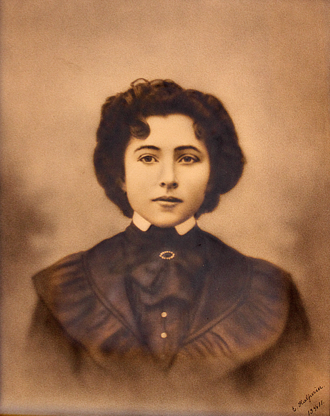
Maryam Freyda Figa Wolf, 1911 silver gelatin print by Elias Halperin

A reader has asked that I post the picture of my paternal grandmother that I described in yesterday’s post.  It is contemporary with Andre Hachette’s portrait of Sarah Lievine and is a silver gelatin portrait taken and hand tinted by Elias Halperin, who was the husband of my grandfather’s sister Menuka Wolfowitz Halperin.  The image is dated June 9, 1911.

The date is significant, because my grandmother, Mary as they called her, had quit her job at the Triangle Waist Coat factory a few months earlier.  On March 25, 1911 in a sad and gruesome tragedy the Triangle Waist Factory, now the NYU Brown building on Washington Square, went up in flames.  The owners had locked the rear doors, so that the girls, who worked there, were forced to exit by the elevator in the front of the building so that they could be checked for stolen cloth.  Within eighteen minutes the entire factory was engulfed in smoke and flames killing everyone left inside.  Fortunately, for me, my grandmother was not one of them.

Mary married my Grandfather Louis Wolf five months after this picture was taken.  The wedding was held at “The Brides Residence at 54 Ludlow Street” in Manhattan.

I have blogged before at how wonderful it is to have silent faces look back at us over a century.  The have a message for us.  When the face is unknown, we catch a glimpse of their lives and create a story for ourselves.  When we know the person and know the rest of their lives, those eyes are filled with the wonder of expectation.

My grandmother was born in 1886 in Lomza, Poland.  She came to America in 1910 at age 24 full of hope and expectation.  My grandmother always seemed a timid person to my sister and me.  But she must have been an incredibly brave person to make that journey alone.

My cousin Ken Figa told me a story that has always haunted me.  When his grandfather, Jack Figa, my grandmother’s youngest brother, was asked what it was like to leave his family behind, he said tearfully, “I kissed my mother goodbye on the dock and I never looked back.”

I hope that Ken doesn’t mind my telling that story, because it’s very important.  Millions of stories like that define the great immigrations that are America.  I always love to look at that picture.  It always makes me think that (to paraphrase Edward R. Murrow), we are not descended from fearful men and women.  They were doers and they did what they did for us.  They had great expectations and they expected nothing less from us.  Anyway, that’s what Mary’s photograph means to me.


The appeal of Autochromes

Andre Hachette 1907

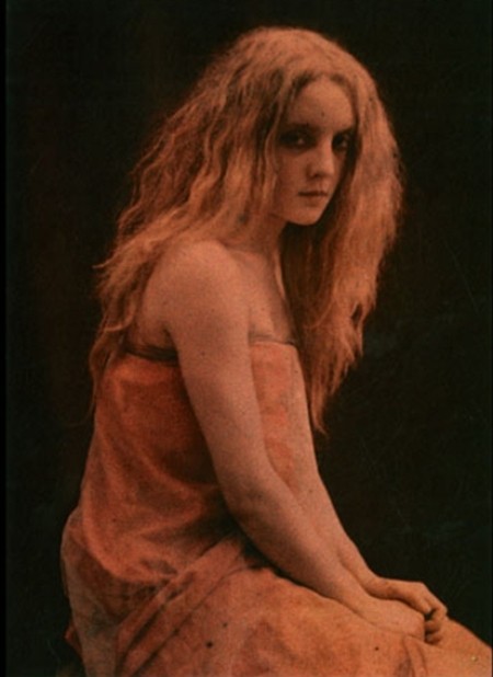
Figure 1 – Sarah Lievine by Andre Hachette, Autochrome c1907, from http://blessedwildapplegirl.tumblr.com/post/18202226926/maudelynn-sarah-lievintese-by-andre-hachette and in the public domain in the United States

In researching yesterday’s blog about Autochromes, I found myself exploring many of these wonderful images and trying to understand their artistic appeal.  I think that the image above by French collector and photographer Andre Hachette, an Autochrome of Sarah Lievine, taken around 1907 pretty much says it all.

I think that we subconsciously feel that pictures from the early twentieth century should be in black and white – that those three decades 1900 – 1930 were black and white.  I have a large photographic portrait of my paternal grandmother.  It is black and white and fits the mold.  She is every bit as beautiful as young Sarah, but she remains temporally distant from us because of the  black and white.

Sarah seems alive – as if we could reach out and touch her.  Because of the color, Sarah seems our contemporary, and we wonder if we aren’t looking at cast photographs from Downton Abbey, as opposed to actual inhabitants of the Edwardian age.

It is again the magic of photography that brings these ghosts of the past back to life.  You will remember how in the movie “The Wizard of Oz,” the black and white film suddenly becomes color when the scene opens in Oz, and Dorothy remarks to her dog, “I don’t think we’re in Kansas anymore, Toto!”  The Autochrome Process ushered in something very new and magical, something now commonplace – namely color photography with its magical spectral dimension.  I don’t think we’re in the nineteenth century anymore.

Early color photography – the autochrome process

AdditiveColor.svg

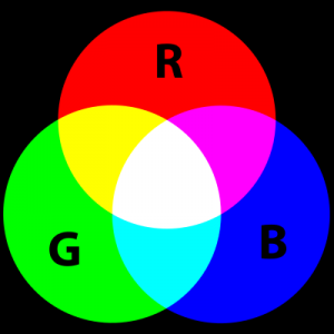
Figure 1 – The additive color wheel from the wikicommons b Mike Horvath New version by jacobolus and released to the public domain.

Yesterday we discussed the fact that color photography first became practical with the introduction of the Autochrome process in 1907.  Autochrome was patented by brothers Auguste Marie Louis Nicholas and Louis Jean Lumière  in 1903,  It was the dominant form of color photography until the introduction of Kodachrome in 1935.  As many photographers lament, Kodachrome succumbed to the commercial onslaught of digital photography and was withdrawn from the market in 2010.  Kodachrome had a very unique soft pastel quality.  I think that you will agree, after seeing some Autochrome images here, that Autochrome also had its own unique appearance and aesthetic quality.

Color Receptors Human Eye

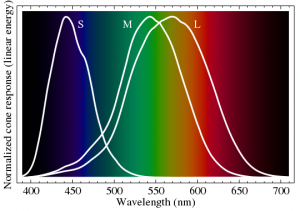
Figure 2 – The spectral sensitivity of the S, L, and M type cones in the human eye. Image from the Wikicommons and in the public domain.

Autochrome was an additive process (see Figure 1).    The human eye has three types of color receptors, S, M, and L cone types, each with its own spectral sensitivity, as shown in Figure 2. .  Color vision, in its essence, comes from the relative excitation of the these three types of photoreceptor cells.In additive color a set of primary colors, usually red, green, and blue is used for illumination.   You might imagine, for instance, that the image of Figure 1 was created with three slide projectors, projecting a red, a green, and a blue circle respectively.  Where they all mix equally you get white.  Essentially, any color can be achieved by varying the proportions of these three primary colors.

Lumiere

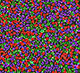
Figure 3 – A closeup of the potato starch particles in an Autochrome from the Wkicommons and in the public domain

Your eye will respond accordingly.  What does that mean?  It means that the different cone types respond according to the responses shown in Figure 2.  These responses are then interpreted by the brain to perceive color.  This is what we mean by physiological optics.  It’s not just a question of the laws of optics.  It’s the laws of optics interpreted by the eye and the brain.  Some will recall Plato’s admonition against trusting the perception of our senses in seeking truth about the universe (see for instance, Richard Tarnas, “The Passion of the Western Mind“).

This kind of additive color process is exactly how a modern LED monitor works.  There are three light emitting diodes that make up a pixel.  Each with its own color spectrum.  We tend to take our technology for granted, which we really shouldn’t do.  Think about how minutely small these diodes need to be, how perfectly the thousands of them must be assembled to create a monitor, and finally recognize that there is so little room for error.  You wouldn’t accept a monitor with many bad pixels.  All of this is why new technologies are so expensive initially.

Taj_Mahal_1921

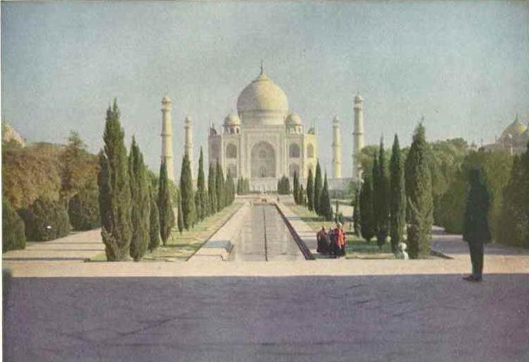
Figure 4 – The Taj Mahal an Autochrome taken by Helen Messinger Murdoch for the National Geographic Magazine, March 1921 from the Wikicommons and in the public domain.

The reason that I am blithering on about how marvelous our digital technology is, is that I now want you to image that it is over a hundred years ago.  The only tools that you have are analogue ones.  But you want to do the same thing.  You want to create a minute color pixel matrix.  How did the Lumiere brothers do it?  They used potato starch.  As a modern technology inventor, I stand in total and complete awe of them.

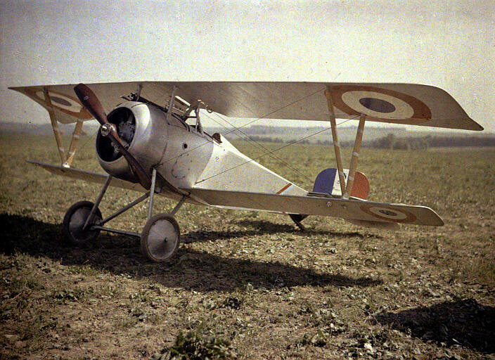
Nieuport_17_C.1

Figure 5 -n Autochrome of a Nieuport 23 C.1 fighter plane 1917 from the Wikicommons and in the public domain

The Autochrome process works as follows.  An adhesive layer was coated onto a glass plate. Potato starch grains graded to 5 to 10 um where attached to this layer.  The starch grains were dyed with either red orange, green, or blue violet dye (an unusual color wheel). Gaps between the grains were filled with lamp black (essentially soot). A closeup of this “pixel” pattern is shown in Figure 3.   Note that if we are dealing with a two inch by two inch plate, this density corresponds to about a 5.3 MPz image – pretty impressive for 1907.  This fragile layer was coated with a shellac and then overlain with a conventional silver halide gelatin emulsion.  Because of the high sensitivity of these emulsion to UV light from the sun, a yellow orange filter needed to be placed in front of the camera lens when taking a photograph to block-out these rays.

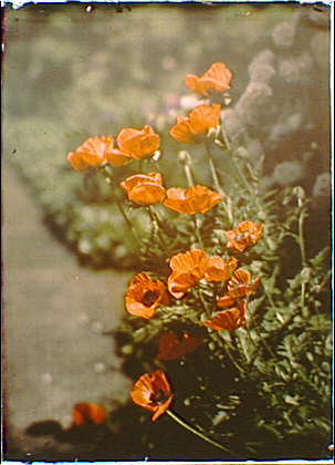
Arnold_Genthe-California_golden_poppies,_Autochrome

Figure 6 – California Golden Poppies an Autochrome taken between 1907 and 1911 by Arnold Genthe in the LOC from Wikicommons and in the public domain

When a photograph was taken the colored potato starch grains acted as minute filters.  The silver halide emulsion was developed by conventional means and then reversed to a positive by what is effectively a bleaching process.  Since the colored starch matrix remains intact, when the positive image (say illuminated from behind) will become colored as light passes back through the filter matrix.

This process very successfully creates color images, which certainly accounted for its popularity during the three decades of its dominance.  It should also be noted that towards the end of its commercial span roll film versions were also successfully introduced. Several examples of beautiful Autochromes are shown in Figures 4 to 6.