Sergey Mikhaylovich Prokudin-Gorsky and the Zenith of Three Color Photography

Alim-Kahn

Figure 1 – Color composite of Alim Khan, the emir of Bukhara, 1911 taken by  Prokudin-Gorsky.  The individual images taken through red, green, and blue filters are shown in the side triad.  This example is unretouched, from the wikicommons, and in the public domain.

Yesterday we  discussed the role played by James Clerk Maxwell in the invention of additive three color photography.  The first example produced by Thomas Sutton in 1861 of a tartan ribbon left much to be desired and, in a sense, left tangibility to the imagination.  As mentioned, this work lay largely dormant for three decades.  It was resurrected and taken to wonderful and beautiful heights by the Russian photographer Sergey Mikhaylovich Prokudin-Gorsky (1863-1944).
L_N_Tolstoy_Prokudin-Gorsky

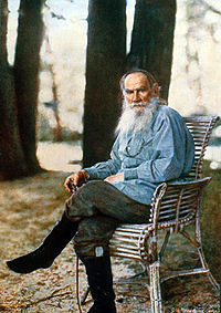
Figure 2 – Count Leon Tolstoy,  1908,three color image by Prokudin-Gorsky from Wikimedia andin the public domain.

From 1909-1915 Produkudin-Gorsky set out, as photographer to the Tsar, to document the Russian Empire through photography, using the three color method.  This work has been brought back to life through digital scanning of the 1,902 original colr images  by the Library of Congress.  As exemplified  by Figure 1, which shows the Emir of Bukhara, Alim Khan these images are simply stunning.  The side panel illustrates the three color positives taken with red, blur, and green filters and then reconstructed by additive  projection to create the composite color image. Note again how the three color planes can be distibnguished at the borders.

Figure 1 is a simple addition of the color planes.  The Library of Congress contracted with digital imaging specialist, Blaise Agüera y Arcas, to scan and digitally render these images.  It is truly worth some time to explore the website at the Library of Congress dedicated to exhibiting these images – or should I say e-exhibiting?

The most famous of Produkin-Gorsky’s work today is his portrait of Count Lev NikolayevichTolstoy (1828-1910) taken in 1908.   While producing actual color photographic prints at the time was challenging, Produdin-Gorsky’s studio did use photomechanical –  photoengravature methods to reproduce his color images.  Most famous of these was this image of Tolstoy issued both as post cards and prints.
Photographic Firsts # 7 – the first color photograph

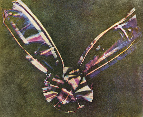
Figure 1 - The world's first color image, a picture of a tartan ribbon, produced by the three color method by Thomas Sutton for Sir James Clerk Maxwell

Figure 1 – The world’s first color image, a picture of a tartan ribbon, produced by the three color method by Thomas Sutton for Sir James Clerk Maxwell (from Wikimedia and in the public domain)

As described in yesterday’s blog, additive color theory says that one can create any color by mixing the primaries from three projectors.  This fact was described by the great Victorian physicist, James Clerk Maxwell.  The critical point made by Maxwell was that the cells of the retina did not perceive color, rather color perception involved the relative stimulation of the red, green, and blue cone cells.  He predicted that  if three transparent (what we now call slides) black and white photographs of the same scene were taken through red, green and blue filters, and then projected in register onto a screen all of the colors of the original scene would be reproduced.

In 1861 such  a set of images, referred to as color separations, were taken by Thomas Sutton, who used them to illustrate a lecture by Maxwell on color.  The image was of a tartan ribbon and is shown in Figure 1, the worlds first color photograph. Maxwell commented on the inadequacy of the result, pointing out the need  for a photographic material more sensitive to red and green light.

Today photographic historians are puzzled by this image because the emulsion used by Sutton was insensitive to red light.  It is now believed that the red in the image actually results from ultraviolet sensitivity of the process.

Of course, these experiments soon faded into obscurity.  They were reinvented in the late nineteenth century.  We have already discussed the Lumiere brothers Autochrome invention – the first commercially practical color photography process

Additive and Subtractive Color

Color Receptors Human Eye

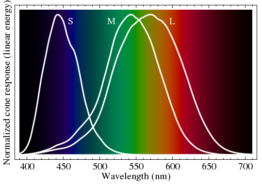
Figure 1 – The spectral response of the S, M, and L photoreceptors in the human eye, from Wikimedia and in the public domain

I’d like to discuss further the nature and development of color photography.  Always key to understanding color is the nature of the human eye.  Figure 1 is one that we have have seen before.  It shows the response of the human eye to color.  The human eye has three types of color receptors, S, M, and L cone types, each with its own spectral sensitivity.  Color vision, in its essence, comes from the relative excitation of the these three types of photoreceptor cells.

AdditiveColor.svg

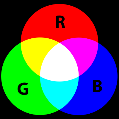
Figure 2 – Additive color primaries from Wikimedia Commons and in the public domain

There are two ways to create color: additive and subtractive.  Additive color starts with black and builds up from there with pure primaries, usually red, green, and blue.  Take a look at Figure 2.   You might imagine, for instance, that the image of Figure 2 was created with three slide projectors, projecting a red, a green, and a blue circle respectively.  Where they all mix equally you get white.  Essentially, any color can be achieved by varying the proportions of these three primary colors.

Subtractive Color System

Figure 3 -Subtractive color primaries, from Wikicommons and in the public domain

Alternatively, see Figure 3, you can start with white and progressively subtract colors.  This is what happens when you mix paints.  Blue paint absorbs all colors except blue, which it reflects back at you.  Yellow paint reflects yellow light.  When the two colors are mixed you get green – as we all learned in kindergarten.  The usual primaries for subtractive color are yellow, magenta, and cyan.  You can think of the circles in Figure 3 as being filters of each of these three colors.  Where they all overlap, you get black, and every color in between black and white can be achieved by some mixture of the three.

DuHaurron1877

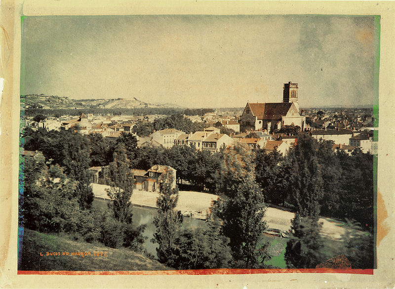
Figure 4 – Early subtractive color process by DuHaurron 1877, from Wikicommons and in the public domain

In future blogs I’m going to talk about various color processes.  Indeed, we have already spoken about the additive Autochrome process and looked at some examples.  So for fun, consider Figure 4 a photograph taken by Louis Arthur Ducos du Hauron (1837-1920) and created by the helichrome multilayer dichromated pigment process.  This is an early subtractive color process and if you examine the edges of the image you can quite clearly see the different pigment layers.


David gets on his high horse about the fashion photography

As promised, today I want to discuss the darker side of fashion photography.  And also as promised, I’m going to get up on my high horse.

The fashion industry, and by default much of fashion photography, is selling sex.  Ok, there’s nothing wrong with sex.  Often this kind of fashion photography is designed to provoke.  We are bombarded with women’s breasts, women’s falsies, men in women’s dresses, and both men and women’s genitalia.  This world is a crotch fest.

Ok, at most levels even that doesn’t bother me, and it is certainly an improvement over the fashion magazines of the seventies and eighties when there were invariably women about to be dismembered by doberman pinschers.  I’m not quite sure what they were selling then – certainly not the much maligned doberman.  Now we only have Tom Brady being attacked by a doberman or wearing its collar.

There is taste and there is bad taste.  Yes, it’s a relative thing, and yes I’m even ready to forgive bad taste. I’m ready to accept the fact that bad taste can sell and that’s ultimately and unfortunately what it’s all about.

But the relativity and commerciality doesn’t alter the fact that you know when the limit’s been crossed.  It’s been crossed when things get degrading and therein lies the fundamental problem.

I’m a child of the sixties and the seventies.  Those were very turbulent times, and in the safety of retrospection, exciting times.  A great off-shoot of those times was the women’s movement.  We’ve seen women make great strides since then, and we’ve watched them take it all for granted and slip perilously backwards in the intervening years.

Frankly, there is nothing more beautiful than a beautiful woman in beautiful clothes.  But the darker side of that industry, and the photographs that promote Darth Vader’s view, objectivize and exploit women.  Worse many of the women involved are really young girls, essentially children.  And young girls seek to emulate this view of themselves, thus perpetuating the worst of this mindset.

It is perhaps the ultimate irony to see a young business woman in the airport studiously reading one of the glamor and fashion magazines.  In so doing she has become complicit  in the world that she claims to hate.  That, one man’s opinion, is what troubles me about this darker side of photography.


Mario Testino – In your face

I guess that I need to begin today’s blog with an apology.  A week ago I visited the Museum of Fine Arts in Boston to see the exhibit of fashion photographer Mario Testino.  Actually, this was two exhibits “British Royal Photographs,” and “In Your Face,” which highlights his work for fashion magazines.  My apology is that these splendid exhibits of this Boston born photographer are scheduled to close today.

These exhibits are the handiwork of museum curator Malcom Rogers.  Rogers has swollen the ranks of museum visitors by expanding audience appeal with such exhibits as “Speed Style and Beauty“, which exhibited vintage cars from the Ralph Lauren collection and “Fashion Show: Paris Collection 2006“.  What these exhibits do is legitimize what we already viscerally recognize as art.

As for Testino, there can be no question, that this is art and that this artist is a master.  The art-form is the heavily staged world of the fashion shoot.  The artist is assisted by a large crew of aids and assistants.  The set and the image are finely constructed.

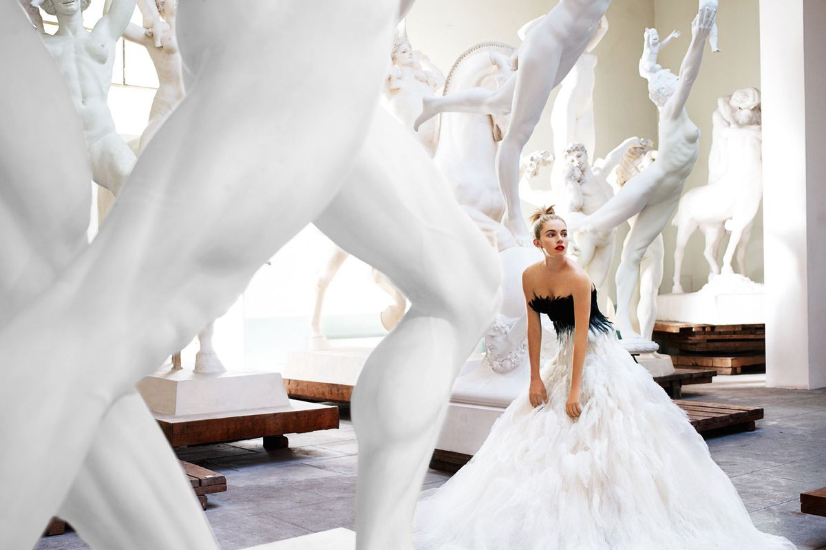
Perhaps the best way to say this is to explore some of my favorite images from the collection. First and foremost “Sienna Miller, American Vogue, 2007.” This is a photographer’s photograph.  Almost the entire scene is in a pale blueish white except the figure, who explodes from her dress in color.  The statues all reach outward creating a sense of motion, while the model bends forward just slightly in contrast.  Do I have to mention the rule of thirds organization?

Then we have “Gweneth Paltrow, Paris 2005.”  The trick of having your subject jump is famous.  A lot of portrait artists use it to take away inhibition.  The subject suddenly concentrates on the jump and reveals themselves.   Actually, one of the interesting observations I had as I walked about the exhibit was that among all the celebrities photographed Paltrow invariably seemed spontaneous and herself.

Next, I was amazed by “Aston Kutcher Gets Real, 2008” for the cover of VMan.  We find Kutcher in a white suit his hands clasped together.  But wait!  His right arm is not connected to his right hand, and his torn jacket reveals,  not sinew and muscle, but a mechanical mechanism.  This is simple, genius, and compelling!  Well, maybe not so simple to execute.

And then there’s this, simply beautiful black and white portrait of  “Emma Watson Wearing White Gloves, 2010,”  It is just wonderful and perfect.

Just think, I made it all the way through this blog without showing you Tom Brady with a growling doberman or anybody’s genitalia.  Mario Testino is a talented artist and has contributed some magnificent and iconic images to our culture.    There is however, a world of saprophytic mutual exploitation in fashion, which also comes out in this exhibit.  Indeed, Testino played a major role in designing the exhibit and one of his stated intents, or so the entry text to the exhibit states, was to provoke. So tomorrow I’d like to climb up on my highest horse and discuss  this darker side.

The FSA in the Kodachrome era

Russell-Lee

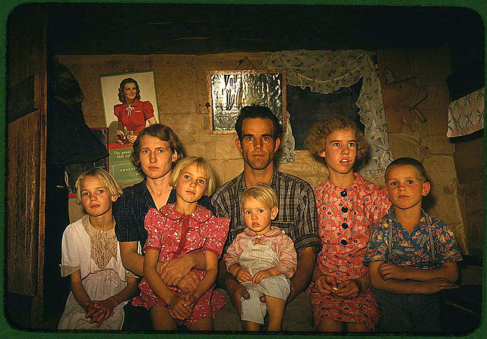
Figure 1 – Russell Lee “Portrait of the Jack Whinery Family, Pie Town, NM 1940” from the Library of Congress and in the public domain.

If we look at the image of the children at the Weill school saying the pledge of allegiance, we see what is our standard view of the depression – it is black and white.  The same is true with Ken Burns’ “The Dust Bowl.”  We have a black and white world, and by virtue of its being black and white we are somehow immune to it.

I have also discussed the Autochrome process, which brought images from 1907 – 1937 into a very spectacular and vivid color.  I also described how Kodak introduced Kodachrome in 1937 and a new age of color photography.

A reader has been kind enough to share with me an article in the Denver Post showing FSA photographs taken with the Kodachrome process from the collection of the Library of Congress.  Suddenly that world becomes rendered in the characteristically striking color of Kodachrome film.  It was hard to chose a favorite and representative image.  Finally, I settled upon the image in Figure 1 taken by Russell Lee in 1940.  It is a picture of homesteader Jack Whinery and his family in Pie Town, New Mexico.

I like the Whinery picture because it is so like the many black and whites that we see from these federal projects.  We can no longer hide in the security of monotone.  And, of course, the current recession 2008 – 2013 raises eyebrows and makes us question the fragility of our perceived distance from these souls and immunity from their woes.


Toyo Miyatake and Dorothea Lange – Japanese internment camp photographs

Lange

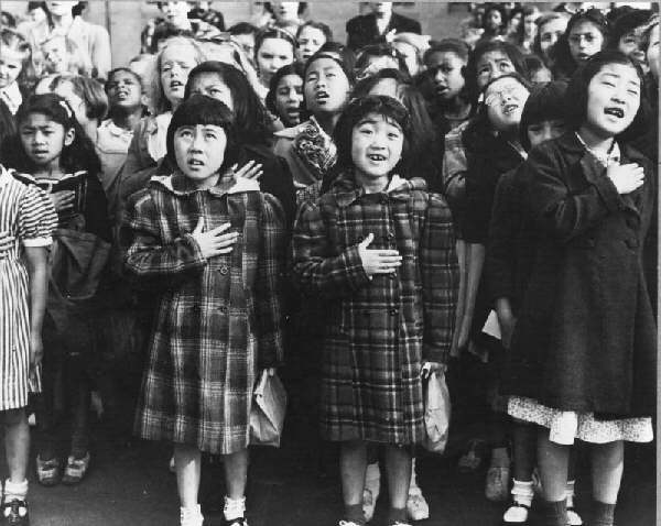
Figure 1 – Dorothea Lange “Students at the Weill Public School reciting the Pledge of Allegence, 1942” Taken for the FSA, in the LOC, and in the public domain.

Yesterday we spoke about Ansel Adams’ photographs of the Manzanar Relocation Camp.  In that post I mentioned two other photographers Toyo Miyatake (1896-1979)  and Dorothea Lange (1895-1965) and I thought that it would be interesting to do some websearching for the photographs of each of them from these camps.

As it turns out, Toyo Miyatake Studios, originally founded by Toyo in 1926 in Los Angeles, was moved to the San Gabriel Valley in 1985.  It is still run by his family and remains a fluorishing and sought after portrait studio. On their website they have galleries of Toyo Miyatake’s photographs taken at Manzanar and also vintage photographs of the 1932 Los Angeles Olympics as well as vintage photographs of Los Angeles’ historic Little Tokyo District.  All of these can be found at the links I have provided and are really worth visiting.

As I discussed Dorothea Lange visited all of the internment camps.  Her black and white photographs of the Great Depression under the auspices of the Farm Security Administration are legendary.  Her photographs of the camps were also taken as part of her work for the FSA and, as a result, many of them were censored by a government, itself ambiguous about the relocation and internment of American Citizens.  Much of this work was not fully revealled until the early 1970’s.

Since they are in government possession there are currently several valuable archives to consult.  Check out:

As for Figure 1, this is an image by Lange taken on April 1942. and shows first graders at the Weill Elementary School reciting the pledge of allegiance.  Within days all of the students of Japanese descent had been relocated for the duration of the war.


Manzanar Relocation Center – images by Ansel Adams

Manzanar_girl_and_volley_ball

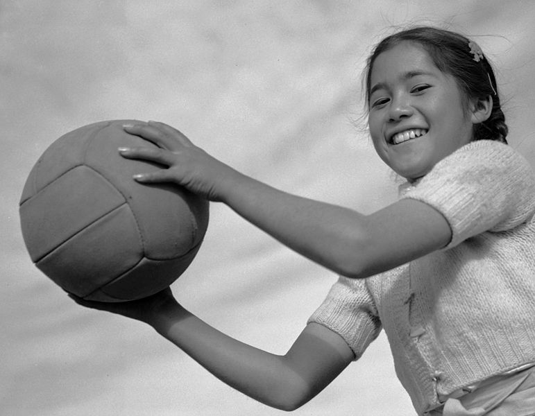
Figure 1 – “Manzanar Girl with Volley Ball, 1943,” Ansel Adams from the Library of Congress.

I’d like to make people aware of a very remarkable collection of photographs at the Library of Congress taken by Ansel Adams in 1943 of the American Citizens of Japanese descent, who were interned in the Manzanar Relocation Center. This work of which Figure 1 is a beautiful example represent a major departure for Ansel Adams from his traditional Monumental Landscape work, being instead intensely intimate portraits and scenes of camp life. It is strikingly interesting how over the last few years the diversity and breadth of Adam’s work is slowly becoming increasing apparent.

These works were originally published in 1944  by US Camera with text by Adams in a book entitled “Born Free and Equal.” and exhibited at the Museum of Modern Art in NYC.   The photographs were donated to the Library of Congress by Adams in 1966.

Ansel Adams’ photographs at Manzanar were the result of an invitation by his friend Ralph Merritt, who had recently been appointed camp director. It is significant that two other contemporary photographers documented Manzanar.  The first was Dorothea Lange, then a staff photographer for the War Relocation Authority.  Lange visited all eleven Japanese-American internment camps. The third photographer was internee Toyo Miyatake.  Miyatake had been a studio photographer in Los Angeles. His first photographs were taken with and improvised camera that he built with smuggled parts.  His activities were discovered, but Merritt allowed him to continue work and even to have his studio equipment shipped to the camp.  Initially he would set up the photograph, but only a camp guard was allowed to press and release the shutter.  This, of course, speaks volumes about the injustices being meted out to loyal American citizens at Manzanar.

In donating these beautiful images and important historical documentation to the Library of Congress Adams wrote:
“The purpose of my work was to show how these people, suffering under a great injustice, and loss of property, businesses and professions, had overcome the sense of defeat and dispair [sic] by building for themselves a vital community in an arid (but magnificent) environment…All in all, I think this Manzanar Collection is an important historical document, and I trust it can be put to good use.”

Snowflake Bentley

Snowflake_Bentley

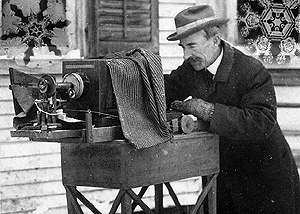
William A. Bentley with his snowflake camera from the Wikicommons original source http://www.flickr.com
/photos/mobyd
/2908371931/
and in the public domain.

We cannot discuss the origins of photomicroscopy without mentioning the work of William A. Bentley (aka the Snowflake man)(1865-1831). Bentley was a self-taught Vermont farmer.  At age fifteen Bentley developed an interest in snowflakes. He learned to capture them beneath the lens of a microscope and tried to draw them in all their beautiful and unique detail. But he found that they melted before he could complete a drawing. If you think about it these are the most ephemeral of objects. Photomicrosopy was the obvious solution, but it still took Bentley two years to develop a camera and methodology.

Bentley_Snowflake5

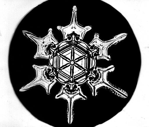
Figure 2 – one of William A. Bentley’s snowflake photographs from http://snowflakebentley
.com/
snowflakes.htm and in the public domain

Today, of course, we recognize that this is an example of macrophotography.  With a 35 mm camera we would want to “blow up” the snowflake two or three times.  For a view camera this is more extreme, and that makes the required exposure somewhat demanding.  But for Bentley, it was all worth the effort.

Today, we learn as children that no two snowflakes are alike.  It was William A. Bentley, who made that discovery.  Today, as physicists, we are taught that this random uniqueness is characteristic of what we call fractal processes.  We should never dismiss the fundamental beauty of nature – even in its most fleeting processes.  Bentley recognized this important point.  He wrote profoundly in 1925:

“Under the microscope, I found that snowflakes were miracles of beauty; and it  seemed a shame that this beauty should not be seen and appreciated by others.  Every crystal was a masterpiece of design and no one design was ever repeated.  When a snowflake melted, that design was forever lost. Just that much beauty was gone, without leaving any record behind.”

Bentley died in 1931 after contracting pneumonia in a blizzard.  But this was not before he left us a very rich legacy of some of the finest and most emotion filled photomicrographs ever created see Figure 2).