F-number, image sharpness, and depth of focus

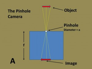
I’d like to begin to explore the technical aspects of photography today.  A lot can be learned from what is ultimately the simplest of cameras, namely the pinhole camera.  You can make a pinhole camera simply by taking a pin and punching a hole in the front of a cardboard box (see the accompanying figure A) and putting some sort of photosensitive material: film, paper, or imaging chip on the opposite side.

Suppose that we have some object that we wish to photograph.  In physics books this is usually a candle, or a tree, or a minimalist arrow.  Let’s go with an arrow.  The thing is that every point on the arrow emits light rays in all directions.  However, the pinhole only allows a single ray to enter the camera.  This is true for every point of the arrow.  As a result a perfect inverted image of the arrow forms on the camera’s image plane.  The image plane, defined by the back of the box, is a distance f (for focal length) from the pinhole.  Interestingly for a perfect pinhole camera f can be any value.  Also, regardless of how far the object is from the pinhole the object is, a sharp image of it forms at the image plane.  The camera has infinite depth of focus or field.

We typically define a parameter called the f-number of the camera that defines depth of focus.  It is the focal length f divided by the diameter of the pinhole d.

f-number =  focal length/aperture diameter

Here, a is zero; so f-number is infinite, as is the depth of field.  Let’s consider what happens if the aperture becomes finite.  This is illustrated is illustrated in figure b, where we consider some of the light rays coming from the tip of the arrow.  More than one ray can now make it through the pinhole and as a result the image of the point is blurred out. The larger the aperture the more blurring occurs.  Another point that you may recognize is that the various rays from the tip cross a vertical line centered where a perfect pinhole would form the image.  As a result you can think of the image being blurred vertically as well.  More importantly, if you think about it the closer the object is to the pinhole the more it becomes blurred.  The finite aperture
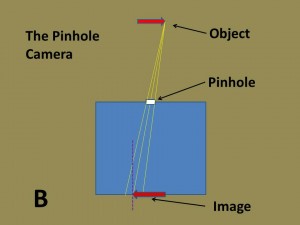
camera does its best job of image formation for an object at infinity and its worse for a point close to the aperture.  Let me point out that lenses enable you to choose the distance for sharpest image, While for pinhole cameras this is always infinity.  But it remains true that the smaller the f-number thr blurrier the image and the less “depth of focus” you have.

So with this simple pinhole camera we have illustrated:

  1. The concept of f-number,
  2. The inverse relationship between f-number and image sharpness,
  3. The relationship between depth of field and f-number.
Annie Leibovitz: Pilgrimage

We are all on a pilgrimage towards enlightenment and engagement with the human experience.  But it is rare that we can catch an intimate glimpse into the pilgrimage of another.  I will offer up James Carroll’s Constantine’s Sword, which beyond being a remarkable exposition of the history of anti-Semitism in the Christian world is Mr. Carroll’s own odyssey of inner awareness.  And if you really want to raise the hairs on the back of your neck with the realization that others have been their before, read Heloise’s letters in The Letters of Abelard and Heloise written in the twelfth century.

This sort of intimacy of experience is rare, and I highly recommend that you make the effort to catch Annie Leibovitz: Pilgrimage somewhere on its national tour.  It will be at the Concord Museum in historic Concord, MA until September 23, 2012.  Ms. Leibovitz has already given us her remarkable portfolio A Photographer’s Life 1990-2005.  In Pilgrimage, she touches our collective past and, I think, significantly reconnects the humanities with the sciences.  We have Thoreau’s cot from Walden Pond, Freud’s couch, Annie Oakley’s boots and a cardboard target card with a little printed heart pierced by a bullet.  And then we have Julia Margaret Cameron’s lens.  Significantly too, the exhibit places each of these in the context of place: Concord, Massachusetts, Vienna, Austria, Darke County, Ohio, and the Isle of Wight.  The pilgrimage is through mind and time and space.  The pilgrimage is at once personal and collective. Intimate artifacts of our collective past connect us.

This is what I take home.  I highly recommend that you experience it for yourself.

Photographer’s Mecca in the Twin Cities

I spent this past Sunday visiting Minneapolis with a close friend, who lives there.  First, let me say that having seen Liv Ullmann and Max von Sydow in “The Emmigrants” (1971) and “The New Land” (1972), there is something very intriguing and appealing about Minnesota in general and Minneapolis, in particular. Second, this has got to be a favorite city for photography.

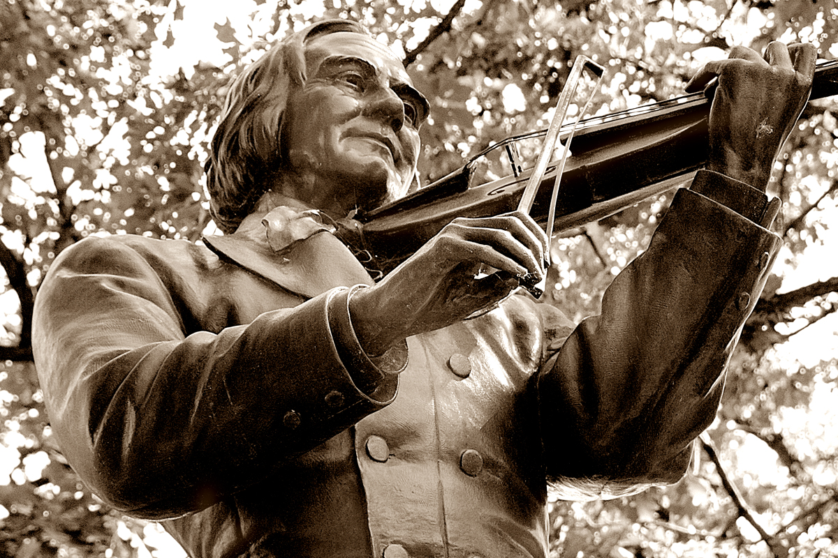
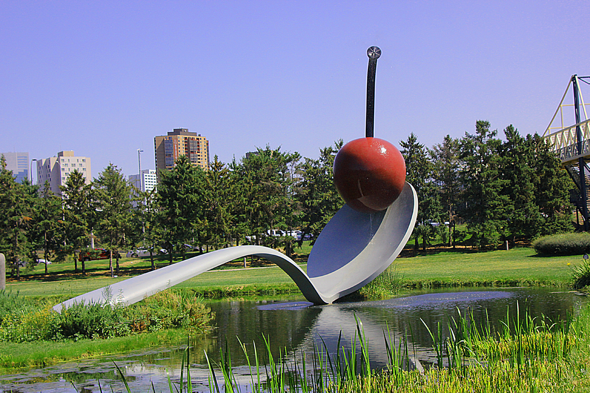
So I thought that I would post a couple of pictures that I took – not great works, even possibly failures – but you get the point.  The first is of the Spoonbridge and Cherry, 1985-1988 a marvelous aluminum, steel, and paint sculpture by Claes Oldenburg and Coosje van Bruggen in the Minneapolis Sculpture Garden.  This sculpture is the iconic Minneapolis snapshot – so obligatory for all tourists.  The second is the memorial bronze statue of Ole Bull (1810-1880), the nineteenth century Norwegian violinist, in Loring Park.  This sculpture was a creation in 1896 of the Norwegian American sculptor Jacob H. Fjelde (1855 – 1896).  I have been for a number of years doing a photoessay on American Sculptors of this period, some of which appear in my galleries.  So this will be an addition to that collection.

My day in Minneapolis was followed by a glorious sunset trip through cornfields to Rochester, MNto do some experiments at the Mayo Clinic.  For art lovers the Mayo is a hidden gem.  There is an extensive collection of art donated by benefactors and they even offer guided tours.


Ansel Adams: resolution, dynamic range, and gamma

I recently went to see an Ansel Adams exhibit entitled At the Water’s Edge,” at the Peabody Essex museum in Salem, Massachusetts.  I have had several such encounters over the years, and encounters are truly what they are.  Years ago I went to an exhibit at the Palace of Fine Arts in San Francisco, then again in San Francisco about ten years later, and then there was a major retrospective at the Museum of Fine Arts in BostonWhat I find interesting is how my view of photography and these works,  in particular, has evolved.

Early on I was taken by the sharpness of detail, how you can see every blade of grass or every nuance in the bark of a tree.  Sharpness in a picture relates to what we call resolution.  Later, particularly at the MFA exhibit, I was taken, really overwhelmed, by the dynamic range in these pictures.  Dynamic range, as already suggested, is the number of shades of grey between black and white in your picture.  The power of Adams; pictures, their inherent luminescence, owes widely to careful placement of the dynamic range.   This is the zone system that Adams’ created.  He would painstakingly measure the brightest and dimmest elements in his picture and then develop, first the negative, and then the print so as to just place these levels within the gamut of grey levels that the photograph allows.  Ultimately, the choice of film developer, paper developer, exposure times, and development times – not to mention some very well chosen dodging and burning in, modified the linearity of response in the final print, the so called gamma.  Linearity means, plain and simple, if I double exposure does recorded density also double.  If it isn’t then gamma isn’t one.

In the next few weeks, I’d like to explore all of these photographic elements in detail.  The point, for now, is that achieving a “technically good” image requires matching.  You’ve got to match the resolution of your lens  to that of your detector, be it digital or film, and then to the resolution of your print, be it a computer screen or printer,  And then the printer resolution needs to be matched to the resolution of the paper as the eye sees it.  Similarly you’ve got to match the dynamic range in the scene to that of the detector and then again to computer screen, printer, and paper. Again, as always, the eye is the ultimate arbiter and task master.

In the world of analogue photography Adams’ zone system was very hard to implement and exploit for 35 mm roll film cameras. Simply because it was hard to keep every picture in the roll within the same set of exposure and development conditions, there was a lot of compromising to be done.  However, just as Eastman’s invention of roll film made it so easy to take pictures, that they for the most part became bland and mediocre, digital photography, particularly if you shoot in raw format, has brought technical proficiency easily within everyone’s reach.  You are left to concentrate on artistic vision.  And as I walked through At the Water’s Edge, I came to realize that when all was said and done, Ansel Adam’s greatness lay in his vision.

The march of time

We learned on Thursday that the great photography giant, Kodak, is no longer in the film business.  This is the latest step in its restructuring, as it struggles out of bankruptcy. Kodak was founded by George Eastman in the 1880.  Eastman was the inventor of roll film in 1884 and introduced the Brownie camera in 1900.  In this way, he brought photography to the masses in what was the first imaging revolution.  Arguably this innovation mediocritized it – making it so accessible to everyone.  Kodak introduced the first commercially successful color film for amateurs, Kodachrome, in 1935.  To this day when one looks at digital photographs expressed in warm pastels, one’s mind is reminded of Kodachrome.

Neutron activated autoradiography

The form of photography we spoke about in the last blog is called autoradiography.  You might ask whether this is really a form of photography and whether it truly belongs in a blog about photography.  The thing is that light comes in many flavors.  Light is an electromagnetic wave, much like the waves at a beach.  The distance between one wave and the next is referred to as the wavelength.  Visible light has wavelengths between about .350 microns and .750 microns.  Remember that a micron is a thousandth of a millimeter. But the spectrum of electromagnetic radiation extends beyond visible light.  Increasing wavelength we have infrared light, microwaves, sub mm waves, and radio waves.  In the other direction we have ultraviolet light, X-rays, and gamma rays.  So really we are taking a pretty narrow view, if we confine ourselves to visible light simply because that is what the human eye can see.

So suppose we had a painting that contained a pigment that contained arsenite, 76As.  76 As has a half life of just over a day.  This means that if you start off with a gram of 76As, it will give off gamma rays so fast that a day later you will only have ½ a gram, two days later ¼ gram etc. On the other hand if you have a gram of copper 64Cu, it decays twice as fast; so a 1/4 gram after one day and 1/8 gram after two days.  So suppose you have a green pigment in a painting and want to determine if it contains arsenite, an arsenic ore, or malachite, a  copper ore, you simple place a sheet of photographic film under the painting for an an hour or so develop it and repeat the process a day and then two days later.  After 24 hours the density of the film below a green region decreases in half if it is made of arsenic or to 1/4 if it is made of copper.  Then to a 1/4 for arsenic or a 1/16 for copper after 48 hours.

It’s as simple as that, except for one thing.  There is very little 76As in arsenite.  It is almost completely 75As.  There’s a similar story for copper, which likes to be either 63Cu or 65Cu.  Atoms consists largely of two types of particles: protons and neutrons.  All arsenic atoms have 33 protons.  The so called isotopes differ by the number of neutrons.  In 75As there are 22 neutrons.  In 76As there are 23.  Now here’s the problem, natural samples of arsenite have precious little 76As, certainly not enough to expose a photographic film in an hour.

To turn 75As into 76As you’ve got to shoot neutrons into your painting.  To accomplish this you have to take your painting to your local nuclear reactor and transmutate the metals in your pigments..  Most art museums don’t have nuclear reactors in their basements.  Fortunately, many physics departments do.  These are the basics of neutron activated autoradiography.  Remember this next time you want to catch a Spanish forger.

* For those who want to dig into this a bit more deeply check out Neutron Activation of Paintings.

My mother and the Spanish forger

I can’t quite remember the details, but a while back one of my Facebook friends posted a video dealing with some previously unknown Amazon tribe, or some such, losing their culture, anonymity, and homes to the press of lumbering.  The video was very sad, but viscerally didn’t ring true.  So I made some comment like “sad, if true.”  One of this friend’s friends (what does that make them to me?) fired back angrily that it didn’t matter if it was true, it was still sad.  I’m sorry, but my mother taught me that above all, and despite whatever the political agenda, the truth matters.  In my adult life I have frequently been confronted with the dilemma of whom should I go with, this guy (fill in the name) or my mother.  Experience has taught me, always go with what your mother taught you.

My mother was Sally Wolf (1917-1988).  She was not an opera singer, but she was very wise.

This desire to deceive with image manipulation is not new – witness the Shroud of Turin.  The desire to believe suspends all credulity. But let’s consider the Spanish Forger, who was a late 19th century forger of medieval illuminated manuscript pages.  Scientists used a form of photography where the paintings were overlaid with photographic film so as to measure the rate of radioactive decay of pigments in the pictures.  The greens were found to contain a pigment called “emerald green” that consists of copper arsenite, not known to be used in artists’ paints until 1814.  The story of green pigments and their evolution in the 19th century is itself very interesting, so perhaps another time.  As for the Spanish Forger, he won in a sense.  His forgeries are collected today for his artistry and in 2009 the Victoria and Albert Museum purchased a large collection of them.


A bit more about RMONEY

I just wanted to say a bit more about RMONEY.  After posting last night I decided to take a look for myself.  All I did was zoom in on the picture to exam the edges.  I’ve zoomed in on the boy with the N and the boy with the E.  You can see very clearly the rectangles where the letters were pasted in, particularly in the case of the E.  Also, when you look at the folds in the fabric of the letters, they don’t register with the folds in the rest of the shirts.  So again, with a little objective scrutiny one can fairly easily label this picture as “black magic.”

White magic, black magic…

We’ve been talking so far about the good aspects of photographic magic – white magic as it were. There is, of course, a dark side as well, a black magic. We see so much of this every day, mostly on the web. I’m talking about the use of photography to deceive. These appear to come in two flavors: wholly made up and created and images that have been drastically modified. There’s so much of this stuff around that “to shop” an image has become a verb. I’ve seen two interesting examples recently; so let’s start with them.

The first is an image purported to be a picture of the Earth, Jupiter, and Venus looming above the Martian horizon taken by the new Mars rover “Curiosity.” It’s gone viral on the web, and I got suckered in as well. But then I started thinking about what a feat it would be to achieve so much dynamic range in a picture and I went to the NASA website to see how it was done. And it wasn’t

there. A quick search of the web turned up Philip Plait’s Discovery Magazine blog, and sure enough “fake!” Plait even points out the letters NE on the bottom edge of the picture, indicating that it was generated using a computer planetarium software package showing the view from Mars. This is an example of a completed computer generated image.

The second is an example of a “shopped” image. It is a picture purported to be Mitt Romney and his family wearing t-shirts misaligned so that they spell RMONEY instead of ROMNEY. This is entitled; “Romney’s family misspell their last name in the greatest Freudian slip in history.” Well, not so much. In fact it’s not even Romney’s family and the reordering of the letters, as explained by David Emery in the urban legends website is the work of a mischievous photoprankster.

Usually, what’s too good to be true isn’t true. Usually too, one can detect a “shopping” job by looking at the suspect edges and monkeying around with the contrast. Image manipulation runs the whole gamut. In fine art photography it’s, well art. In scientific photography it’s a big no no. And in currency counterfeiting it’s as much as twenty years.