Exactly how democratic is the internet?

Figure 1 - Percent population connected to the internet by major geographic region, data from Internet World Stats.

Figure 1 – Percent population connected to the internet by major geographic region, data from Internet World Stats.

I’m afraid that I have boxed myself into a bit of a corner.  In my last two blogs I discussed the democratizing effects of the internet, focusing on book and photography publishing.  I have a couple of readers that are bound to challenge me with the question: “Exactly how democratic?”  So, while this blog is meant to be primarily about photography, I feel that I have to defend myself with some statistics about the internet.

An institution isn’t democratic unless there is substantial enfranchisement.  So if the internet is excluding vast numbers of people by either political or economic suppression it fails to be democratic.  So what about the internet?

Figure 2 - Internet usage growth between 2000 and 2012 by major geographical region. Data from Internet World Stats

Figure 2 – Internet usage growth between 2000 and 2012 by major geographical region. Data from Internet World Stats.

According to Internet World Stats there are currently (2012) 7,017,846,922 people in the world, of which 2,405,518,376 people or 34.3% are connected to the internet.  This has grown by 566.4% in the last twelve years.  This number, of course, does not tell the whole story.  So, in Figure 1, I show internet penetration of the population for the world’s major geographic regions and in Figure 2 the rate of growth for these regions  over the past twelve years.

I think that the story told by these statistics already indicates high penetration of the population and tremendous growth especially in regions that are lagging the major internet centers.  At a certain level access, indeed, represents enfranchisement and a democratizing effect – access to publish and access to download.  From the fundamental viewpoint of “knowledge is power,” this is a positive story.  The subtler and, perhaps profounder, questions of the quality of the information that people have access to, whether there is government or other censorship of free expression, and whether information is otherwise controlled or manipulated is a wholly different issue.  We have to at least have faith that access is an important first step.

Physical media and the need to touch

Figure 1 - The world's first digital computer. Image from the Wikimediacommons and in the public domain. Uploaded by  Anasalialmalla (own work) and put in the public domain by creative commons license.

Figure 1 – The world’s first digital computer. Image from the Wikimediacommons and in the public domain. Uploaded by Anasalialmalla (own work) and put in the public domain by creative commons license.

In my blog yesterday, I intentionally illustrated it with a historic picture from the Kelmscott Press.  Productions by William Morris at Kelmscott are some of the most beautiful and prized books ever created.  There is something wonderfully tactile about a beautiful book or a beautiful photographic print that defies the fact that we can do better in purely electronic medium: better linearity, greater dynamic range, and even comparable resolution.

There seems to be a true human need to touch and feel an object, and an even greater one to own it.  Owning a CD or other recording defies merely downloading it.  And I suspect that this somehow relates to the need of some people to collect, to amass great collections.  Rarity is desired.  Tactility is sensual.  These are the intrinsic human needs that any electron medium must ultimately overcome if it is to effectively compete with more substantive media.

I know this from my own personal experience.  I take a photograph and process it to my liking.  However, it is always aimed at an ultimate physical print, and I am not truly satisfied until I hold that print in my hand.

And there is another curious aspect of this to consider.  We seem to believe that the purely physical is somehow more enduring than the electronic image.  If you keep a diary or journal, for instance, you tend to believe that the physical journal will have a greater longevity than one keep electronically.  Computer memory can be erased in a flash.  The nature of storage media has historically changed at lightning speed.  Try to find a way to read an 8“ floppy (1980’s technology) or even a zip drive (1990’s technology) and you will understand the persistent problem that the conservators at the Smithsonian Institution continuously face.  Of course, understanding visual media like photography printed out is pretty straight forward.  On the other hand, can you guarantee that your journal gloriously scripted can still be read a hundred years from now? Will people still know how to read cursive?  It’s a lot like trying (for most of us) to read old German printing.

On the other hand printed words and photographs are getting costly to produce.  They are costly to distribute.  They are costly to store.  And they are costly to conserve against the elements.

We come then to the purpose of libraries and galleries.  No doubt there is something really special about seeing or reading an original.  But the other purpose of these institutions is to store and disseminate information.  Therein, lies the other way in which the internet specifically and the digital age in general become democratizing.  Great works of art were originally prepared for kings and emperors.  With the exception of public art and church art, nobody got to see these originals. Now anyone can see them electronically.

Control of information and its flow is power.  Making information publically available electronically is empowering.  So the internet and electronic digital media democratize at both ends.  Firstly, the artist has essential control over his or her own dissemination.  And secondly, the viewer has essential control over what he or she chooses to view.

Where is all of this going?  Where is it taking us?  In some regards the answer is unclear.  Broadly however, we are moving more and more into a digital and electronic world.  We are not given a choice really, the world and its media are evolving before our eyes.

The economics of scarcity and the democratization of media

Figure 1 - Arguably the ultimate limited edition publisher, a work room in William Morris' Kelmscot House, where such great works as the "Kelmscott Chaucer" were produced..  From the Wikimediacommons and in the public domain.

Figure 1 – Arguably the ultimate limited edition publisher, a workroom in William Morris’ Kelmscot House, where such great works as the “Kelmscott Chaucer” were produced.. From the Wikimediacommons and in the public domain.

A couple of days ago, I went off on a bit of a tangent and discussed the pending demise of the mega bookstore.  In my opinion, this is an inevitable event for which we await only the march of time.  There are, in fact, a number of very interesting considerations that relate to the nature of the book and indeed of photography.

Historically, publishing is a scarcity-based industry.  Publishers decided how many copies of a book to publish, and once that run was sold out the future availability of the book became dependent on the publisher choosing to publish further editions and runs.  This fundamental economic fact limits who gets published, controls the choices that the reading public has, and controls the price of books.  Similarly for fine art photography, editions were limited first by the artist, but then by the galleries, and yet again by the publishers – pretty much the same publishers.  Scarcity was the controlling factor, with art and book critics serving as gatekeepers and accomplices.

Electronic publishing, for books, and electronic media, for images, changes the equation dramatically.  Books and images can be published and disseminated by demand.  Anyone can establish a website and sell their writings or artwork.  So the whole process becomes democratized.  Your ability to get your message out is limited only by the intrinsic value of your work and by your creativity in selling yourself.  Indeed, you need not even feel the need for wide dissemination.  You can either choose to worship web statistics (the cyber scorecard) or not.  You can publish for the love of sharing or for profit.

We are in this transitional “Brave New World.”  The traditional bounds of these industries are crumbling.  The means and way to success are becoming rapidly redefined and created anew.  You can either succumb kicking and screaming or you can embrace these changes, but they are coming nevertheless!

Flooding on the Concord River

Figure 1 - The Old Manse Boat House, Concord, MA, (c) DE Wolf, 2013

Figure 1 – The Old Manse Boat House, Concord, MA, (c) DE Wolf, 2013.

Two weeks ago I blogged about the flooding at the Minuteman National Historic Park in Concord, Massachusetts.  At the time there was no crossing the river beyond the Daniel Chester French Minute Man statue.  Today I got a late start on a photography jaunt to the Sudbury River marshlands in Lincoln, Massachusetts.  The weather was perfect here(I apologize to friends in the Southwest who are sweltering) and as a result there was no parking at either of the public access points.  As a result, I decided to drive up to Concord and see how much the river had receded.

Things were looking a lot better; so I had some opportunity to continue to test out my new 18-55 mm Canon zoom lens. I took photographs around the Old Manse, where both Ralph Waldo Emerson and Nathaniel Hawthorne lived for a time, in the flooded watershed, and in the secret hedge tunnel.  I have started to work on these and thought that I would share a couple of them here.

The first, Figure 1, was taken at water level of the Old Manse’s boat house.  Readers of this blog may recognize that a color photograph of the boat house surrounded with lupine (the Wolf flower) and taken one spring from the bridge is the banner for the Hati and Skoll site.  Here I was experimenting in sepia toned black and white seeing whether I could successfully get the broad dynamic range necessary to render detail from shadow to highlight.  If I had had my tripod, I might even have tried to photograph in high dynamic range (HDR) with multiple exposure.  Here I under exposed by a stop to prevent the middle tones and highlights from bleaching out.

Then after crossing the bridge and contemplating the flood plain, an unusual event occurred.  The river is usually filled with canoes and kayaks.  But for some reason a power boat came through causing an unusual series of intense parallel waves.  As with the ducks, I had little time to react and fortunately was at a reasonably photogenic spot.  The result is Figure 2.  I particularly like the way in which the waves distort the perpendicular shadows of the trees in the lower right.

Figure 2 - Waves on the Concord River Flood Plain, (c) DE Wolf 2013.

Figure 2 – Waves on the Concord River Floodplain, (c) DE Wolf 2013.

Peter Gedei’s Journeys to the Center of the Earth

Figure 1 - The great French science fiction author Jules Verne.  Image from the Wikimediacommons and in the public domain in the United States. Original photograph from  from the the 1876–1883 "Men of Mark" series by the photographers Lock & Whitfield

Figure 1 – The great French science fiction author Jules Verne. Image from the Wikimediacommons and in the public domain in the United States. Original photograph from from the the 1876–1883 “Men of Mark” series by the photographers Lock & Whitfield

A few days ago I blogged about images of the building of New York City’s new Second Avenue Subway and mused about American boyhood and big trucks.  So with all this fresh in my mind, how could I not react to a portfolio of photographs by Peter Gedei entitled “Journey to the Center of the Earth?”   These pictures are gorgeous and my reaction visceral: mostly palpitations, anxiety, panic, and finally spiritual.

The title, of course, conjures up images of Jules Verne‘s “Voyage au centre de la Terre.”  For my generation there is the 1959 movie “Journey to the Center of the Earth” with Pat Boone, Diane Baker, and the great James Mason as Sir Oliver S. Lindenbrook. “Here’s to the professor of geology…” And as a physicist, how can I resist one of the worst science fiction movies ever, “The Core,” (2003)  distinguishable that for once the physicist, Aaron Eckhart, gets the beautiful girl, There is justice in the world after all!

Like the Second Avenue subway photographs, Gedei’s images share the problem of how to create a sense of wonderful vastness in a dark often cramped and wet place.  The answer is creative and spectacular lighting and using the human figure to create a sense of size perspective.  Note how in many of these pictures the human figures are small but brilliantly spotlighted.  Then there are the images of spelunkers making their way through tight passageways into a seeming endless abyss.  This conjures up the primitive mythic theme of the hero’s journey through magic tunnels, where great treasure is to be found guarded by terrible creatures and demons that, like fear, must be overcome.   The Bestazovca Cave is where the first Slovenian cave drawings were found.  This raises a profound sense of human connection, and is humbling when I think that primitive men entered these caves tens of thousands of years ago, with only torches to guide them, for the purpose of gaining spiritual enlightenment in the darkness.  It is only then that I truly appreciate the meaning of Pete Gedei’s journey and these images.

A note on MTFs for Nikon Users – and a note about dying bookstores

Figure 1 - The தமிழ்: Books Shop from the Wikimedia Commons under creative commons license.  Image by Superbmust, 2012.

Figure 1 – The தமிழ்: Books Shop from the Wikimedia Commons under creative commons license. Image by Superbmust, 2012.

After finishing my last two blogs, I took a more serious look at the MTFs that Nikon provides for its users and realized that a short note was necessary.  The charts that Nikon provides are essentially the same as those provided by Canon except that they only provide the MTF for the lens fully open.  They do not provide curves for the near “sweet spot” or “best performance” setting of f/8.  And if you look at my blog about measuring lens sharpness, you’ll realize that fully open is certainly far from the best performance setting.  There is a sound engineering logic for this choice that we don’t really need to consider.   The most important point to make is that these curves are meant to enable you to critically compare lens within a family or brand.  You also have to remember that there are many other factors to consider, and I will try to discuss some of these in the future.

Most photographers, and certainly most amateur photographers, tend to make a brand decision early on and then are essentially captive within a brand, if for purely financial reasons alone.  That’s why within brand comparisons become important.  My choice of Canon is because when I bought my first DSLR it was the only game in town.  So I have stuck with it and slowly built up my accessories.  I am quite happy with this choice.  I am however, very impressed with the Nikon line and am looking forward to having the opportunity to explore it hands-on.

I should also add that I am much more interested in taking good pictures than I am in the “feature mentality” of photography.  This is why I tend not to read the equipment oriented photomags.  Of course, they serve their purpose, especially when you’re shopping for new equipment.  I am just grateful that book stores have coffee shops; so I do not have to buy these magazines.

Book stores?  For the last several years I have been watching the Nook Section slowly metastasize and consume my local Barnes and Nobles from within.  Now with the news that they are abandoning the Nook Tablet after suffering massive losses in competition against Amazon’s Kindle, one has to wonder whether those of you who like to take photographs of modern social dinosaurs before the go extinct should rush to your large book changes and snap away nostalgic images.

I must apologize to my high school English teacher Mr. Jensen for violating a golden rule of good writing.  I have turned today’s blog on a dime from MTFs to the off-topic of bookstores.  Saturday mornings are meditative stream of consciousness moments.

Selecting a new lens

Figure 1 - Fallen Tree, Sudbury, MA, (c) DE Wolf 2013

Figure 1 – Fallen Tree, Sudbury, MA, (c) DE Wolf 2013

Now that we have discussed the ins and outs of MTF charts, we can consider how to use them to select a lens.  In the previous blog I laid out the dilemma that I was faced with.  As a starting point I went to the Canon site and considered the MTFs of two lens that I knew from personal experience perform excellently: the EF-S 18-55mm f/3.5-5.6 IS II (This is the IS version of then lens that I discussed at length in a previous blog) and the EF 70-200mm f/4L USM, which is a lens that I am in love with.  The 70-200mm is a bargain among the Canon L Lens series at ~$700 and performs fabulously, as long as you are willing to forgo image stabilization.  I use a monopod almost all the time with that lens and results are amazing.  If you click on the two hyperlinks for these lenses you can see their MTFs.  This gives you a perspective of what good is, and all of the other lenses that I was considered did not have as good MTF performance.

So I thought that I had the issue settled.  Buy the EF-S 18-55mm for the great price of ~$199.  But then I took a look at the MTF for the EF-S 18-55mm f/3.5-5.6 IS STM.  The STM feature enables continuous focusing when you are doing video.  Actually, I have no interest in video but the superior performance of this lens in terms of sharpness really makes it, at ~ $249,  worth the extra $50.  As I’ve tried to emphasize, sharpness is not everything, and a review in PC Magazine, while rating the lens very highly, does describe some of its flaws: small amounts of barrel distortion at wide angle and edge darkening.

All this said the proof is ultimately in the forest!  There is nothing like a good tree in the forest picture, with its myriad spatial frequencies to put a lens through its sharpness paces.  In Figure 1, I show a picture of a fallen tree in the woods near my house.  Note how well the pine needles in the background are resolved. (Note that I like to use a very small amount of Adobe Photoshop’s “Smart Sharpen” feature to crisp things up, although this is not really necessary.  I have done so here).  Also I took this image handheld to test out the IS feature  As a result of all of this, I am declaring the EF-S 18-55mm f/3.5-5.6 IS STM a best buy Canon lens in my book.

How to select a new lens – the modulation transfer function (MTF)

Figure 1 - A typical MTF Chart for a Canon Lens

Figure 1 – A typical MTF Chart for a Canon Lens

During my recent trip to Vermont, I discovered that my ten year old Canon 18 – 55 mm zoom lens, the one that came with the original 300D Rebel had given up the ghost.  If you try to get such a lens repaired its going to cost you about $150.  In contrast if you buy a new one from a store like B&H Photovideo, it sells for about $199 and has the added advantage of being image stabilized.  So no contest right?  Well maybe not so much.  I immediately started down the path of whether another lens would better serve my purposes, maybe a different moderate zoom range?

So setting $500 limit for myself, I entered the world of what lens to buy.  You can start to read the customer reviews.  This approach comes with the problem that these people don’t know what they are talking about, more often than not.  So then you have to look at the technical specs of the lenses.  There are a lot of parameters that define lens quality.  But given my obsession for image sharpness a good starting point is the Mosulation Transfer Function or MTF.

Figure 2 - Schematic defining terms in an MTF (c) DE Wolf 2013

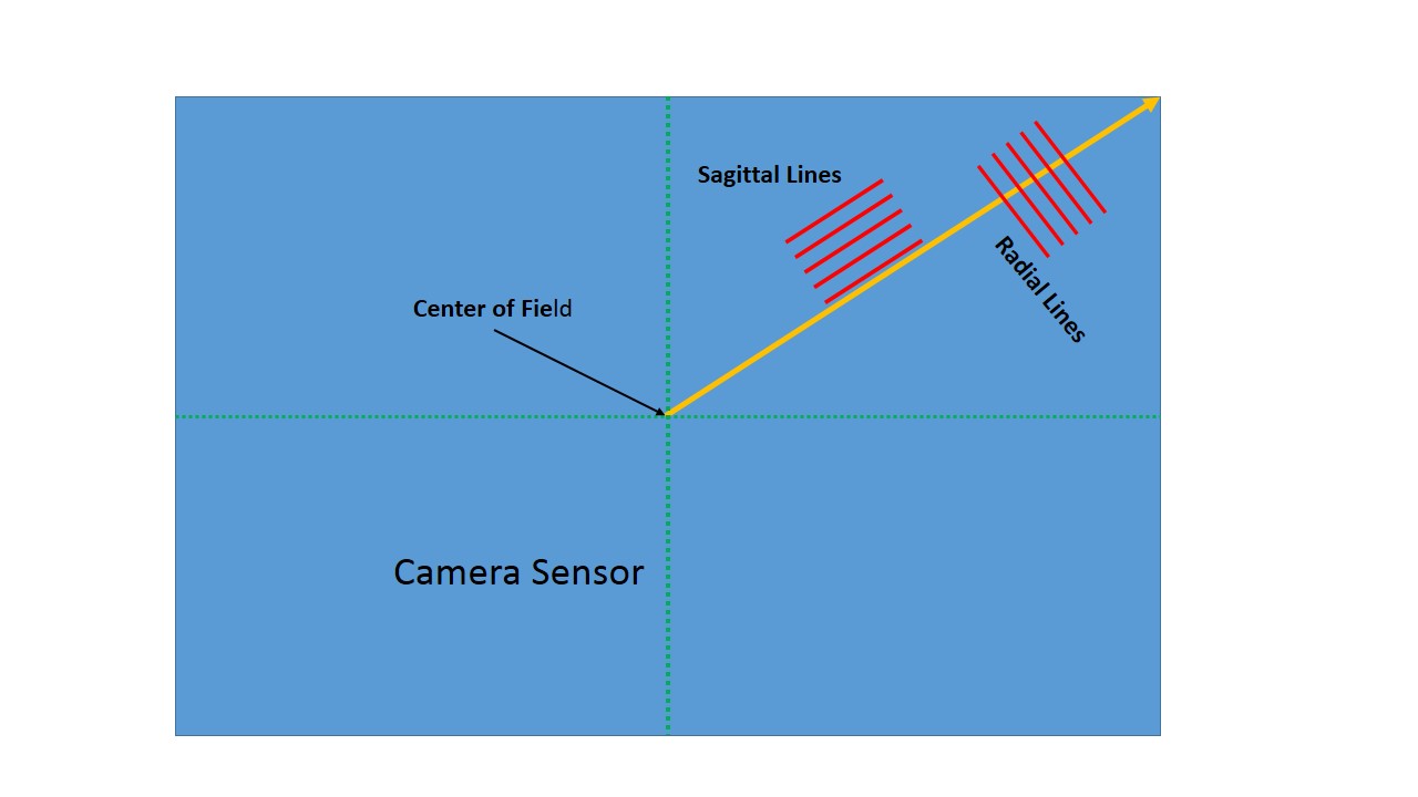
Figure 2 – Schematic defining terms in an MTF (c) DE Wolf 2013

In today’s blog I’d like to talk technical about how to read an MTF curve and then, in my next technical blog, I’ll discuss the choice that I made and how I made it.  We have previously discussed resolution in terms of how a lens handles a set of parallel line or line pairs.  Simply put if you have a set of white lines and black lines, where the line thickness equals the line spacing, and unless the lines are very wide and far apart the lens is going to distort the lines.  It does this in two ways: it smooths or unsharpens the line edges and it modulates the lines. Huh?  Modulates mean that black becomes gray and white becomes gray until when the line spacing is so fine you can no longer distinguish the two shades of gray.  Suppose black is 0 and white is 255, then a 10 % demodulation takes the contrast down to 90 % of what it was to begin with.  The difference between black and white is now only 230.  That’s what the MTF does.  It tells you how much the  lens( or lens/camera system) modulates the contrast, expressed as a fraction, where 1.00 or 100% is maximum.

Figure 1 shows a typical MTF Chart from Canon.  Obviously, it requires a bit of explanation.  First, you will recall that the sensor on a digital camera is typically rectangular.  For a full frame 35 mm camera this rectangle is 25 mm X 36 mm.  The corner to corner diagonal distance is approximately 44 mm; so the center to corner distance is approximately 22 mm.  In Figure 2 the blue rectangle is mean to be the camera sensor.  The arrow goes from the center to the corner; so it is 22 mm long.  The x axis of Figure 2 is meant to be distance from the center along this arrow.  Next imagine that we had a set of lines parallel to the radius (referred to as meridional lines), and at each point along the radius we measured the modulation of these lines.  We can refer to this as the meridional modulation transfer function.  The key point is that the camera’s ability to resolve lines falls off from the center of the sensor to the edges; so the MTF decreases.

If you think about it, you will realize that the lines could alternatively be parallel to the radius instead of perpendicular to it.  So you could alternatively measure the MTF for parallel lines.  Parallel lines are referred to as sagittal lines.  I’ve always liked the word sagittal.  Sagittal comes from the Latin word sagittalis, meaning arrow.  You may be familiar with the constellation, or Zodiac sign, Sagittarius, the archer.  So the MTF measured with lines parallel to the arrow is referred to as the sagittal MTF.  This gets a bit confusing and you might ask why the resolution of the two types would different.  With a perfect lens they would be the same.  However, if they are different the lens is said to have astigmatism.  So comparison between the  two MTFs is a good measures of the lens astigmatism.

So here’s how it all works.  The two MTFs are usually measured at two line spacings, 10 line pairs/mm and 30 line pairs/mm.  10 lp/mm is meant to be a measure of the lens response to low spatial frequencies and the 30 lp/mm to high spatial frequencies.  That would give you four curves.  However, it is usually measured both with the lens wide open and with an f-number of 8.0 (near the sweet spot for lens resolution); so worst and best resolution.  This is why there are eight curves in Figure 1.  So here we go.  The thick lines are measurements taken at 10 LP/mm  and the thin lines are at 30 LP/mm.  The black lines are measurements taken with the lens wide open, and the blue lines are with the lens at f/8. The solid lines are meridonial measurements while the dotted show the sagittal measurements.

Now the key point, a value of 0.8 or greater represents superior lens performance.  A value of 0.6 represents only satisfactory performance.  So you know what you’re looking for 0.8 or better everywhere and at a cheap price.  Finally, one saving grace if you are using a Canon camera with an APS-C sensor with dimensions 14.8mm x 22.2mm.  Then the radius is only  about 13 mm, so you only have to worry about lens performance out to 13 mm.

As I said at the outset, totally defining lens specifications is a complex issue.  But the MTF is represents a good starting point and at least gives you a peg on which to hang your comparative performance.  Do remember caveat emptor that individual lenses can vary and a lemon is sour no matter how you slice it.  So you’ve ultimately got to field test your lenses, while you can still return them.

I will return to the question of which lens I bought and why in my next technical blog.  Wait a minute, David.  Aren’t you going to tell us where to find the MTF data.  For Canon lenses go to the Canon DSLR site and click on the picture of your lens.  The MTF’s are on the bottom of the page.  The situation with Nikon lenses is similar.  Go the the Nikon Lens Site, click on the lens you’re interested in and you’ll then see a link to the MTF Chart.


Romulan cloaking devices

There has been a lot of discussion lately among optical physicists about cloaking devices.  That is the ability to become invisible.  This has decided military advantages; so you can understand why it is of interest.  And, of course, in Star Trek the Romulan‘s have just such a device, “the better to terrorize the universe with, my dear.”

Well physicist John Howell of the University of Rochester and his sons Benjamin and Isaac have built such devices with common around the house materials.  Be sure to click on the video link, not just the still image, and then watch John’s explanation, which is a second video link. While this is just a little off topic for this blog, it is optical, and it is very cool.  So I hope that you will indulge me.  And, if it does not serve to hide a Romulan War Bird, it does come with the advantage of enabling you to make your little brother disappear.