Let’s continue our discussion of the Look Up Table or LUT. As the pixels of your digital camera’s sensor are hit by light, they emit and store electric charge – the more light, the more charge. After the exposure, this charge is sequentially read out. The charge is read as a voltage and the camera’s circuitry applies this voltage to what is referred to as an “analog to digital converter” or A/D. The important point is that if you have an 8-bit camera, it converts the voltage to 2^8 or 256 grey levels for each color and for a 14-bit camera to 2^14 or 16384 grey levels for each color. That’s your basic image.
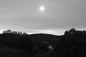
Your image processor, e.g. Photoshop, can alter this fundamental image by applying a Look Up Table to it. To see what this means, let’s consider the image in Figure 1. You can guess what I was trying to accomplish with this image. There was the valley of trees, a very overcast sky, and the sun burning through. The problem is that there was too much dynamic range in the scene for the camera’s sensor to handle. Probably the picture should have been shot with a graded neutral density filter or taken at a set of bracketed exposures and then reassembled as a high dynamic range image. But nevertheless, errors can be educational.
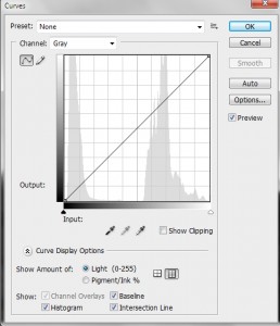
In Figure 2, I display the Photoshop Curves screen. Look first at the histogram. A histogram is a display of the frequency or number of times a particular grey level appears in the image. You can see that there are really two distinct regions: the dark tones of the valley and the high tones of the sky.
Next look at the curve, which is here a straight line. The curve is a display of the LUT. For a perfectly one-to-one linear LUT, like this, it says: a grey level of 0 should be displayed as 0, a grey level of 1 as 1, of 2 as 2, etc. So you can think of a two column table. The first column is input value. The second column is output value. That’s your LUT.
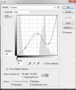
Now this picture calls for a different curve or LUT. I set an anchor point at the end of the first subregion of the histogram and at the beginning of the second. The lower values I don’t change by very much – just a bit of a concavity to the curve. But the high values I seriously distort. In fact, as seen in Figure 3, I drive the grey levels of clouds from very bright to very dark. This is a very nonlinear and nonmonotonic (output grey level does not always increase with increasing input grey level) curve or LUT.
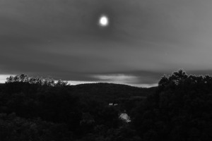
The final effect is illustrated in Figure 4. It is certainly improved in comparison to the original, but there is still a lot of work remaining to achieve my concept of the image, when I first took it. Indeed, it may not be salvageable. However, it does serve to illustrate the concept of the LUT and response curve.


